PRELUDE
After bidding adieu to my only Sailor fountain pen - a stunning 1911 Profit Standard in
Navy Blue colour, dazzling with golden accents with a broad 14k nib, I was constantly missing a Sailor. It was not that there was a dearth of good pens. For all good reasons, I believe that these Sailors are a great piece of workmanship as far as design, build and quality of materials are concerned. However, my romance with Sailor Pens was rather an one-sided affair, as far as their nibs were concerned. Not once but for five consecutive times, I had gone for a return. Thanks Raul & Engeika. With a strong feeling for a sixth luck since it corresponds to my birth number, the urge for a Sailor was getting bolstered with each passing day. And then, giving in to my temptation, I went for the newly launched Pro Gear 2 or Sigma ∑ Series, which kind of fulfilled my criteria of being a Sailor as well as having a two-tone nib.
THE SAILOR STORY
In 1911, Mr. Kyugoro Sakata, an Engineer from Hiroshima, Japan, was introduced to the fountain pen by friend, who was a British sailor. He was so intrigued by the design and function of a fountain pen that he started a company to craft fountain pens among others. In honour of his British friend, he chose to name the company as Sailor Pen. Henceforth, the Sailor nibs carried an imprint of 1911, the foundation year. Today, the Sailor pens come mostly in a classic cigar design (KOP, 1911) or a tapered cigar cut (Pro Gear),
excluding a few like Reglus, Somiko among others.
In 2013, Sailor changed the classical Pro Gear design to appeal to modern tastes of the 21st century folks, at least this is what their marketing campaigns said. There was a visible change in design of the clip and the logo on the finial. And I admit, I never could find a connection of Pro Gear ‘Sigma’ with the eighteenth letter of the Greek alphabet. Finally when I asked Sailor, it seemed their intent was to create another luxury segment out of their already successful Pro Gear/ Sapporo Series, with an enhanced nib/design. The Sigma nomenclature was originally aimed for the domestic Japanese market. For the international markets, Sailor renamed it as Professional Gear II when Sigma did not gain enough foothold.
PRESENTATION
The pen comes in a beautiful blue gift box, packed with two black cartridges, a converter and a user manual.
DESIGN - THE TAPERED CIGAR (5/6)
The Pro Gear II (or Sigma) Slim comes in two standard designs - Gold Accents and Silver Accents. They also feature a corresponding ballpoints and mechanical pencils.
The build is remarkably sturdy without addition of weight. It is made up of PMMA resin or Polymethyl Methacrylate which was developed by a group of scientists in 1928. PMMA is easier to mould with heat. It’s actually transparent when synthesised from petroleum and therefore dyes are added to impart colour. Besides, it’s resistant to normal scratches with a hardness of around 4 in Mohs scale. So you would probably need iron or steel to make a bad enough scratch on it.
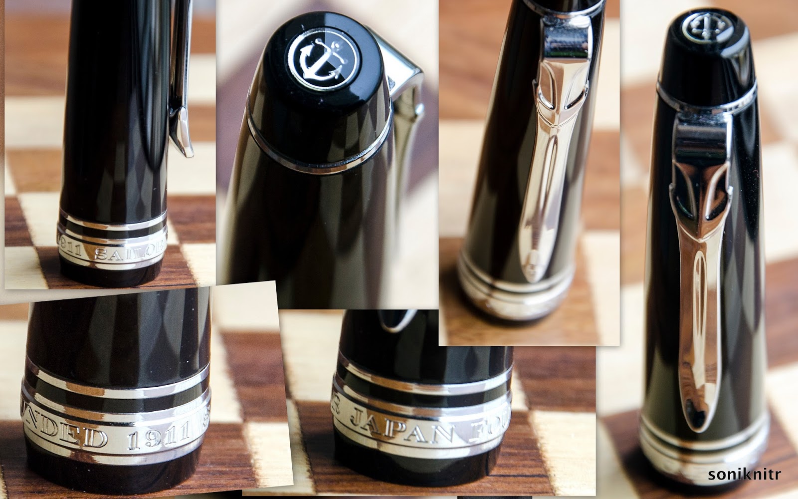
The pen is 0.6 cm longer compared to the Sapporo Slim, with an increased taper at either finials. The lustre of the pen is rendered chiefly by nickel-chrome plated accents (it’s not rhodium), though the resin does have a gleam of black shine. A thin layer of chrome plating over bright nickel coat makes the surface resistant to common corrosion by air or water. The rings at either ends along with the clip and cap bands deliver the dazzle. Apart from the thick clip, the pen does have an understated look.
The cap feels light and unscrews with two complete turns, revealing a grand two-tone nib. There is a loop of glitter coming from the metallic threads, which marks a start for the grip section.
The cap band carries an imprint of SAILOR JAPAN FOUNDED 1911 and has a thin loop just above it for the pure aesthetics part. The finial carries a distinct anchor logo within a dome of transparent acrylic. A much-debated anchor embedded inside its tension-fit clip, has also got wider proportions in terms of size when compared to the earlier clip.
FILLING SYSTEM (4/6)
As a CC filler, the supplied convertor is limited by a volume of 0.6 mL. It does give an advantage to frequent ink-swappers or you can use cartridges. The barrel unscrews from the grip section with eight turns with an usual metallic thread section for the grip. The resin barrel is directly threaded on its insides.
The nib and the font part of the grip have to be completely immersed inside ink, to get a proper suction.
NIB - ALL THAT MATTERS (5/6)
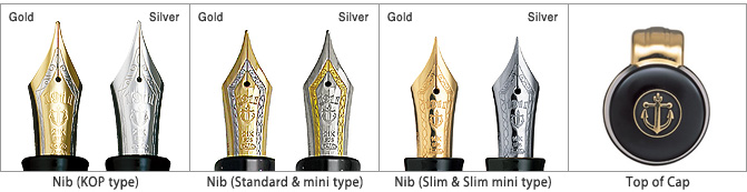
The nib/feed section is friction-fit and comes in a 14k two-tone design across three stock widths - F, M & B. Sailor does make absolute stunners here. The silver accented one carries a rhodium coated nib adorned with a band of gold and it's vice versa for the gold-accented one.
The tail end carries the brand imprint of Sailor with the traditional elongated S and the nib-composition (14 C, 58.5% Au) rests above it. 1911 and the Anchor logo are embossed above towards the circular breather hole. A band of golden decor runs in between the body and its shoulders which enhances the decor. The size H-M (Hard Medium) is imprinted on one of the faceted shoulders. The nib lays a wet and fine line writing quite smoothly for its sweet-spot. While writing, it does produce a distinct sound. A slight rotation changes the tip angle and makes it toothy. Between, I have never seen any Soft nibs from Sailor (S-M or S-F)!
A standard black plastic feed with closely spaced fins allows a buffer capacity of ink and even with the cap open for a while, it does not take any effort to lay a nice wet line.
PHYSICS OF IT (5/6) – RELATIVELY SPEAKING
The cap needs to be posted, else the pen seems to lack both length and heft. The grip section is about 1 cm thick and provides a decent level of comfort, while writing.
- Uncapped Length ~ 11.3 cm
- Posted Length ~ 14.5 cm
- Nib Leverage ~ 2 cm
- Overall Weight ~ 17 g (Cap Weight ~ 7 g)
The size of the Pro-Gear models (+ nib sizes) rises with a progressively condescending nomenclature & price of course:
Capped, uncapped and posted comparisons with a pelikan m405 run below for your reference. The pelikan m4xx appears shorter when capped.
Uncapped or posted m4XX is a good 0.5 cm longer than the PG 2 slim.
ECONOMIC VALUE (6/6)
The Pro Gear Slim retails at around US$ 200, though it might be available at lower street prices. I was able to get the pen at around $ 145 from Engeika’s Indian arm. I feel that it’s a good value for money pen.
OVERALL (5/6)
This stunning 14k nib is smooth at a normal angles with a pretty wet flow. There is no noticeable line variation between the horizontal and vertical strokes. A slight rotation changing the tip angle makes it feel toothy and a little more change makes it scratchy. The nib is a H-M (Hard Medium) nib and is like a nail. There is a slight bit of spring and an absence of any perceptible softness with this nib.
Even being a wet writer right out of the box, the Sailor Medium nib puts a line which takes around 15 seconds to dry on MD Paper. Ink used was Sailor Sky High.
REFERENCES
Thank you for going through the review.