Saturday, October 4, 2014

An Ambitious Review: The Faber-Castell Design Ambition

Long ago during school days, I had used some of the not so expensive Faber-Castell ballpoints, pencils, highlighters, rulers, mechanical pencils and geometry sets. They used to be a bit scarce in India then, as they came with a ‘Made in Germany’ tag. Though there was little or no price difference with other Indian brands like Camlin or Omega, these were not widely available as such. Years later one fine day, while randomly searching for pens made by Faber-Castell, I bumped across the Ambition/Ondoro/e-motion fountain pens which were placed in a premium segment with Graf-Von Faber Castell Anello/Intuition in luxury segment. In India, a few models were available in Shoppers Stop Online and some of the other known e-com sites. I finally ordered an Ambition (then an Ondoro) from Pensavenue, as they were running a discount sale on all Faber-Castell products. I added a converter since it was clearly mentioned that a Faber-Castell Design (FCD) converter was not included with the gift package. 

A BIT OF FABER-CASTELL HISTORY 


Around 1660s Kaspar Faber was one of the pencil makers in Stein, Bavaria, Germany. Later Kaspar’s son Anton Wilhelm Faber took over the business and the initials A.W were added from his name in 1839. Later on in 1898, when Ottile Von Faber (sixth generation of Faber family) married Count Alexander zu Castell-Rüdenhausen, A.W Faber-Castell was born. Count Alexander modernised the company and introduced the jousting knights logo. Faber-Castell started manufacturing fountain pens in 1951, after acquiring the Osmia Company and produced fountain pens till 1975. They had carried the Osmia logo [diamond-within-a-circle] till the 1960s, given Osmia’s high brand recognition in the fountain pen industry. Later under Anton Wolfgang von Faber-Castell, Faber-Castell started expanding their factories & offices across the globe and also started manufacturing fountain pens under two banners of Design and Graf von Faber-Castell (introduced in 1993) from the 90s. 

These Ambition range comes with a fountain pen (with 4 different nib widths), a roller ball, a propelling pencil (0.7mm) and a ballpoint pen with various barrel designs constituting of resin, wood or brushed steel. 

PRESENTATION 


Within 3 days, the pen and a converter were delivered in a moss-green cardboard box. The colour reminds me of lush green cricket outfields and the Australian Baggy Green Caps. 
The box has a slider and the pen is secured with an elastic band on a felted bed, along with a warranty card. 

DESIGN - THE CYLINDRICAL MOTLEY OF RESIN & METAL (4/6) 


Held in hand, the pen will feel somewhat heavier towards the cap end, with a relatively lighter brushed barrel made of up black coloured resin (Like MB, Faber-Castell also calls it ‘precious resin’, I feel it has comparatively lower density). 

A convergence in its minimalistic design of chrome plated accents is achieved with another piece of metallic finial at the end of the barrel, which also serves as the click-lock for posting the cap. 

And yes, the chrome accents are prone to fingerprints. Very much!
The cap is substantially heavy with a snap-on locking mechanism. Once you pull it, it comes off with an audible click, and you can see a chromed metallic section attached to the non-differentiated grip, at the end of which rests a shiny nib. Absence of any taper in the singular cylindrical section, introduces a steep step for holding the pen.
A mirror finish on the chromed cap etched with the Faber-Castell logo of two jousting knights will immediately gleam with the slightest amount of light and it is also embossed with the traditional statement preserving antiquity of A.W Faber-Castell - Since 1761. The clip is spring loaded and is shaped like an arc with a concave end. To generate friction with fabric, there are multiple grooves on the insides of the clip’s concavity, where it touches the cap. There is also a plastic insert inside the cap gives the snap-on friction. However, it seems to lose grip with time. 


FILLING SYSTEM (5/6) 


The small metallic section at the end of the barrel unscrews from the resin barrel with less than three turns and it disengages the section containing the nib and CC filling system. The nib has a screw fit, and inserts into a metallic sleeve like most of the Faber-Castell fountain pens, which I have seen. The nib sleeve has threads which synchronize with threads on the insides of the resin barrel. 
The converter says SCHMIDT on its piston along with a brand imprint of FABER-CASTELL Germany on the metallic sleeve. It has a reasonably high capacity of 0.8 – 0.9 mL, and the ink does last for quite a while! I am usually biased towards piston fillers, but I like the capacity offered by Faber-Castell or Schmidt converters. In case of GvFC Converters there is no mention of Schmidt on the converters themselves. 


NIB - ALL THAT MATTERS (6/6) 


The nib is made of stainless steel alloy with an iridium tip. The initially available nib sizes featured F, M and B nibs, though an EF was made available later. I went with an M sized nib. Right out of the box, this was a butter-smooth nib. 

The nib has a perforated imprint of dots which cover a third of its surface area. Had these been real perforations there would have been an opulence of breather holes. And in fact there is not even a single breather hole. The nib-size is embossed above the traditional Faber-Castell Design logo of two jousting knights near the tail. Nib section is screw-fit and thus easily removable from the steel sleeve for cleaning or replacement. 
The feed is standard grey plastic, with a big filler hole for ink suction, which is incidentally also used across the GvFC Intuition Series. 

Faber-Castell Design (steel) nibs are sourced from JoWo whereas the GvFC nibs are known to be sourced from Bock. 

PHYSICS OF IT (3/6) – RELATIVELY SPEAKING 


Without the cap, the pen measures around 12 cm, which might not be comfortable for people with medium or large hands. Posting the cap is easy and it seems to be secured with a click-lock at the finial section. Although the posted pen exceeds a 15 cm scale, the steel cap makes it pretty top-heavy. In addition to weight, the cap freely rotates once it’s click-posted. While writing posted, the beautifully arched clip later becomes the pen’s arch-nemesis for top weight imbalance, with free rotation around the metal section. A girth less than 1 cm might be inadequate for the shorter uncapped length. 
  • Uncapped Length ~ 12.2 cm 
  • Capped Length ~ 14 cm 
  • Posted Length ~ 15.8 cm 
  • Nib Leverage ~ 1.9 cm 
  • Overall Weight ~ 28 g (Cap Weight ~ 15 g) 
Capped and uncapped and posted with a GvFC Intuition, Pelikan m400/2XX and a bigger MB146 run below for your reference. The Intuition has a wider grip than the Ambition. 


ECONOMIC VALUE (5/6) 


It retails at around USD 70 and I got a converter included at the same price, because of the aforementioned discount. I believe it’s a good value for money pen, given you too end up with such a nib, which defeats many of the gold ones. 

OVERALL (4.6/6) 


This nib is wet, runs wide and smooth like butter, without giving even a hint of feedback. I purposely used a less wet ink, but the pen did quite well against a drier pelikan 4001 ink. There is a bit of line variation with relatively thicker verticals. The nib has some spring and a touch of softness. In fact it lays a wetter and wider line with a little pressure. If you hold it from the metal section, the pen might feel slippery after some time and it might even rotate a little between your fingers. I instinctively hold the pen just above the metal section. 

Being a wet writer out of the box, the Medium nib puts a line which takes more than 20 seconds to dry on MD Paper with a relatively dry Pelikan 4001 Brilliant Black ink. 


REFERENCES 


Thank you for going through the review. 
You can find some more pen and paraphernalia reviews here.

Thursday, September 25, 2014

No Greek in the Pro Gear - The Sailor Pro Gear 2 (Sigma) Slim

PRELUDE


After bidding adieu to my only Sailor fountain pen - a stunning 1911 Profit Standard in Navy Blue colour, dazzling with golden accents with a broad 14k nib, I was constantly missing a Sailor. It was not that there was a dearth of good pens. For all good reasons, I believe that these Sailors are a great piece of workmanship as far as design, build and quality of materials are concerned. However, my romance with Sailor Pens was rather an one-sided affair, as far as their nibs were concerned. Not once but for five consecutive times, I had gone for a return. Thanks Raul & Engeika. With a strong feeling for a sixth luck since it corresponds to my birth number, the urge for a Sailor was getting bolstered with each passing day. And then, giving in to my temptation, I went for the newly launched Pro Gear 2 or Sigma ∑ Series, which kind of fulfilled my criteria of being a Sailor as well as having a two-tone nib.


THE SAILOR STORY


In 1911, Mr. Kyugoro Sakata, an Engineer from Hiroshima, Japan, was introduced to the fountain pen by friend, who was a British sailor. He was so intrigued by the design and function of a fountain pen that he started a company to craft fountain pens among others. In honour of his British friend, he chose to name the company as Sailor Pen. Henceforth, the Sailor nibs carried an imprint of 1911, the foundation year. Today, the Sailor pens come mostly in a classic cigar design (KOP, 1911) or a tapered cigar cut (Pro Gear), excluding a few like Reglus, Somiko among others.

In 2013, Sailor changed the classical Pro Gear design to appeal to modern tastes of the 21st century folks, at least this is what their marketing campaigns said. There was a visible change in design of the clip and the logo on the finial. And I admit, I never could find a connection of Pro Gear ‘Sigma’ with the eighteenth letter of the Greek alphabet. Finally when I asked Sailor, it seemed their intent was to create another luxury segment out of their already successful Pro Gear/ Sapporo Series, with an enhanced nib/design. The Sigma nomenclature was originally aimed for the domestic Japanese market. For the international markets, Sailor renamed it as Professional Gear II when Sigma did not gain enough foothold.


PRESENTATION


The pen comes in a beautiful blue gift box, packed with two black cartridges, a converter and a user manual. 


DESIGN - THE TAPERED CIGAR (5/6)


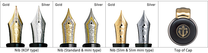
The Pro Gear II (or Sigma) Slim comes in two standard designs - Gold Accents and Silver Accents. They also feature a corresponding ballpoints and mechanical pencils. 


The build is remarkably sturdy without addition of weight. It is made up of PMMA resin or Polymethyl Methacrylate which was developed by a group of scientists in 1928. PMMA is easier to mould with heat. It’s actually transparent when synthesised from petroleum and therefore dyes are added to impart colour. Besides, it’s resistant to normal scratches with a hardness of around 4 in Mohs scale. So you would probably need iron or steel to make a bad enough scratch on it.

The pen is 0.6 cm longer compared to the Sapporo Slim, with an increased taper at either finials. The lustre of the pen is rendered chiefly by nickel-chrome plated accents (it’s not rhodium), though the resin does have a gleam of black shine. A thin layer of chrome plating over bright nickel coat makes the surface resistant to common corrosion by air or water. The rings at either ends along with the clip and cap bands deliver the dazzle. Apart from the thick clip, the pen does have an understated look.


The cap feels light and unscrews with two complete turns, revealing a grand two-tone nib. There is a loop of glitter coming from the metallic threads, which marks a start for the grip section.


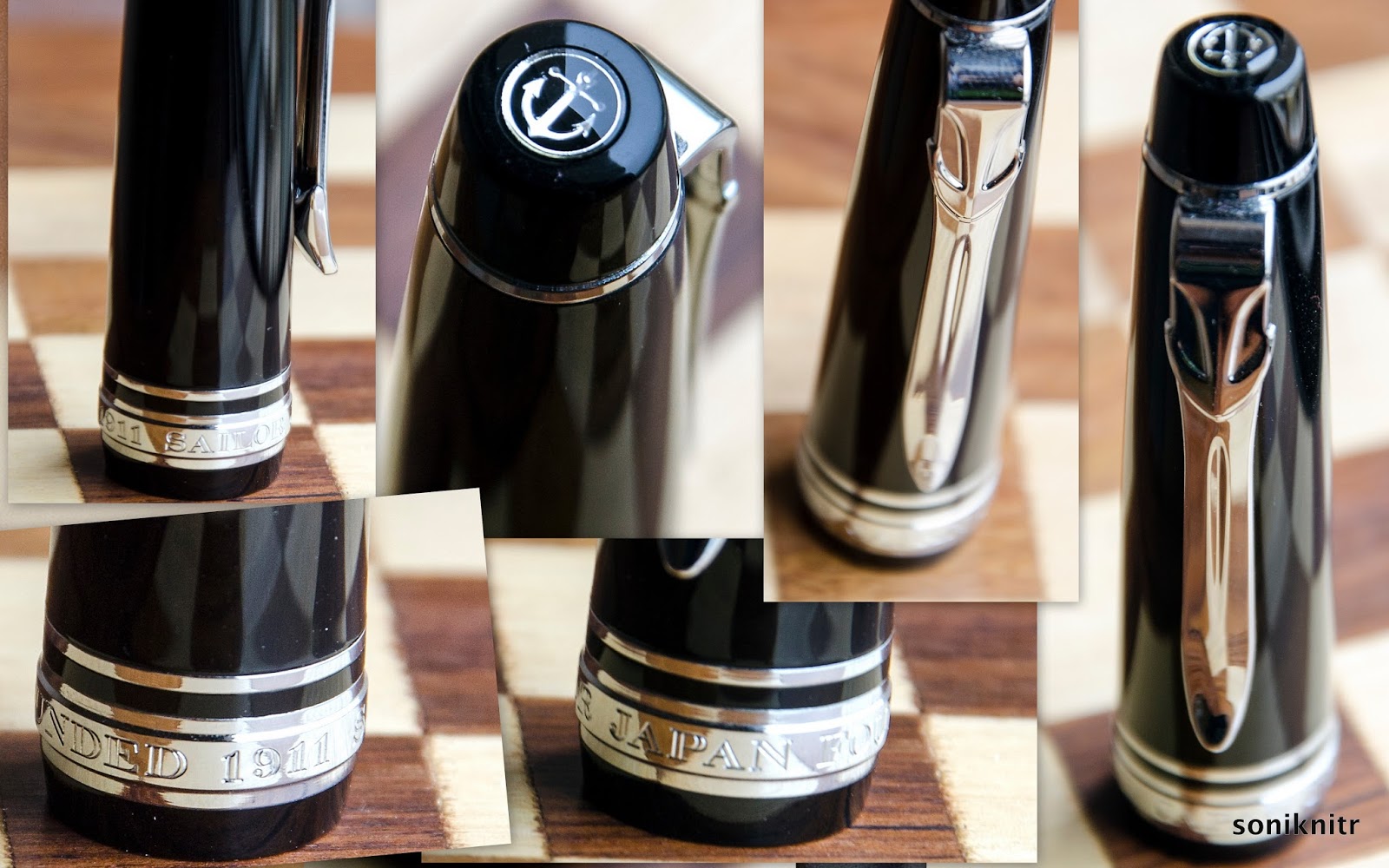
The cap band carries an imprint of SAILOR JAPAN FOUNDED 1911 and has a thin loop just above it for the pure aesthetics part. The finial carries a distinct anchor logo within a dome of transparent acrylic. A much-debated anchor embedded inside its tension-fit clip, has also got wider proportions in terms of size when compared to the earlier clip.


FILLING SYSTEM (4/6)


As a CC filler, the supplied convertor is limited by a volume of 0.6 mL. It does give an advantage to frequent ink-swappers or you can use cartridges. The barrel unscrews from the grip section with eight turns with an usual metallic thread section for the grip. The resin barrel is directly threaded on its insides.

The nib and the font part of the grip have to be completely immersed inside ink, to get a proper suction.


NIB - ALL THAT MATTERS (5/6)


The nib/feed section is friction-fit and comes in a 14k two-tone design across three stock widths - F, M & B. Sailor does make absolute stunners here. The silver accented one carries a rhodium coated nib adorned with a band of gold and it's vice versa for the gold-accented one.

The tail end carries the brand imprint of Sailor with the traditional elongated S and the nib-composition (14 C, 58.5% Au) rests above it. 1911 and the Anchor logo are embossed above towards the circular breather hole. A band of golden decor runs in between the body and its shoulders which enhances the decor. The size H-M (Hard Medium) is imprinted on one of the faceted shoulders. The nib lays a wet and fine line writing quite smoothly for its sweet-spot. While writing, it does produce a distinct sound. A slight rotation changes the tip angle and makes it toothy. Between, I have never seen any Soft nibs from Sailor (S-M or S-F)!


A standard black plastic feed with closely spaced fins allows a buffer capacity of ink and even with the cap open for a while, it does not take any effort to lay a nice wet line.


PHYSICS OF IT (5/6) – RELATIVELY SPEAKING


The cap needs to be posted, else the pen seems to lack both length and heft. The grip section is about 1 cm thick and provides a decent level of comfort, while writing. 
  • Uncapped Length ~ 11.3 cm
  • Posted Length ~ 14.5 cm
  • Nib Leverage ~ 2 cm
  • Overall Weight ~ 17 g (Cap Weight ~ 7 g)
The size of the Pro-Gear models (+ nib sizes) rises with a progressively condescending nomenclature & price of course:


Capped, uncapped and posted comparisons with a pelikan m405 run below for your reference. The pelikan m4xx appears shorter when capped.


Uncapped or posted m4XX is a good 0.5 cm longer than the PG 2 slim.


ECONOMIC VALUE (6/6)


The Pro Gear Slim retails at around US$ 200, though it might be available at lower street prices. I was able to get the pen at around $ 145 from Engeika’s Indian arm. I feel that it’s a good value for money pen.


OVERALL (5/6)


This stunning 14k nib is smooth at a normal angles with a pretty wet flow. There is no noticeable line variation between the horizontal and vertical strokes. A slight rotation changing the tip angle makes it feel toothy and a little more change makes it scratchy. The nib is a H-M (Hard Medium) nib and is like a nail. There is a slight bit of spring and an absence of any perceptible softness with this nib. 

Even being a wet writer right out of the box, the Sailor Medium nib puts a line which takes around 15 seconds to dry on MD Paper. Ink used was Sailor Sky High. 


REFERENCES


Thank you for going through the review.

Wednesday, July 30, 2014

Pelikan Souverän M 400 Review

BACK IN TIME


An 180 year old maker of fountain pens and their paraphernalia, coupled with the fact that your collection is rather incomplete without a Pelikan, was enough to provide momentum for my first purchase. Pelikan had launched its first fountain pen back in 1929. As for me, having already witnessed the writing finesse of a steel nibbed M 205, which I had to trade off, it was time to witness the real 14K Gold nib. And of course, these Swiss-incorporated German pen makers are credited with the genesis of piston filling mechanism with a differential spindle gear. It means that the piston knob is also threaded so that it unscrews a bit when the piston moves outward, thus delivering a greater ink-suction. Hungarian engineer Theodor Kovacs is credited with the invention of the original filling mechanism before selling off the patent to Günther Wagner (the man who established Pelikan) in 1927.

The M4XX is usually considered to be a logical next step to M2XX. As with the model numbers, there is a general increase in nib size & specs, in addition to overall dimensions, when you move from M4XX to M1XXX. Brass piston fittings in 8XX/1XXX series, render additional weight. The designs of the striped 400/600/800/1000 are pretty linearly recurring over the entire writing range except for several special editions. 405/605/805/1005s refer to the similar pens with silver accents, plated with noble metals (like Palladium or Rhodium), unless it’s a special or demonstrator model. The other model numbers refer to special/limited editions. One such alluring model is Souverän M 625 with sterling silver fittings (Ag 92.5%). And the green-striped M400 embarks the 1929 classical design with a translucent striped barrel. 

The logos have changed over the years starting from a mother pelican with four chicks to a one-to-one correspondence from 2003 onwards.


PRESENTATION


The pen comes in a standard G15 gift box, constituted of thick cardboard with dimensions in the range of 20 X 9 X 5.5 cm, in a top-bottom slider configuration. 


On opening the box, you would at once notice a white synthetic-leather pouch, secured by a brown strap with a plastic emblem, which mimics a wax seal. The pouch contains your pen and there is a separator holding the warranty and catalogue beneath.


DESIGN - THE STRIPED TRANSLUCENCY (6/6)


The m400 comes in five standard designs, four striped translucencies - Green, Blue, Red, Tortoiseshell White and one Classical Black with a Green Ink Window, across four different nib widths - EF, F, M and B although a custom grind is offered for a italic nib by some of the authorised sellers. The m405s now come in silver trimmed versions of Striped Blue and Black/Ink Window with monotone rhodiated nibs. Personally, I prefer the earlier two-tone nibs on them.


A touch would unveil the subtle craftsmanship associated in building the writing instrument. Through its light-weightiness, it apparently belies any effort for transforming thoughts into words. The black and green striped shaft has stood the test of time since the 1950s. The barrel made up of extremely smooth pelikan famed ‘cellulose acetate’ with its diamond cut contours, partially revealing the necessities like the piston end or ink level, while concealing the irrelevant ones.


Light and dark play differently with the barrels, which dazzles your eyes, rather than the lenses. 


The striped transparent sleeve gleams in gold with ambient light and these effects proliferate with sunlight. The golden radiance is matched throughout the pen starting from the famed finial and the pelican beak (clip) through the concentric bands in the cap, finally converging with the concentric piston rings. 


The cap feels light and unscrews with a single turn, revealing a dazzling two-tone nib. The grip reveals another knot of glitter, towards the nib end. The transparency does reveal the inside works of its piston mechanism.


Two concentric golden bands with a gold plated crown embossed with the pelikan logo, adorn the cap with a signature pelican beak-shaped clip (with a face!). The thicker one carries the brand imprint of PELIKAN SOUVERÄN GERMANY. A high degree of polish gives it a gleam which can coax the lustre of the gold plated bands. The logo on the finial is the one embraced by Pelikan post 2003, that of a mother pelican and its chick, gleaming in brushed gold or brushed palladium.


The significance of these bands is that somehow they seem to be intrinsically associated with the design rather than just differentiating the aesthetics. 


FILLING SYSTEM (6/6)


A piston filler with a sturdy knob is embellished with two concentric golden loops. Apart from their enchanting looks, like any other pelikan, it's an easy and hassle-free mechanism. The piston end unscrews with three to four rotations and ink is sucked in, with quite a gush, once the piston is screwed back on. And of course, you can observe the thing in action through the striped windows. A plastic spindle connector in the m4XX/6XX limits weight. M4XX fills upto 1.3 mL of ink. However, given the wet flow of the flock, it does not get a long time to use this capacity.

One thing to note here is that these piston mechanisms are not supposed to be dismantled using a wrench. In case of problems other than lubricating the piston seal, it’s better to send the pen to Pelikan Germany/Country Authorized Service Center. Pelikan does have an excellent customer service.


NIB - ALL THAT MATTERS* (4/6)


The nib/feed section is screw-fit and comes in a standard 14k two-tone design across four stock widths - EF, F, M & B. It has the standard pelikan design with the usual convenience of a screw-fit section.

Like all its cousins, the nib is exquisite and efficient. With a standard m4xx feed, the nib-section is an ensemble of efficiency and art. And this two-tone finish does converge with the golden/silver trims in terms of both glitter and glimmer.


The tail end specifies the nib-width and composition (14 C, 58.5% Au) of the gold-alloy used. Three arabesques diverge along the shoulders of the nib with two of them converging near the circular breather hole. The third curve runs across the tines towards the shoulders ending with the tail end of the nib, outside of which a golden decor runs along the shoulders across the outer tines, before converging onto the iridium tip. There is of-course the dazzling golden mother-baby pelikan logo, resting above the tail. 

This one in the picture is an Extra-Fine nib and writes smooth out of the box.

A standard black plastic feed (earlier ones had ebonite feeds) with closely spaced fins allows a good buffer capacity to hold ink with ambient pressure and temperature fluctuations.


*My first green striped M400, had a wet yet scratchy nib. No doubt, it drained my entire emotional elation all of a sudden, when I started writing with it. Upon close inspection with a 20X loupe, I found tines misaligned by a considerable extent. But still due to wet flow, it laid a broader line than a pilot 14k medium nib, concealing most of the scratchiness, unless I wrote a looped ‘r’ or ‘s’. The next day, taking the loupe I did spend two hours, routinely lifting the right tine from the middle with my fingernail to align it with the left, although it kept coming back with amazing flex. An hour and a half later, the loupe showed both the tines to be more or less aligned and yes the scratchiness was almost gone. But the inertia of scratchiness still carried on the back of my head. Finally, I sent the nib back for a free replacement. The next m40Xs were gliders right out of the box and needed no such effort. But I did expect a better QC from Pelikan.


PHYSICS OF IT (5/6) – RELATIVELY SPEAKING


It does give a comfortable feel to write with the pen with the cap posted. The overall capped length is around 12.5 cm. The total weight of m400 has a third of contribution from the cap and it feels very light without posting the cap. The pen does get some heft from the ink inside the barrel.
  • Uncapped Length ~ 12 cm
  • Posted Length ~ 15 cm
  • Nib Leverage ~ 2 cm
  • Overall Weight ~ 16 g (Cap Weight ~ 6 g)
Capped, uncapped and posted comparisons with its cousins - m605 and a m805 go below. A m20X with a steel nib shares the same measurements as a m40X.


ECONOMIC VALUE (5/6)


The m400 retails at around USD 300 - 400, though it might be available at lower street prices. I was able to get the pens at a good discounted price in an online action at the bay, however the subsequent custom duty was high. I would not undervalue this rating by much, because in the end, I do consider the pen a workhorse.


OVERALL (5.2/6)


These 14k nibs have a smooth and wet flow. The nibs have a slight bit of spring and softness in them, without any noticeable line variation. Being extremely wet writers out of the box, the Fine nib puts a line which takes around 40 seconds to dry on MD Paper (for the Extra-Fine one, it takes 30 seconds to dry a line-width falling between a pilot 14K Fine and Medium nib)


Thank you for going through the review. Hope you enjoyed it.

More pen and paraphernalia reviews here.

Sunday, July 6, 2014

Time and ‘Alka Aunty’ wait for none

It’s been quite a while now, in real terms say around nine hundred and forty six million seconds, since it all began. That is about the time I have been serving on this planet or it might as well be the other way round. spacecloudsstardustFrom the nine hundred and forty six million seconds, it takes a normal human being less than thirty one million seconds to understand the nature of life and its materialistic incongruence, once he or she is able to apply Pythagoras Theorem in school. However, for me it took around two hundred and thirty million seconds, which is about the time in which one would have reached Uranus starting on a normal space shuttle from Earth, cruising along at a constant speed of 28000 mph. That’s about 100 times faster than the Volkswagen groups’ Bugatti Veyron Super Sport (Originally French), the fastest production car till date. Production car means you can actually sit on its seat, supported by gravity on your bum, while its wheels are turning and travel from Mumbai to New Delhi in less than three and a half hours over a perfectly deserted freeway sans any potholes or bumps without seeing any death angels. The absence of potholes is completely theoretical since it would render around ten million citizens jobless, and many more contractors and city municipal corporations penniless at the same time. And as someone had said, even the moon is envious of potholes in Mumbai roads. Pardon me for my mathematical analogies, for my dreams most certainly pertain to John Von Neumann types whereas outside the matrix it’s a cubicle with a dizzy screen to stare at and do whatever I am told by an assortment of Weasels#.  And that dizzy screen is also my own laptop’s, since we had byod (brick bring your own device).

From the classical Indian context or say rather from the kaleidoscopic perspective of an Alka Aunty, a perfect life mandatorily constitutes of the following: Engineering from an IIT or NIT (by Alka Aunty’s exceptional mercy NITs were allowed to be on the list since 1990s via a special amendment) , MBA from an IIM (No other B-schools are approved by Alka Aunty within India, even if they feature within Top-10, MSc/PhD from the I-Bhee League was added later) OR a Hard-bard in US , an intra-caste marriage to a good-natured girl belonging to a decent family (Special approval may be sought for intra-caste love marriage against arranged ones), having kids who would always top from Pre-nursery to Post-Graduation and finally landing up with a aaMaNCee job, till death takes you apart. Pre 1990s, it was perhaps cracking the UPSC examination ending up with a high-profile government job instead of a MNC one, with other factors unchanged. Kids still had to stand first in each and every grade. All these things would be materially and spiritually fulfilling for the rest of one’s life. Social life in school should be pursued with like-minded people excelling in various fields and people aspiring to be a Dhoni or Sehwag (Tendulkars were alright though after he had won the Opel Astra[MoS] in Sharjah in 1998) neglecting studies lacking even the mild potential of a Gagan Khoda, are strictly untouchables. Boys looming behind girls are destined to end up as beggars or possibly lepers, in distant future and are worse than untouchables who have to be dealt with a poker-face insulting their intellect or rather the lack of it. This was about the idea.

This formulae is probably what Alka Aunty has seen succeed throughout her life. There might have been many others who would have been done things very differently and still would have done as well if not better in their lives. Limited to middle class towns, belonging to middle class families, these outliers or rather aliens like someone’s uncles’ sister’s son are simply ruled out by frame of reference, sometimes as myths and other times as lucky ones. Dinku has been voting for last ten years but is still living off his father’s pension at his father’s place, because he was hitting the cricket ball when he should have been reading books. And yes he could not equal Gagan Khoda forget a Sehwag or a Dhoni. Even worse, Dinku was composing love-letters to Dinki when he should have been solving quadratic equations. Dinki ignored those, thankfully to Dinku’s poor English and is now a successful and well-settled doctor. Had she not, she would have been selling vegetables after eloping with a vegetable seller on a bicycle which again would be a borrowed one, as her staunch father would have refused her any help. Though theoretically, she could have simply lived off Dinku’s father’s pension.

After performing the rituals one has to look higher up in Maslow’s pyramid for a challenging job. For someone like myself, both the person and the need is beyond comprehension. Something monotonous might require a change, but challenges beyond challenge is abominable. Long ago, our class-teacher asked the class to name of the tissue in the human eye where the image is formed. Amidst the chorus, one lanky bespectacled fellow firmly stood up and confidently answered it as “rectum”. The teacher almost fell off her chair in mirth, before correcting it as retina. That day he was probably written off from Alka Aunty’s books and possibly her alluring daughters’ too. Even that guy craves for a challenging job today, with incessant updates of his facebook status with thought-provoking latin maxims, either on world cup matches or during anything that is being broadcasted to two or more people. Even the concept of ambition is so abstruse, one frequently confuses with what someone wants to do and what others want one to do. My childhood ambition was limited to being a traffic cop, since you get to see all the cars from the front side. Gradually, giving in to my friends and relatives constant disapproval, I upgraded that to an engineer where I would still get to see those cars. Now, that was a secret till now. I am told that my next childhood ambition was to become a truck-driver, and my guess is that it might have been true. It must be fascinating to have a moving front view from a height of 8 to 10 feet. But it is not so fascinating for the people around me.

Lack of ambition for doing an MBA post engineering landed my friend in pre-marital affairs of a completely different sort. (Note - From Alka Aunty’s books, he is already written off) Although, post-engineering  he was doing great in his life in the US, he was bombarded with similar questions related to his ‘doing an MBA’ ambitions, whenever he met a prospect. The questions were either direct or carved out in utterly ingenious ways starting from, “my friend’s father’s uncle who is CEO of Y Company thinks that this world requires an advanced management degree to deal with todays business problems, so what is your opinion on that” to “all my other pretty friends are married to b-school grads, so will you please do it later ?”.  We learnt that this happened invariably when three conditions were met : (1) The prospective wife was very pretty (2) This was their second meeting (3) Third meeting never happened. So, his logical response should be to avoid meeting very pretty girls or just meet them for the first time and keep the memory. Being human, that too in the male format in late twenties, both were difficult and second response was possibly catastrophic. And in two to three weeks time, he would deluge himself with both gloom and Royal Stag, once he could see the engagement album of the earlier prospect in his facebook feed, till news of meeting the next prospect arrives. How did this happen ? Was it due mere lack of ambition for learning or simply a social cost ?

In contrast Learning seems to be the new buzzword to crack interviews. Even if you are sure that you are roughly ending up with a similar set of weasels, almost doing the same thing but with a pay hike, you have to emphasize on the steep learning curve the new weasels group would have for you,  ascending to newer heights of Weaselry. They all need a go-getter, self-starter ambitious little hog who would takeaway all the weasel work from them and yet stay motivated till the end.  What you do will perhaps never match with what you felt you were supposed to do.

Feeling mystified by ambitions, interest and social costs, most of us would keep thinking rather than working on newer things, keeping everything in eternal abeyance.

#- Weasel is synonymous with office workers who can/will project your work as their own, It’s a Scott Adams inventionhappy_weasel_day_th