Showing posts with label 18k. Show all posts

Friday, January 17, 2020

A review of the Wahl Eversharp Decoband in rosewood

PRELUDE


The search for a delectable nib


After a brief hiatus from fountain pens, and a seemingly eternal interlude from reviewing pens, I was somehow on a lookout of a novel pen, which harnessed the excellence of this modern material age while preserving the flair of vintage brilliance. When zaddick posted this excellent review on FPN long long back (2015), the charismatic pattern of the rosewood ebonite caught my eyes, perhaps like many of you. And then, the frosted flourish on the nib itself (ah! slightly reminiscent of the sold-out Pilot Bamboo) coupled with a lustrous red-urushi feed! My primary concerns apart from the price point of 850, were the unconventional size, girth and weight of the pen. Then, I waited….and waited…and waited. Three years passed by, before I could order the Decoband from Bryant (I would happily recommend Chatterley Luxuries). Ah yes, the same one in that bewitching rosewood ebonite, how oft is the rosewood pattern so adorable! Then a month later, it finally landed into my hands.

                      I then inked the pen with an available one (probably pelikan blue) and after writing with it for a while as a desk pen, it was boxed. It wrote about a western medium and the ink did not seem to last long. It stayed in the cupboard for quite a while. And another year passed by! Other hobbies, nonetheless quite interesting like machine learning, took much of my time. And then, I felt like there was something missing, concerning with writing with the SUPERFLEX nib. And in the end, the pen has been inked up multiple times, since last year. So, here goes my review of the same.

PRESENTATION (5/6)


Elegantly Utilitarian


Presentation is modern and spotlessly utilitarian. These days, it comes in a fair-sized black cardboard box with the Wahl-Eversharp name & the trademark double-check logo on it.
                             And within it, sits another deep green cardboard box patterned with the W (double-check) logo, secured with a magnetic clasp. And within it (end of 'withins' but not underneath), a clamshell presentation box with transparent laminate halves cushions the pen. Perhaps, I would have been able to love the modern presentation completely, had there been no precedents set! Then, there comes a little nag reminding you of having missed the lacquer box along with its accouterments, in those three years. I bought the Wahlberry ink later. The box, nonetheless carries an anti-oxidant sleeve and a booklet and a warranty card, placed below the separator.

DESIGN (6/6)


Larger than ‘Vintage’ Life


The Decoband Oversize Gold Seal Collection as of today comes in a multitude of finishes - around twenty probably in varying combination of materials - ebonite, celluloid and acrylic along with gold or rhodium plated trims. Perhaps, a ruthenium finish will be a nice addition to the line. The nibs now have two categories - SUPERFLEX and a more stiff GOLDFLEX nib, in 18k gold. Some versions are still available in 14k as earlier.

                           I had been rather mesmerized by the rosewood finish long time back, so that was the finish eventually ordered. The effusively striped contours of burgundy and black, give the cylindrical structure, a remarkable semblance to actual finishes in rosewood. The metallic appointments at the centre, clip and either ends of the finial, are coated with (14k) gold and the golden dazzle well dances with the rhythms of the lustrous rosewood finish.
The finish appears brighter with ambient light. I would also want to preserve the finish for long and would happily avoid carrying the pen in sunlight. The ebonite is quite expertly polished to reflect this kind of luster. 
Coming back to the pen, there is a slight taper is at the filler end of the barrel converging the rosewood silhouettes with the golden ring and the thin black acrylic appointment of the filler rod.
You would notice a little hole in the acrylic end, to compress out air of the sac.
The cap is cylindrical and one thing you will notice is that the rosewood contours of the cap, well-align with the ones on the barrel. You can almost see its inner threads and the insert in some light. The finial is another thin (2-3 mm) polished black acrylic disk which discerns itself from the rest of the cap, with a golden ring. Then you would perhaps notice the inlaid metal disk - the gold seal with the customary double check. These seals earlier denoted Wahl’s top of the line products, like Sheaffer’s white dot. The V-shape tension fit clip with a broad cylinder albeit normal in terms of length, appears remarkably short, given the overall heft of the pen. On the clip, the name of WAHL-EVERSHARP is imprinted, where comes my little qualm like a few others, of not being crisp enough. The center band consists of three concentric rings, with some space for the lip to reflect the crimson silhouettes. The ring in the middle is etched with the Greek Key, much like the vintage one. The same design is present in Omas pens, with branding embossed in the middle. I later learnt that the Greek Key symbolizes flow of infinity.
                   The cap comes off in 1.5 turns, which consequently reveals the dazzle of golden threads of the section and a never to be missed, large #8 mesmerizing nib. The threads are nevertheless charming, to both eyes and fingers. The acrylic glossy black section slightly tapers towards the business end before bumping off towards golden hues of the loop. Quite some eloquent detailing!

FILLING & CLEANING SYSTEM (5/6)


One-touch “Chilton Style” Pneumatic filler!


         The supply end of the barrel, i.e the little black glossy disk takes around 6 turns to unravel another Greek key adorned, rhodium plated, brass sleeve of the pneumatic filler. This one doesn't have a branding, unlike the one released initially. The filling process is actually quite simple, but for me it took a bit of practice and observation, to have an acceptable level of fill.
      Once you pull out the metal sleeve, the nib needs to be completely submerged in the ink bottle, then with the air hole (in the finial end), covered with your finger/thumb, you need to press the sleeve back inside completely, which in turn releases the air inside the barrel and then eventually the air inside the latex sac. As per Syd, silicone would have been too supple a material, latex would last 10 years or more. 

                   Typically, you would count till 10 or 12, before the sac expands and draws ink up. Then you can push in the sleeve, without covering the air hole and finally screw on the glossy finial end. I have observed that the ink fills really well, once you see a lot of bubbles of air released inside the ink bottle.

                              The stated capacity in the website is 2.1 ml, but in my experience, I have got variable levels of ink fills depending on the ink brand (all with deep inkwells). It seems to work better with Wahlberry and GvFC inks. It is also recommended by the company, to use slightly acidic inks (pH between 4.5 to 6.5, Japanese inks are usually alkaline), else it could damage the metal components. Also, you might prefer a drier ink, since the nib lays out a wet & juicy line.

        The visual from Edison pen company does a better justice to the whole ink-filling process.


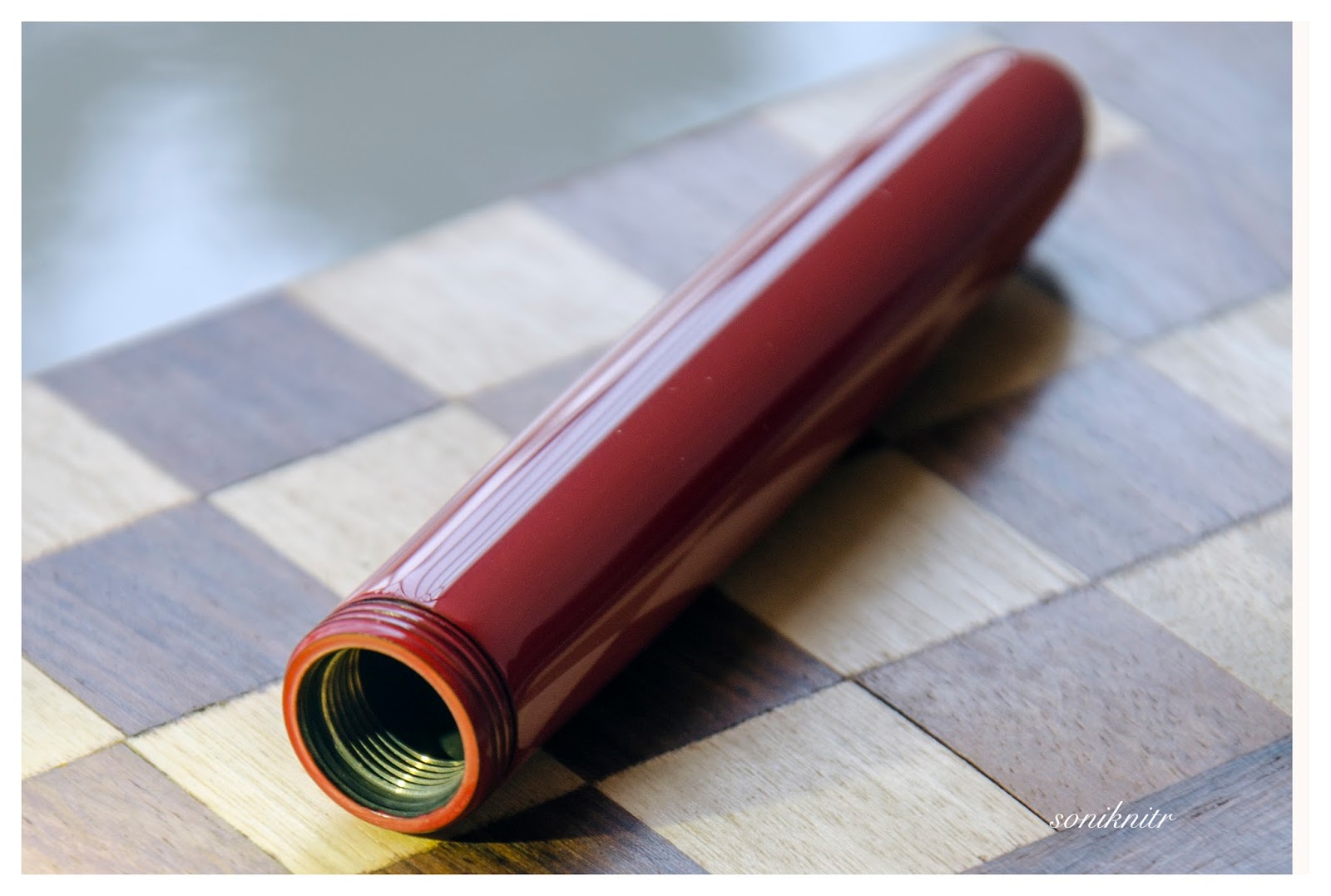
                      From a cleaning perspective, it’s easy. It seems to fill better with thinner liquids, that includes water apart from your inks! One thing, I found after unscrewing the section is that, some ink still remains inside the sac and the lower threads of the inner section, which is directly attached to the sac (ref. the open section in the picture, a little ink seems to go in nonetheless, as we dip the nib & section to draw ink).

NIB - ALL THAT MATTERS (6/6)


The frosted stunner, the vivid red enchantress


Now comes the business end of the pen. All I can say is that, it's elegant and stunning. The frosted appearance from a distance, along with a symphonic texture renders the nib as a work of art, rather. I have not seen many (or shall I say any?) manufacturers put this kind of effort in making a nib glorious (even at much higher price points, Ouch! Namiki). They kind of concentrate on the pen, polish the nib (probably with a Ford assembly line attitude) and then shift the entire attention towards the presentation. A circular breather hole runs among the sandy dunes & along the body of the nib.

           The process of removal of gold and subsequent plating to get this frosted appearance (from email conversation) is called debossing, which is done in France. The nib albeit sourced from Germany, gets the flex by this debossing. The flex variation between the SUPERFLEX & GOLDFLEX arises due to the difference in contours made by the laser debossing process. Below the breather hole, the hallmark double check is embossed within a circle within a little imperfect snowflake (okay, I discovered it only after taking the photo, probably like schwarzschild discovered his radius)! The brand name and the words SUPERFLEX are imprinted towards the base with the 18k gold content indicator.
                  A side view of the nib imbibes even a more regal structure with the feed and the section, in a single frame. The marriage of the nib and feed, promises joy and happiness for a long long time.
Then once you turn the nib, you would be beholding a vivid red urushi feed, the lacquering happens in-house in Arizona. The split ebonite feed has closely spaced fins on the underside, which allows to run the nib wet with flexing the tines, while maintaining the ink buffer. The nib hasn't skipped at all.
Below is a little comparison with a red urushi lacquered feed of a Namiki Emperor. It's plastic against ebonite, and you can see the grainy finish of the Decoband's feed compared to the smoothly machined feed of the Emperor.

PHYSICS OF IT (5/6) – RELATIVELY SPEAKING


The Newtonian Laws


The overall capped length is around 15 cm. I use the pen un-posted as it balances the size, girth and more importantly the weight, for my writing style. The section has a comfortable grip diameter of about 1.2 cm, before it bumps off towards the gleam of the golden ring of about 1.5 cm diameter. The pen is comfortable from an overall perspective, given that you spend some time getting used to it. It balances well for a large oversized pen with brass fittings.

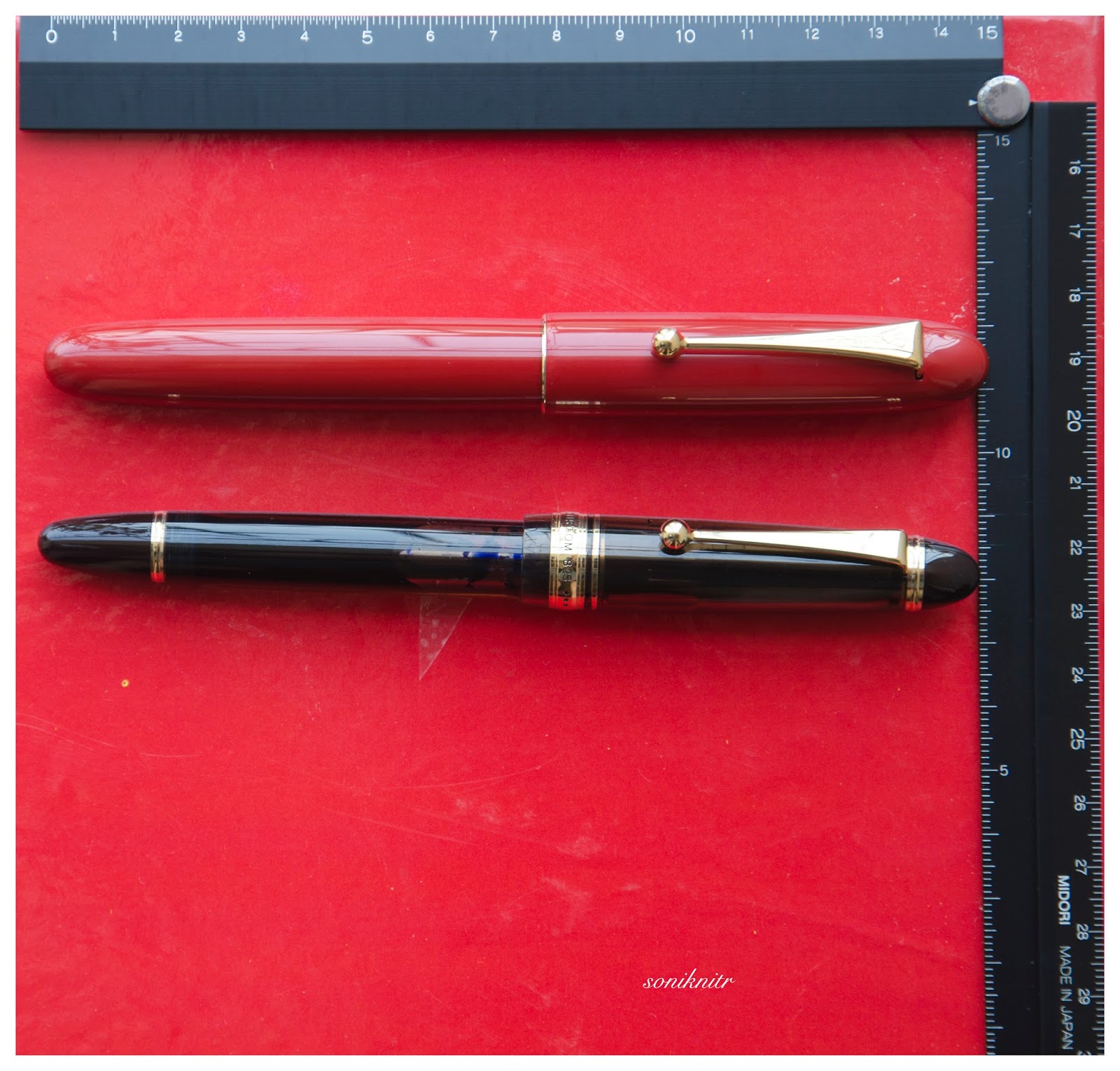
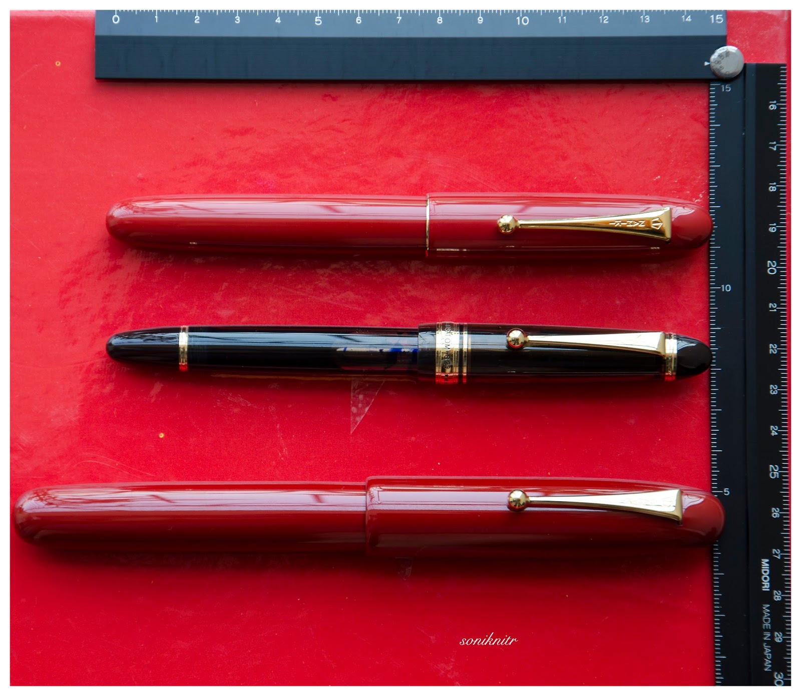
              Below are the pictures along with a MB149 and a Namiki Emperor for comparative reference.
  • Uncapped Length ~ 14.5 cm
  • Total Length ~ 15 cm

One piece of staggering engineering (which I had missed) around the pen is that the cap screws on quite deep, so there is minimal difference (0.5 cm) with the length of the uncapped pen.
  • Exposed Nib Leverage ~ 3 cm (#8)

Now this pen is bold and solid in terms of heft. It took me a little while to get used to it. Having said that I was amazed at its weight distribution and overall balance.
  • Overall Weight ~ 57 g (without ink, cap weight~13.5 g, Gosh! almost a uncapped Lamy 2000)


I used a Pelikan 3-pen pouch and it nestles the pen okay (but then there is just enough space left for another oversize pen). Also, just on sheer impulse, I had got a leather pen box with some velvety inner cushion, from Cross (it was selling at $7 or something, I assume it's locally sourced here). Thankfully, it turned out to be perfect fit for the Decoband.
The leather pen box from Cross.

With the berry!

ECONOMIC VALUE (4/6)


Demand & Supply


While an expensive retail price of around $ 850 is steep, I have seen a few selling in second hand market below $ 600, from time to time. For me, the exceptional work on the nib, feed along with materials, make this pen effortlessly matchless. For the filling mechanism, I would have probably preferred a piston/vacuum filler, rather than a pneumatic one. There is rather a vintage appeal with the pneumatic one, I guess. Add to this, somehow the exceptional make must have been a sourcing nightmare, given that the parts belong to France, Germany, Switzerland and Italy, with the final machining & assembly done in Italy & US. (as quoted in emails & FPN comments)

WRITING & FINAL COMMENTS (5.1/6)


Writes like a rainy writer


The SUPERFLEX nib graces a wet and juicy flow, and writes like a western medium. I usually do not flex nibs with my regular writing, but an added springy flourish comes automatically with the downstrokes. I tested the nib on a relatively better paper of a growing Indian brand. It's a Nightingale A4 notebook, and it does pretty well. The Wahlberry ink however doesn’t seem to be close friends with Tomoe river paper, while it does make the line variation more noticeable on TR. Given the wet flow, a hint of feedback isn’t quite noticeable until you consume most of your ink. The ink took around 25 secs + to dry on this particular paper, although it has dried quicker, in other papers. The ink itself seems to be well formulated and on the drier side for the overly generous super flex nib.

                   The nib has never skipped and always laid a wet juicy line, and seems to be one of the best nibs in my relatively small collection. Another hesitation on my side is that, if the pen stays unused for a few days, then the ink possibly dries up and it's a task to get it to write again with the same panache.

The balance & girth of the pen is something, I have gotten used to and never looked back since then. I feel the pen needs a separate carrying box (like the cross one) if you wish to take it in your backpack or bag. I am not very keen on the pneumatic filler as mentioned earlier, a piston/vacuum would have perhaps better worked in my opinion, given the ink-demands of the feed. And perhaps, the ink should be packaged along with the pen like earlier. Since it runs quite wet out of the box, so you might not be able to appreciate the nib with many of your inks.
Below is a short writing sample on TR paper.

Thank you for going through the review.

You can find other pen and paraphernalia reviews here.

REFERENCES


ADDENDUM

The gold seal over the years had lost its lustre. It got restored from its maker, Syd Saperstein!


Saturday, May 26, 2018

Review of the Cross Peerless 125 Tokyo Edition

PRELUDE 

Plurality of singularities 


Among many other fountain pen lovers, I do retain a high level of adoration for the way the Sailor nibs look, aren’t they just beautiful? Paradoxically enough, there is also a certain distaste, when it comes to my acceptance of their nib smoothness. My humble experience has been mostly with sailor nibs straight from Japan and not the US market. Alas! the glassy smooth angle to manoeuvre writing with the Japanese ones (except the Naginata one), wouldn’t work for me, ever with the five sailor nibs.  Also, I always felt an immense opportunity have something done with their relatively bland base pen designs and the CC filling system. Many times, I pondered whether it would be worth sending a sailor nib to Conid and have a pen made. The nib can be smoothened for English script rather than struggling on my part to learn the Kanji to have it used! 

As it turns out, I couldn’t justify the Conid plan for a long time, but I do intend to add one in future. By this time, Cross had relaunched the Peerless range in 2015, marking 125th anniversary of its original Peerless pen (1889). Hoorah! it came with a 18k Sailor nib! 

Cross was founded in 1846, in case you too thought this to be the company’s 125th anniversary :). Below is an ad, I could find with respect to the original peerless fountain pen. 


PRESENTATION (6/6) 

Presented in Style 


Presentation is exquisite consisting of a paper box wrapped around a luxury gift box, along with a brand leaflet and two spare black cartridges. The screw-in (8756) converter, comes fitted inside the pen. I hope that the following pictures will do more justice. And if you are thinking of gifting this, I can assure you, it’s altogether a fantastic package. Full Marks! The hinged box is sturdy and substantial with enough cushion for all residents. In fact, there is enough space to fit two more large sized pens and probably you could smuggle a turtle inside! 


DESIGN (5/6) 

Designed by Aliens 


Cross released the Peerless 125 in four finishes: 23kt Heavy Gold Plate, Obsidian Black Lacquer, Platinum Plate/Medalist, and Platinum Plate in three models initially: fountain pen, ballpoint and rollerball. Later, three special editions NYC, London and Tokyo were released in Silver, Gold and Black, that imbibed prominent works of architecture (Chrysler Building, Big Ben and Skytree) in the respective megacities. 

         I went for the Tokyo primarily because of silver accents and partly because of its availability over Obsidian Black edition. Eventually, I think that it was a good choice :) 

The pen looks elegant and appears quite substantial compared to a Townsend or a Century, while preserving in its signature cigar custom-design. The platinum coated metallic appointments at the centre, clip and either ends provide a pleasant lustre to an otherwise dull matt finish of the body. The taper is pretty nuanced and organically converges into the glitter at either ends. 

              The Skytree being the tallest structure in Japan and the second tallest one in the world has a charm of its own, more so during night. It seems to blend between a pagoda and a futuristic spaceship control center, though is used primarily for Radio and TV broadcasts in Tokyo. Below go some pictures of Skytree at Night and Day! For the Peerless, the brushed black PVD coating of the body poses as the structural base and the circular glass houses perhaps get represented by the lustrous platinum appointments, although YMMV. 


        While the pen does look hefty and is quite an oversized pen, the semblance of size no way compromises the impeccable balance and comfort of writing, with the Tokyo. The cap seems to imbibe most of the heft within itself with a cylindrical cross section Quite delicately, the PVD body tapers down towards the metallic blind-cap. 

           The glazing finial looks quite industrial with the cross section of a conical frustum. Given the galvanising finish, it is prone to fingerprints! It may get misinterpreted as a piston knob. Apart from it’s enchanting shimmer, the black ring creates a step that serves for posting the cap securely. 

                             The tension-fit clip preserves the cross tradition, with a slightly elongated arclike structure. It carries the brandname CROSS imprinted on a black rectangular background, made to standout. Visconti also does that. Both ends of the cap have platinum plated appointments. The barrel end however has a thin sheen, thanks to the metallic ring at the end. The other side is well adorned with a jet hematite Swarovski crystal. The tassie carries the latitude and longitude of Skytree along with model name TOKYO and an individualised serial number. Pretty Cool! The centre band where the barrel meets the grip has a shimmering inscription of CROSS PEERLESS 125, deftly etched in black & silver. 

                  The jet hematite dazzles like a diamond with visible light and ambient angles. The tassie is anyway a frozen GPS of the Skytree. If you are lost on this planet with the Tokyo, and Aliens do come to your rescue, you can tell them exact location of the Skytree! When they turn rogue, you can probably deflect lasers with the jet hematite crystal or simply hit them with 43 grams of PVD and metal!

                   It is oversize but I never felt any heft, while using the pen. Very Cool! The cap unscrews with two and a quarter turns, revealing the elegant dazzle of a 18k Sailor nib, with rhodium plating. The silvery section threads along with the centre band go well in the overall design. Quite some attention to details! The section ends up with a little bump with a shinier loop of metal, before the mind is bewitched again, by the shimmer of the rhodium plated nib. 


FILLING SYSTEM (6/6) 

It's a 8756!


The barrel unscrews from the section with four and a half turns. Now if aliens indeed attack, this is not the time you are found to be putting ink in the Tokyo! Sitting inside is a Cross piston type screw-in converter (#8756). I found that this converter has a better capacity than traditional sailor ones. And filling ink is clean and easy. The converter might hold more than 0.5 ml if you happen to fill the converter with a syringe. 


It’s not interchangeable with a sailor converter and you can see that the feed connector has a smaller diameter in case of Cross. 

I have no qualms of this being a CC, piston would have been nicer though! I wouldn't have paid an extra 100 $ for a piston, by the way.

NIB - ALL THAT MATTERS (6/6) 

In his majesty’s glittering service 


The dazzling nib is tested by hand, and comes in five different widths including EF, F, M,B, and sailor Z, the widths being Japanese. As mentioned earlier, I like the glamorous design of sailor nibs. The size and spread of the nib are standard#6. 

          The lower middle section of the nib specifies carries the brand imprint of CROSS with the nib-composition (18 K, 750) and nib width M, resting above it. PEERLESS and 125 are embossed just below the circular breather hole. The scrollwork runs in between the body and the shoulders which enhances the decor, probably in a very industrial way. Reminds me of the machine drawing classes, where every cross section had to be cross-hatched, else you lose a point or so. The tines elongate themselves in trademark Sailor style. Both the gold & silver accents look like adorable cousins. 

A black plastic feed with closely spaced fins allows to maintain balance against air-pressure with a good buffer capacity of ink. The feeder hole provides the ink suction for the converter. It’s as good or bad, as a sailor.


PHYSICS OF IT (5/6) – RELATIVELY SPEAKING 

Newtonian Laws Intact 


The overall capped length is around 15 cm. I would prefer to use the pen unposted as both weight and balance seem perfect with a good nib leverage. The section has a comfortable grip of around 1.32 cm. I feel it’s very comfortable from an overall perspective, balancing amazingly well for an oversized pen with metallic appointments. 

  • Uncapped Length ~ 13.3 cm 
  • Posted Length ~ 15.6 cm
  • Exposed Nib Leverage ~ 2.3 cm (#6 nib) 
  • Overall Weight ~ 43.4 g (without ink, cap weight~16 g) 

Below are the pictures along with a MB146 and a Pelikan m805 for your reference. 


ECONOMIC VALUE (4/6) 

Demand < Supply 


While an expensive retail price of around USD 625 puts off many people, these market rates sometimes come with a 35-55% discount. The best part is that the pen in itself is quite difficult to fake , with many parts i.e crystal, nib and body, imported from around the world. 

OVERALL (5.3/6)

Buy 


This is a great pen. The writing experience is as amazing as the nib looks, with just the hint of control which you would expect from a well tuned sailor nib. Some springy softness is present in the nib with little line variation between horizontal and vertical strokes. The lines dry within 25-30 seconds with Sailor Red Grenade ink, running on MD Paper. The nib runs quite smoothly even on copy paper. This is a Japanese medium nib with a wet flow, so any effects on ink shading might miss the normal eye. There is the slightest hint of feedback, typical of sailor but that’s all there is. No glassy angles, just well tuned for English script. 

The nib has never skipped and always laid a wet line, and seems to be one of the best sailor nibs in my small collection. If the cap is left open for a few minutes or so, you might need to put a light effort to get the wet lines flowing again. 

REFERENCES 


Coming up Next… 


Saturday, May 13, 2017

A Review of Namiki Yukari Royale in Vermillion(Red) Urushi


A wait longer than words can define, an Emperor in Red singing a glistening rhapsody, and then a Yukari dazzling in Royale Red glory. The pens, an encompassment of elegance of words, combined with precision of maki-e artisans have been unsurpassed. The Yukari did anxiously waited in my hands to have it's first sip of ink and I had same thoughts with what if clauses! Before getting the Yukari, this is a must read-review by FPNer shuuemura, which is a rather poetic series of pictures with practical words, comparing two pilot beauties in black urushi. 

This pen, one can find ideal for everyday carry to write or to keep admiring the marvel it is! The doubly magnified and magnificent emperor would be more suitable for the latter though. Having said that, when both are together, it’s more fulfilling than a sumptuous meal. 

PS. Google says Yukari in Japanese means Affinity (上記) and is feminine by gender. 

In case you are looking for a review of the larger Emperor (sized pen), the below link redirects to the necessarily ‘unnecessary’ eye-candies :) 


A BRIEF HISTORY 


The Namiki Yukari Royale more or less derives itself from the 80th Anniversary fountain pen (with only 1918 produced) aka the ShiSen, which was launched in 1998. The cap band was then imprinted with four mythical creatures - Dragon, Phoenix, Tiger and XuanWu (Tortoise). 

The band decorated with the Shijin (four gods) was finished in Togidashi maki-e. The Chinese fable of these creatures goes like this - Each mythical creature is supposed to guard one particular Earth direction and is Harbinger of a particular season. They are respectively, Shujaku - the red phoenix of the South (Summer), Byakko - the white tiger of the West (Autumn), Genbu - the black tortoise of the North (Winter) and Seiryu - the blue dragon of the East (Spring). The latter four are the Buddhist guardians of the four directions who serve Lord Taishakuten (who represents the center), and are associated with China’s Theory of Five Elements. 

The 80th Anniversary pen is rather excellently reviewed here by RLD. 

And later, in 2005, another 50 Seki Shun LE pieces (branded as Dunhill Namiki) were made by Pilot/Namiki for the Elephant & Coral Store which are still available. The clip matches the colour of the main finish in the earlier editions, something which may or may not appeal to all of us. 

URUSHI 


Urushi as you may know is the otherwise poisonous sap of the urushi or lacquer tree (Toxicodendron Vernicifluum) which grows in Japan, China, and Korea and is primarily brown in colour. The sap of this tree polymerises to form a hard, durable, plastic-like substance, when exposed to moisture/air. Liquid urushi can be applied to multiple materials like wood, metal, cloth, resin, ceramics or ebonite as opposed to the best available synthetic lacquers. When it solidifies, it turns into a very hard coating that is waterproof and protects the coated object from effects of fungus, ambient chemical reactions at surface due to heat or humidity or even from caustic acids. By mixing pigments into cured urushi, colored urushi such as black or shu (red) are made. With natural exposure to air and ultraviolet light (extended UV exposure ends up in discolouration), the urushi layers gradually increase in transparency and the material gradually unveils shades of original bright colours within. 

Like the Emperor, the Yukari Royale also comes in a spacious wooden box, made of traditional Paulownia wood. The box is protectively packaged inside a cardboard box. I had to let go of the box, while someone hand-delivered the pen, along with the accessories! 

                            The model number of the pen, in this case FNK-128S-<R/B>-<F/FM/M/B> contains the launch price, colour and nib width. The 128 refers to the list price of JPY 128,000 whereas the third digit R/B refers to the red/black urushi. 

THE TORPEDO 


This Lacquer No.#20 model comes in two standard finishes - Black & Vermillion (Urushi) with gold plated clips. The brass body feels comfortable in hand, from dual perspectives of dimensions and weight. 

The torpedo shaped pen in Vermillion/Red is adorable in both light and shadow, and when light reflects through layers of urushi, it renders itself an electric red appearance. I believe the brass substrate is partly responsible for its bright hues compared to a relatively darker scarlet hue off the Emperor’s ebonite. The expected fit & finish seem impeccable. The simplistic yet elegant design comes with two golden accents, provided deftly by the traditional triangular shaped tension fit clip with a sphere and a thin gold ring at the cap lip. Again there is a marked absence of any other decoration like a cap band or ring or anything else on the entire pen, extending infinity to modes of artistic convergence. 

Vermillion is considered as an auspicious colour throughout East Asia, where it’s culturally imbibed. It has four synthetic & natural shades as of today: Red-Orange[sRGB (255, 83, 73)], Orange-Red[sRGB (255, 69, 0)], Plochere[sRGB (217, 96, 59)] and Chinese Red[sRGB (170, 56, 30)]. The shades/hue of the pens in red urushi might vary. 

                 The cap finds itself after two turns, revealing a nib with the modern Mt.Fuji inscription. The seamless grip shows a pronounced taper starting from the barrel and ends up with a smoothly carved out bump, rendering continuity. 

The cap threads on the barrel are carved out with artistic finesse, deftly spaced and carved out of brass. The barrel at the other end leads leisurely to the smoothest tail. 

The brass cap again displays the most subtle art, sans any discernible extravagance. It carries the same perseverance and focus with a fluid like finish. The finish is impeccable with a parabolic finial and with colours hovering between bright and dark red, with the play of light. The clip is traditional triangular Pilot with a sphere at the end, inscribed with Namiki with the ‘Isosceles Triangle within a Pentagon’ logo. There is a thin gold ring at the cap lip, the only adornment than the golden clip. There is a alphanumeric code inscribed on the upper base of the clip, where it delves into the cap. 


FILLING SYSTEM - ‘CON-70 ZINDABAD’ 


The section unscrews from the barrel with three and half turns, with a metallic clink, given the metallic threads on both the section and the barrel. This exposes the golden metallic threads of the section, which would otherwise remain ever hidden! A special CON-70 converter, in black, is pushed inside. 

The inner barrel carries the opposite metallic threads. With a short black coating near the threads which contacts with the section, the rest of the brass barrel is all exposed metal on the inside.

The pen can take all pilot converters CON-20/40/50 (0.4-0.5 mL) & CON-70 (1 mL) along with pilot proprietary cartridges (0.9 mL). I have used the included ‘special black’ CON-70 converter, which has a push button filling mechanism. Mind you, the ink bottle with have some froth during the otherwise fun filling exercise. Although, for Yukari I have always directly filled the converter from an eye dropper! 


NIB WITH THE ‘OVAL’ BREATHER HOLE 


The nib with the Yukari Royale is 18k, Size#20 (similar to Pilot#15) and it comes in four stock widths - F, FM, M & B, across Japan and other distribution countries. Inscribed upon it, is the symbol of Mt. Fuji and the upper part does seems symbolic of the snow caps! Comparatively the nib weighs a tad more than a usual pilot#15 nib (middle vs right, 0.78g vs 0.70g), but at the same time it is much less wide at the shoulders. 

The oval breather hole rests within the snow caps. Below the snow, etched are the Namiki Logo (Isosceles triangle inside a Pentagon), Namiki, gold alloy specs (18k-75%) and Nib width <M> 

On the left the #20 nib carries the Namiki Logo with Ste PP-F hallmark and on the right it carries a simple date stamp. The red plastic feeder does converge with the overall color of the pen, though I would have preferred a similarly urushi coated feeder, which only the Emperor has! May be it’s a feed size limitation, may be Pilot doesn't want to spend more money, I have no idea. The moderately spaced fins ensure levelling ambient air pressure and give you a good buffer, my experience says it’s a tad better than the usual pilot feed. You can see the three different feeds, Size#50 Emperor, Size#20 Yukari Royale & the Size#15 Custom 823, side by side. 


PHYSICS AS RELATIVELY IT IS


The lacquer somewhat helps in keeping the pen warm which is otherwise metallic, and renders it comfortable for writing. The pen is deftly balanced for writing, even for extended use. The grip, smooth & soothing, showcases both utility and elegance at the same time. I do not post the pen as the cap is not as inlaid with as much felt/velvet as the Emperor. Figures for weight and dimensions run below for the technically minded ones. 
  • Length closed ~ 14.9 cm 
  • Length open ~ 13.4 cm 
  • Grip Diameter ~ 1.1 cm 
  • Nib Leverage ~ 2.4 cm 
  • Weight (without ink) ~ 45 g 
  • Weight (without cap) ~ 27.4 g 
Capped, uncapped pictures with a Pilot Custom 823 run below for your reference. There is an Emperor posing, just to highlight its relative significance :) 

The uncapped Emperor without weighs around 31 grams and the Yukari with an unfilled converter weighs around 27 grams. And this is one of the most comfortable pens, I found.


ECONOMIC VALUE 


The Yukari Royale retails at around USD 1200 in the US, and you can find it at similar prices in Japan. I was able to source the pen at a good bargain. 

                     Logically the economic value should be equal to salvage value of the pen after a few years of use and I don't think the price will vary by much even after few years of use, given that someone finally decides to sell it off. Having said that, even though the pen is one of its kind, you should give it a serious thought. It will result in a fair amount of money trapped within the urushi layers! 

FINAL WORDS IN WRITING 


The medium nib is graced with a super wet flow, which might put a few of my Pelikans to utter shame! The nib is as smooth as I want it to be, with a slight hint of control, evident in all pilot gold nibs, strictly speaking. I feel that there is some characteristic spring and softness because of the size & shape of the nib, and it does open up with a bit of pressure. The verticals grow thicker with pressure, and this nib runs a tad thicker than a usual pilot medium nib. No skips with fast or normal writing. It writes pretty similar at whether held at a high angle or a low angle. A relatively wet Sailor Nioi-Sumire ink takes around 55 seconds to dry completely on Tomoe River paper with the #20 medium nib. 

Thank you for going through the review. 
You can find other pen and paraphernalia reviews here. 

REFERENCES