Showing posts with label Pilot. Show all posts

Sunday, April 14, 2024

Pursuit of an almost elusive Pilot Bamboo

 PRELUDE

A sharp twist in the clip


This is going to be an unrated review in addition to an eulogy for one of my beloved blue Pilot Bamboo pens, which met its ultimate demise at the hands of an evil FedEx carrier. I would probably have spent more time pondering this loss, than Juliette would have done while finalizing the pen's design. Okay, I was joking. To bring this narrative to a point, I had noticed that the clip had lost its rose gold plating over the years. When I received confirmation from Namiki Repairs, along with their generous offer to re-plate the clip for a service fee, I was filled with joy.

       So, I packaged the pen in my ever-trustworthy Sheaffer hard shell box. This box has been my faithful companion for servicing various pens (including a Scribo, Pelikan M800, Pilot C823, and more) over the last few years. It has traveled to Germany, Italy, and probably a few other countries across the globe without even getting a crack. However, this trip from San Francisco to Florida was doomed.

                   I kept the fountain pen section with me and sent the pen with the rollerball attachment. I thought I had packaged it well with bubble wrap and other protective materials, drawing from my own experience of sending pens for repair both domestically and internationally. I shared the below picture the fountain pen community on Reddit, and the group chimed on the importance of armor-like packaging for expensive items, citing the continuously degrading logistics services of carriers like FedEx.

    As fate would have it, I had insured the pen at a relatively lower amount ($200) when shipping it. However, FedEx eventually approved the claim for $200 plus shipping costs. The FedEx representative had suggested a lower amount, around $20, but fortunately, I didn't heed that advice. I am still awaiting the arrival of the reimbursement check.


Then, when I reached out to Regina Martini, who always seems to have a few more pieces of rare pens, I was fortunate to find a store sample (a black rollerball) at a good price. It arrived within 3 days.


PRESENTATION


The luxury of yesteryears


The second Bamboo came in a luxurious packaging, probably meant for European markets. White cardboard box market with the Pilot logo, with a pull out ribbon, oh that finesse of gifts of yore. I appreciate it in its essence, since these boxes are temporal and will eventually find their way into the recycling plant.

Once you pull out the sleeve there is foam cut to compartments. The middle one houses the Bamboo pen inside a black Pilot branded cotton sleeve. And since it’s a rollerball there are two spare refills thrown inside the box. The papers are in the last compartment, which carry branding of Pilot Corporation of Europe.

The instruction manual seems generic one meant for fountain pens. I highly doubt that Regina has very kindly shipped me a spare box meant for the fountain pens, since this pen was a store sample.


DESIGN 


Symbolism 


The Bamboo pen, as per the original sales description, is meant to represent the shape of a bamboo stem, which symbolizes enlightenment in Buddhism. Buddhist literatures mention that King Bimbisara presented a bamboo grove to Lord Buddha and his community of monks. The characteristics of a bamboo stem - strength, flexibility, and growth, are synonymous with qualities valued in Buddhism. In certain Asian cultural precepts such as Feng Shui or Vastu Shastra, bamboo is believed to bestow divine providences such as peace, joy, and positivity. A book called Old Path White Clouds by Thich Nhat Hanh, contains stories of the Buddha from his many lives, and I found deep inspiration in it during my teens.

             The pen was designed by a French designer named Juliette Bonnamour, who purportedly had a passion for writing instruments. In my humble opinion, she was quite successful in amalgamating certain cultural aspects with a writing instrument. 

The pen itself has an appealing appearance, resembling a bamboo stem with slightly angled/tapered finials on either end. While a bamboo is hollow, I would liken this structure more to that of a sugarcane. However, naming it Namiki Sugarcane would have been inappropriate, if not ungodly. Let's stick with Bamboo.

                 The curvature of the pen is quite unique compared to others. It's akin to a graduated cylinder, thinnest at the barrel end and gradually increasing in diameter as it approaches the midsection where the cap threads meet the barrel threads. Then, there's a slight decrease in diameter as it reaches the cap end of the finial. There are around seven rings around the midsection of the barrel.   


In Buddhism, there are seven factors of awakening: mindfulness, study, energy, joy, tranquility, concentration, and equanimity. While it's uncertain whether these influenced the design of the Bamboo, the number seven holds a degree of sacredness in Vedic philosophy as well. It is said that one must pass the kundalini through the seven energy centers or chakras to achieve enlightenment.

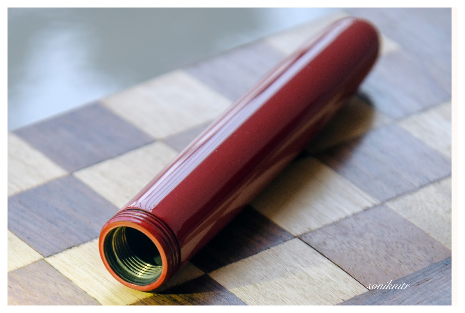
The cap unscrews from the barrel with 1.75 turns, revealing why this pen feels so substantial in hand. The threads on the barrel, as well as the inside threads of the cap, are metallic. There is a step down from the barrel, and the rollerball and fountain pen sections are very similar in design, each adorned with a lone steel ring on the section. The continuity of the bamboo rings is evident in the design of the pen itself.

In this case, the cap features a rose gold clip, which is not a usual Pilot clip. It has a slightly convex curvature with some resemblance to a bamboo stem. The plating shows some wear, but I can live with it for now. The finial although unadorned, carries its own imprint. The tapered finials of the cap and the barrel always align themselves to meet at a finite angle.


FILLING & CLEANING SYSTEMS 


Cartridge Converter (Rollerball barrel can take in a CON-40/20/50/B not a 70)


The barrel unscrews from the section with almost four turns. As you can observe, the section has metal threading that syncs with the metal threads of the barrel.

Since this is a rollerball, it cannot accommodate the longer CON-70 converter without compressing the inner spring at the end of the barrel. However, the other proprietary converters or even cartridges fit well. I have tested the pen with a CON-40/20 and a CON-B converter, and they work fine with the rollerball barrel. I have a quibble about ink capacity, but it doesn't matter in the grand scheme of things. I found it easier to clean the section with the eye dropper that comes with a Pilot Parallel.


NIB - ALL THAT MATTERS


Frost-smitten


Pilot #10 14K. The nib was originally released in three stock widths - F, M & B across Japan and other countries. The frosted frontiers create an elegant contrast to the rest of the white silvery luster of the nib. An elongated hexagonal imprint separates the design from the outer shoulders and tines, featuring arabesque decorations within its borders, encompassing the circular breather hole in the center. 

              The branding and nib specifications of PILOT, 14k-585 (58.5% Gold Alloy) are imprinted below the breather hole, along with the nib size and width. The date code on the left shoulder of this nib is A903 (Plant-Month-Year), indicating a manufacturing period of September 2003, with symbol A signifying the Hiratsuka factory's production line A. Below is a list of codes sourced from Richard Binder’s blog, which may be helpful if you're just beginning to survey all the Pilot nibs you own. I did that already.

T: Tokyo factory (in Shimura, Itabashi ward)

H: Hiratsuka factory (in Kanagawa prefecture)

A: Hiratsuka, production line A

B: Hiratsuka, production line B

F: Thailand, Burma, India, or Brazil

Once you turn the nib, the first thing you'll notice is the feed. A standard bluish grey plastic feed with moderately spaced fins with a decently sized feeder hole delivers the good ink buffer. These feeds are pretty well made and render moderate wetness to the nibs.


PHYSICS OF IT – RELATIVELY SPEAKING


The Newtonian Laws


Although there's a step down from the barrel to the section, I find it comfortable to grip. The diameter of the gripping section is larger than that of a typical Pilot 742 series or a similar pen (such as a Dunhill AD2000) with a #10 nib, due to the additional piece of concentric cylinder above the aesthetic ring of the section. The weight is well balanced by the metal inserts in the barrel, cap, and section.


Below are the pictures along with a Conid Minimalistica for a comparative reference. 

Here go the dimensions.

  • Uncapped Length ~ 12.9 cm
  • Total Length ~ 15 cm
  • Exposed Nib Leverage ~ 2.2 cm

The weight of the pen is comforting even without the cap.

  • Overall Weight ~ 32.5 g (inked, without cap ~19g)


WRITING & FINAL COMMENTS


Writes soft and beautiful


The writing experience with this nib so far matches the experience I have had with other 14k nibs from Pilot, including the superb #15 nib of a Custom 823. The nib writes moderately wet, without any issues of drying out. It writes softly with a hint of feedback and a sense of control, which is perfect for me, though less springy than a #15 nib.

            This is a relatively stiff nib, even though some line variation can be achieved with moderate pressure. It's not quite my preference, but its softness more evident than, say a Sailor 21k nib on the 1911L or its equivalent. On Endless Regalia 80 GSM paper, the drying time for lines with Sailor Yama Dori ink is approximately 25-30 seconds.

      One aspect to consider regarding the step in the section is that the Bamboo provides a longer section compared to the typical 742 or a similar pen equipped with a #10 nib. Compared to a Dunhill AD2000 the pen appears to have a longer section. I find the AD2000 18k nib somewhat softer than the Bamboo. 

       I do not think that the pen was designed to be posted given the metal threading inside the cap. The Bamboo feels quite well balanced even without posting the cap. To be honest, the rollerball version is also a pleasure to write with. 

Thank you for going through the review. 

You can find other pen and paraphernalia reviews here. 


REFERENCES


Nib Codes


Saturday, May 13, 2017

A Review of Namiki Yukari Royale in Vermillion(Red) Urushi


A wait longer than words can define, an Emperor in Red singing a glistening rhapsody, and then a Yukari dazzling in Royale Red glory. The pens, an encompassment of elegance of words, combined with precision of maki-e artisans have been unsurpassed. The Yukari did anxiously waited in my hands to have it's first sip of ink and I had same thoughts with what if clauses! Before getting the Yukari, this is a must read-review by FPNer shuuemura, which is a rather poetic series of pictures with practical words, comparing two pilot beauties in black urushi. 

This pen, one can find ideal for everyday carry to write or to keep admiring the marvel it is! The doubly magnified and magnificent emperor would be more suitable for the latter though. Having said that, when both are together, it’s more fulfilling than a sumptuous meal. 

PS. Google says Yukari in Japanese means Affinity (上記) and is feminine by gender. 

In case you are looking for a review of the larger Emperor (sized pen), the below link redirects to the necessarily ‘unnecessary’ eye-candies :) 


A BRIEF HISTORY 


The Namiki Yukari Royale more or less derives itself from the 80th Anniversary fountain pen (with only 1918 produced) aka the ShiSen, which was launched in 1998. The cap band was then imprinted with four mythical creatures - Dragon, Phoenix, Tiger and XuanWu (Tortoise). 

The band decorated with the Shijin (four gods) was finished in Togidashi maki-e. The Chinese fable of these creatures goes like this - Each mythical creature is supposed to guard one particular Earth direction and is Harbinger of a particular season. They are respectively, Shujaku - the red phoenix of the South (Summer), Byakko - the white tiger of the West (Autumn), Genbu - the black tortoise of the North (Winter) and Seiryu - the blue dragon of the East (Spring). The latter four are the Buddhist guardians of the four directions who serve Lord Taishakuten (who represents the center), and are associated with China’s Theory of Five Elements. 

The 80th Anniversary pen is rather excellently reviewed here by RLD. 

And later, in 2005, another 50 Seki Shun LE pieces (branded as Dunhill Namiki) were made by Pilot/Namiki for the Elephant & Coral Store which are still available. The clip matches the colour of the main finish in the earlier editions, something which may or may not appeal to all of us. 

URUSHI 


Urushi as you may know is the otherwise poisonous sap of the urushi or lacquer tree (Toxicodendron Vernicifluum) which grows in Japan, China, and Korea and is primarily brown in colour. The sap of this tree polymerises to form a hard, durable, plastic-like substance, when exposed to moisture/air. Liquid urushi can be applied to multiple materials like wood, metal, cloth, resin, ceramics or ebonite as opposed to the best available synthetic lacquers. When it solidifies, it turns into a very hard coating that is waterproof and protects the coated object from effects of fungus, ambient chemical reactions at surface due to heat or humidity or even from caustic acids. By mixing pigments into cured urushi, colored urushi such as black or shu (red) are made. With natural exposure to air and ultraviolet light (extended UV exposure ends up in discolouration), the urushi layers gradually increase in transparency and the material gradually unveils shades of original bright colours within. 

Like the Emperor, the Yukari Royale also comes in a spacious wooden box, made of traditional Paulownia wood. The box is protectively packaged inside a cardboard box. I had to let go of the box, while someone hand-delivered the pen, along with the accessories! 

                            The model number of the pen, in this case FNK-128S-<R/B>-<F/FM/M/B> contains the launch price, colour and nib width. The 128 refers to the list price of JPY 128,000 whereas the third digit R/B refers to the red/black urushi. 

THE TORPEDO 


This Lacquer No.#20 model comes in two standard finishes - Black & Vermillion (Urushi) with gold plated clips. The brass body feels comfortable in hand, from dual perspectives of dimensions and weight. 

The torpedo shaped pen in Vermillion/Red is adorable in both light and shadow, and when light reflects through layers of urushi, it renders itself an electric red appearance. I believe the brass substrate is partly responsible for its bright hues compared to a relatively darker scarlet hue off the Emperor’s ebonite. The expected fit & finish seem impeccable. The simplistic yet elegant design comes with two golden accents, provided deftly by the traditional triangular shaped tension fit clip with a sphere and a thin gold ring at the cap lip. Again there is a marked absence of any other decoration like a cap band or ring or anything else on the entire pen, extending infinity to modes of artistic convergence. 

Vermillion is considered as an auspicious colour throughout East Asia, where it’s culturally imbibed. It has four synthetic & natural shades as of today: Red-Orange[sRGB (255, 83, 73)], Orange-Red[sRGB (255, 69, 0)], Plochere[sRGB (217, 96, 59)] and Chinese Red[sRGB (170, 56, 30)]. The shades/hue of the pens in red urushi might vary. 

                 The cap finds itself after two turns, revealing a nib with the modern Mt.Fuji inscription. The seamless grip shows a pronounced taper starting from the barrel and ends up with a smoothly carved out bump, rendering continuity. 

The cap threads on the barrel are carved out with artistic finesse, deftly spaced and carved out of brass. The barrel at the other end leads leisurely to the smoothest tail. 

The brass cap again displays the most subtle art, sans any discernible extravagance. It carries the same perseverance and focus with a fluid like finish. The finish is impeccable with a parabolic finial and with colours hovering between bright and dark red, with the play of light. The clip is traditional triangular Pilot with a sphere at the end, inscribed with Namiki with the ‘Isosceles Triangle within a Pentagon’ logo. There is a thin gold ring at the cap lip, the only adornment than the golden clip. There is a alphanumeric code inscribed on the upper base of the clip, where it delves into the cap. 


FILLING SYSTEM - ‘CON-70 ZINDABAD’ 


The section unscrews from the barrel with three and half turns, with a metallic clink, given the metallic threads on both the section and the barrel. This exposes the golden metallic threads of the section, which would otherwise remain ever hidden! A special CON-70 converter, in black, is pushed inside. 

The inner barrel carries the opposite metallic threads. With a short black coating near the threads which contacts with the section, the rest of the brass barrel is all exposed metal on the inside.

The pen can take all pilot converters CON-20/40/50 (0.4-0.5 mL) & CON-70 (1 mL) along with pilot proprietary cartridges (0.9 mL). I have used the included ‘special black’ CON-70 converter, which has a push button filling mechanism. Mind you, the ink bottle with have some froth during the otherwise fun filling exercise. Although, for Yukari I have always directly filled the converter from an eye dropper! 


NIB WITH THE ‘OVAL’ BREATHER HOLE 


The nib with the Yukari Royale is 18k, Size#20 (similar to Pilot#15) and it comes in four stock widths - F, FM, M & B, across Japan and other distribution countries. Inscribed upon it, is the symbol of Mt. Fuji and the upper part does seems symbolic of the snow caps! Comparatively the nib weighs a tad more than a usual pilot#15 nib (middle vs right, 0.78g vs 0.70g), but at the same time it is much less wide at the shoulders. 

The oval breather hole rests within the snow caps. Below the snow, etched are the Namiki Logo (Isosceles triangle inside a Pentagon), Namiki, gold alloy specs (18k-75%) and Nib width <M> 

On the left the #20 nib carries the Namiki Logo with Ste PP-F hallmark and on the right it carries a simple date stamp. The red plastic feeder does converge with the overall color of the pen, though I would have preferred a similarly urushi coated feeder, which only the Emperor has! May be it’s a feed size limitation, may be Pilot doesn't want to spend more money, I have no idea. The moderately spaced fins ensure levelling ambient air pressure and give you a good buffer, my experience says it’s a tad better than the usual pilot feed. You can see the three different feeds, Size#50 Emperor, Size#20 Yukari Royale & the Size#15 Custom 823, side by side. 


PHYSICS AS RELATIVELY IT IS


The lacquer somewhat helps in keeping the pen warm which is otherwise metallic, and renders it comfortable for writing. The pen is deftly balanced for writing, even for extended use. The grip, smooth & soothing, showcases both utility and elegance at the same time. I do not post the pen as the cap is not as inlaid with as much felt/velvet as the Emperor. Figures for weight and dimensions run below for the technically minded ones. 
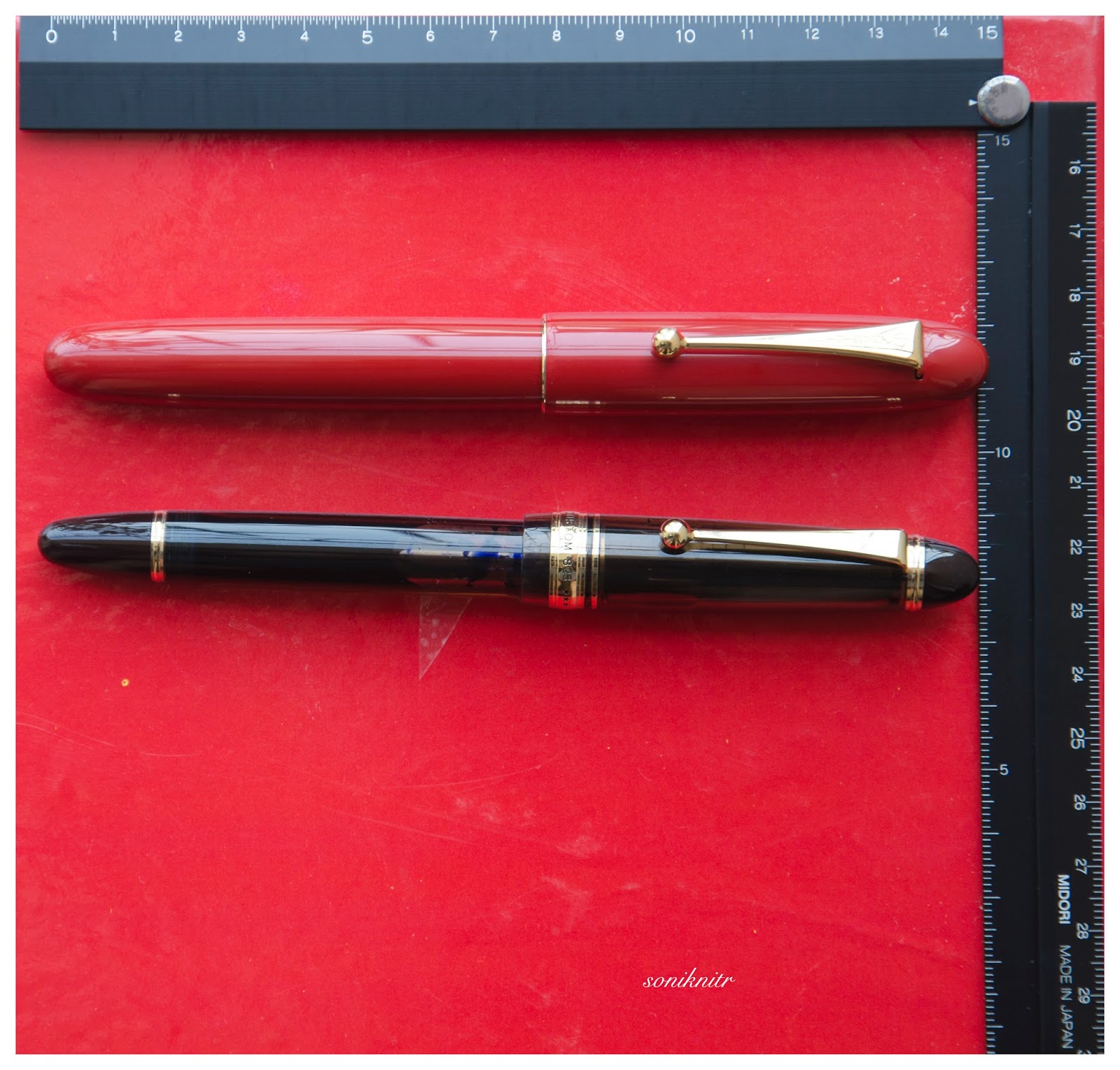
  • Length closed ~ 14.9 cm 
  • Length open ~ 13.4 cm 
  • Grip Diameter ~ 1.1 cm 
  • Nib Leverage ~ 2.4 cm 
  • Weight (without ink) ~ 45 g 
  • Weight (without cap) ~ 27.4 g 
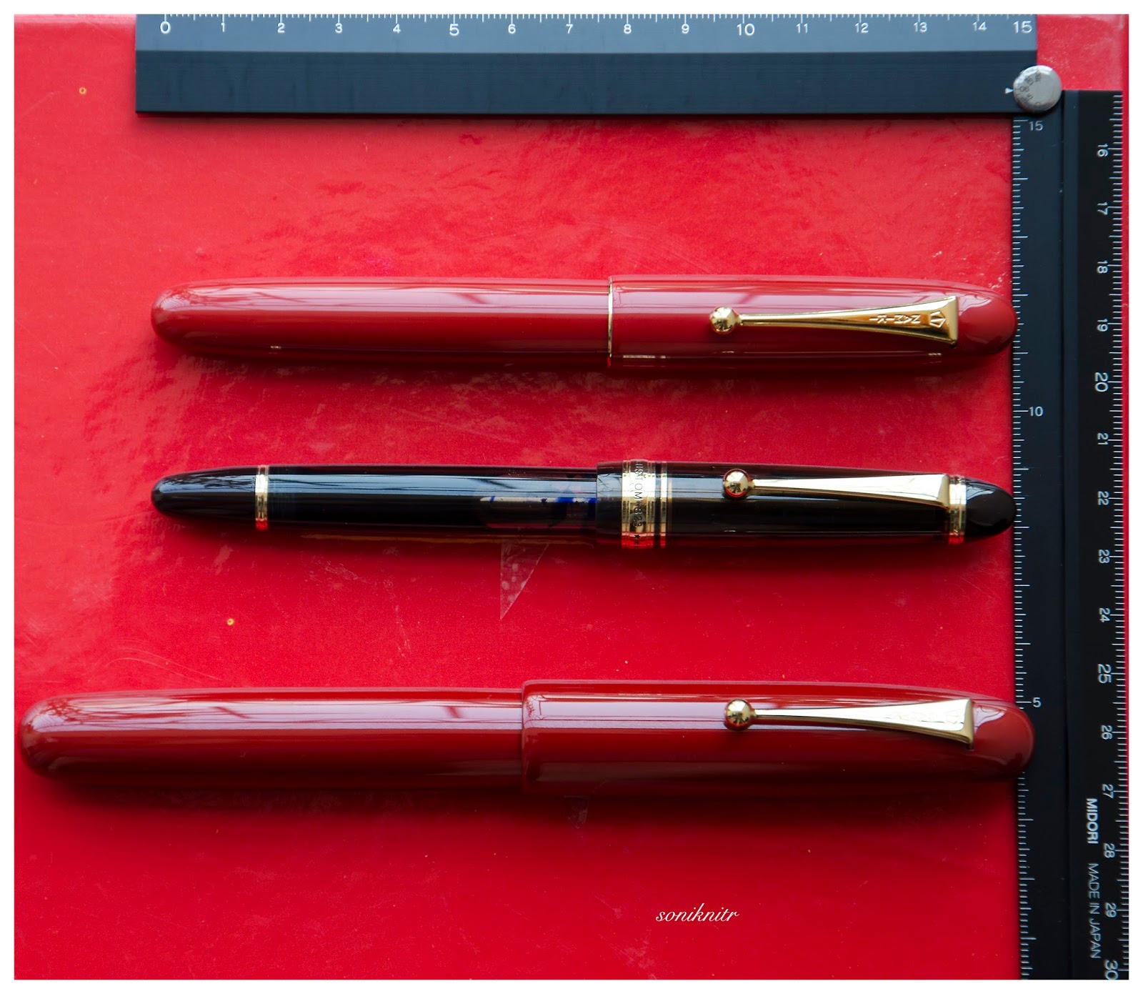
Capped, uncapped pictures with a Pilot Custom 823 run below for your reference. There is an Emperor posing, just to highlight its relative significance :) 

The uncapped Emperor without weighs around 31 grams and the Yukari with an unfilled converter weighs around 27 grams. And this is one of the most comfortable pens, I found.


ECONOMIC VALUE 


The Yukari Royale retails at around USD 1200 in the US, and you can find it at similar prices in Japan. I was able to source the pen at a good bargain. 

                     Logically the economic value should be equal to salvage value of the pen after a few years of use and I don't think the price will vary by much even after few years of use, given that someone finally decides to sell it off. Having said that, even though the pen is one of its kind, you should give it a serious thought. It will result in a fair amount of money trapped within the urushi layers! 

FINAL WORDS IN WRITING 


The medium nib is graced with a super wet flow, which might put a few of my Pelikans to utter shame! The nib is as smooth as I want it to be, with a slight hint of control, evident in all pilot gold nibs, strictly speaking. I feel that there is some characteristic spring and softness because of the size & shape of the nib, and it does open up with a bit of pressure. The verticals grow thicker with pressure, and this nib runs a tad thicker than a usual pilot medium nib. No skips with fast or normal writing. It writes pretty similar at whether held at a high angle or a low angle. A relatively wet Sailor Nioi-Sumire ink takes around 55 seconds to dry completely on Tomoe River paper with the #20 medium nib. 

Thank you for going through the review. 
You can find other pen and paraphernalia reviews here. 

REFERENCES 


Wednesday, September 9, 2015

Pilot’s Pocket Pen: Elite 95S Review

The Elite 95S (or E95S in US) was released as Pilot’s 95th anniversary pen in 2013, sporting a Pilot 14k nib, which is larger than a standard Pilot#5 nib. The Elite S was originally a pocket pen designed by Pilot in 1968. The second run of these pens occurred in 1974. The 95S is more of a evolution of the Elite S fountain pen and as it was launched 95 years after the company’s inception (i.e. 1918) it does carry the first two digits of the model number as ‘95’ with the S and the third digit is by default ‘1’ usually refers price at launch of the pen (i.e 1 X JPY 10,000). It’s referred as the E95S in the US market due to copyright obligations.


                    The Elite 95S (for the Asian market, Model #FES-1MM-DR/B-EF/F/M) comes packaged in a standard pilot gift box (Z-CR-GN) which is usually more of a protection rather than presentation.

DESIGN - FOR YOUR POCKET (6/6)


The E95S comes in two standard designs of acrylic resin with a double anodised aluminium cap - Black, Deep Red (or burgundy) in gold plated trims. The acrylic resin material feels sturdy but light, I guess a defining feature for a light pocket pen sharing one dimension with your shirt pocket. You will definitely like the E95S if you like Kaweco Sport pens.

The tapered geometry starts with a flattened finial of a pearly cap (with a hint of red shade) with a gold plated clip syncing nicely with concentric cap bands and a differentiated ring from the section before it concludes with burgundy of the barrel. The glossy red resin shines moderately under light and creates a good contrast with the cap. This pen seems to preserve a vintage look both in terms of design and make. The cap is light and and can be pulled out quite smoothly, revealing a big dazzling gold nib.
The grip section is moulded from the same burgundy resin and a thick golden step announces its beginning as well as the end stop for posting the cap. But as usual, the nib dazzles out the rest. The posted pen gains considerable length and renders both beauty and a deep red contrast to the pearly finish of the cap. 

The snap cap with a slightly domed finial preserves a rather classical look. A few things etched across the lower band of the cap includes the model name of Elite on one side and PILOT & JAPAN on the other. Two concentric bands of golden paint render aesthetics to the entire pen, as the cap is quite significant for this pen. The spring loaded clip with an associate loop, has a rectangular top view with geometrical cuts. It’s engraved with PILOT vertically. The design of the clip is reminiscent of older Pilot pens. 


FILLING SYSTEM (5/6)


The barrel unscrews from the section which has a metallic insert carrying the necessary threads for syncing with the resin threads inside the barrel. One of those rare pens, in which the section is considerably longer than its barrel.

The pen takes only pilot CON-20 (0.5 mL) converter and pilot proprietary cartridges (0.9 mL) because of its size limitations.


NIB - ALL THAT MATTERS (5/6)


The nib is inset and comes in a 14k design across three stock widths - EF, F & M. The tail end of the nib specifies the month and year of manufacture. It has no other scrollwork apart from branding and nib specs. By the way, the productions are limited to 5000 pieces and that’s why you mostly see 413 (April-2013) as timestamp (or monthstamp) on these nibs.

     All branding and nib specs namely 14k-585 (58.5% Au Alloy), PILOT, along with the nib width & country of manufacture i.e JAPAN are imprinted below the breather hole. The tines are relatively short, given the longish nib. While this was not the best of nibs I had from Pilot, I have asked the seller for a replacement.

A partially enclosed or rather hooded bluish grey plastic feed with big feeder hole provides ink suction and a decent buffer.


PHYSICS OF IT (5/6) – RELATIVELY SPEAKING


This is a pocket pen and measures only around 12 cm closed. It is meant to be posted for writing and in addition to the length the cap does add some weight. Though the cap itself is quite light and weighs only 6 grams, the snap mechanism does make it a quick note scribbler. The grip is comfortably tapered ending with a longish nib.
  • Closed ~ 12 cm
  • Uncapped Length ~ 10.5 cm
  • Posted Length ~ 14.7 cm
  • Nib Leverage ~ 2.4 cm
  • Overall Weight ~ 17 g (without converter)
Capped, uncapped and posted comparisons with a Pelikan m200 cognac go below for your reference.


ECONOMIC VALUE (6/6)


The E95S retails at around USD 136 in the US, although it sell at USD 100 or even less, in Japanese shops like Engeika or Rakuten. I had bought the first pen from Engeika’s Indian Arm - Pensindia. It’s a definite VFM pen. 

OVERALL (5.4/6)


The fine nib has some feedback but is graced with a moderate flow. Although pilot does not associate any softness with these nibs, these nibs are quite springy and have a decent amount of flex, the leverage coming from their unique shape. The verticals can grow thicker with slight pressure. The nib has a moderate flow, taking less than 25 seconds to dry a wet Diamine Majestic Blue ink on MD Paper. The paper grids are 5 mm squares.
PS - I got the fine nib replaced with a medium one, since I felt that it was giving more than the usual levels of feedback. The medium nib has the same springiness/softness but runs quite on the broader side. I am happy with this nib, though people who prefer pilot fine and medium nibs might find this width a bit too broad for their taste.

Thank you for going through the review.
You can find some more pen and paraphernalia reviews here.

ADORABLE REVIEWS