Showing posts with label Montblanc. Show all posts

Monday, January 15, 2024

A Review of the Montblanc M in Red

PRELUDE

In the search of suitable replacements for a Meisterstuck Doue FP 145


My meticulously planned fountain pen hiatuses are occasionally disrupted by the well-meaning members of my family. Instead of appreciating my carefully timed fountain pen acquisitions, they enthusiastically offer advice on investments, the time value of money, and everything in between. To add a twist to the tale, they threw me a curveball last year by gifting a Meisterstück Doue FP 145 LE, even though I had only bought a total of three fountain pens in the last three years. If we exclude the Opus 88, then it's just two.
The Doue 145 is undeniably a beautiful pen, but I found myself wondering if I could ever use it with its slim metal section and rather shortish nib. Determined to find a more suitable replacement, I revisited the local MB Boutique. While Montblanc's customer service remains top-notch for pens within the two-year warranty period, they seem to derive more delight from pens outside the warranty period than their customers do.

    Faced with the task of choosing two pens to match the value of the pricier Doue, I was drawn to a Naruto LeGrand 146. Then, the salesperson revealed his secret NOS drawer, housing various pens, including a Great Characters Walt Disney FP. Opting for the Montblanc M, not only because its 2018 price, combined with the Naruto, matched the total credit value for the Doue, but also because it simply looked nicer.


PRESENTATION (6/6)

Usual MB 


The usual MB single pen box. The standard Montblanc single pen box with no customisation, with the only variation being the red cardboard sleeve that encases the box. The RED collection boasts a charitable initiative, contributing less than 1% (€5) towards fighting HIV/AIDS programs. It's almost as if Montblanc is tackling HIV/AIDS single-handedly, making minuscule donations of €5 at a time, all while charging the end customer a whopping €540+. As Master Yoda famously said, “Do or do not. There is no try”.

    The pen securely nestles within a cushioned and somewhat snug slot inside the box, accompanied by a complimentary cartridge filled with black ink. However, it seems that most of the ink inside the cartridge had evaporated during its 5 years of shelf-living.


DESIGN (6/6)

From the likes of the Apple Watch 


The Montblanc M, available today in three finishes—Ultra Black, RED, and RED Signature—has been designed by Marc Newson, renowned for his work on the Apple Watch. Newson has successfully blended functionality with elegance, anchoring the design firmly outside the tradition for Montblanc.
The shape of the pen is particularly appealing in modern pen terms. It boasts a perfect cylindrical shape with zero taper and rounded ends, except for the flat section, commonly referred to as the “plateau” at the end of the barrel. The platinized clip is a personal favourite; it avoids the cheap look of the Safari, perhaps because it's not oversized and doesn't unlawfully occupy a third of the cap's surface area.
The glossy and bright red finish mirrors background lights and hues effectively. Upon uncapping, one notable feature is the novel use of magnets to secure the cap. The snap cap rotates itself to align its magnetic poles perfectly, ensuring the clip and plateau on the barrel are perfectly aligned on a plane. A soft snap securely seals the cap, earning full marks here. According to Red Dot Project award records, the snowflake emblem made of white resin is ultrasonically welded onto the plateau and then milled with a diamond tool to maintain flatness. The design reflects a harmonious flow and is truly eye-catching.
The cap, adorned with the snowflake emblem on top like regular Montblanc pens, exhibits impeccable overall quality of work. In certain lighting conditions, the magnetic insert is faintly visible inside the cap.
The knurled platinized metal section adds enough weight to balance an otherwise light barrel. Due to the flat plateau on the barrel, the cap cannot be posted. The section, embossed with the MONTBLANC brand name five times on the visible rear ring where the cap snaps on, is somewhat short and not ideal for longer writing sessions. More on that later.


FILLING & CLEANING SYSTEMS (4/6)

Cartridge & No Converter


This is where, like many other fountain pen users, I express my concerns. It's worth noting that this pen only supports standard international short cartridges, and none of the available converters are compatible due to the featured plateau on the barrel. On the positive side, the pen accepts short international cartridges or proprietary MB cartridges, limiting its cartridge capacity to 0.5 ml. The form of the pen, while aesthetically pleasing, somewhat restricts its functionality as part of the design. Perhaps because the pen was conceived in this digital age, the designer didn't anticipate it being used extensively.

Additionally, cleaning the section with running tap water is an easy process.


NIB - ALL THAT MATTERS (6/6)

The two toned rhodium ruthenium stunner


The 14k nib is claimed to be handcrafted by Montblanc in a series of 30 steps. Rhodium-coated with a dark grey ruthenium-coated inlay, this nib is a stunner. I particularly love the shape of the nib, which comes in two widths - Fine and Medium, as far as I know.

    A dazzling cylindrical flow of silvery rhodium bounds the dark grey ruthenium inlay with well-defined contours. Just below the circular breather hole, the 'M' logo rests within an encircled star. The tail end specifies the composition 'Au585' of the gold-alloy, and the brand name 'MONTBLANC' rests just above the tail. Between those, a hallmark of 'StOD' with a crossed ellipse adds a touch of elegance. As always, the nib itself doesn't mention the width explicitly, but a sticker at the piston end of the barrel provides all the necessary details.

Once you turn the nib, you'll behold a somewhat unconventionally shaped black glossy feed that seamlessly matches the curvature of the pen. Apart from an air hole, there is nothing else in the feed, although the nib runs almost medium wet.


PHYSICS OF IT (5/6) – RELATIVELY SPEAKING

The Newtonian Laws


The overall capped length is around 14 cm. As perhaps mandated by Mr. Newson, I have to use the pen un-posted. Although the section has a somewhat comfortable girth, the shortest length of the section of around 2 cm with a step from the barrel does make it less than ideal to use it as a workhorse. The metallic section balances the weight of 19g pretty well.


Below are the pictures along with a Conid Minimalistica for a comparative reference. The Minimalistica is super comfortable for me, here are the dimensions for the Montblanc M.

  • Uncapped Length ~ 12.5 cm
  • Total Length ~ 14 cm

  • Exposed Nib Leverage ~ 1.6 cm (A #6 nib has typically 2.4 cm)


The weight of the pen is comforting even without the cap.

  • Overall Max Weight ~ 27 g (with a cartridge, without cap ~18.75 g)


ECONOMIC VALUE (0/0)

FOC for me


No comments. No rating, as I paid nothing :)


WRITING & FINAL COMMENTS (5.4/6)

Writes well


The writing experience is quite pleasant, albeit with a relatively stiff nib. It does possess a hint of tooth and precisely the kind of control you'd expect from a well-tuned nib. There is a certain degree of softness in the nib, though minimal line variation occurs with pressure. Lines dry in 30 seconds with MB Toffee brown ink on Endless Regalia 80 GSM paper, and the line width is sufficient to display some shading. The nib skipped on the black cartridges (the salesman included a couple of cartridge packs), but it performs flawlessly on the brown ones, offering a steady ink flow with no drying issues.

However, the length of the section, along with the step, leaves something to be desired in an otherwise excellently designed fountain pen. The nib leverage is minimal, so you inevitably touch the step from the barrel. With sweat, the knurling on the grip loses efficiency, unlike a Conid Kingsize with a titanium section. The weight, balance, and aesthetics of the Montblanc M surpass present standards. I believe Montblanc has successfully created a modern pen.

Thank you for going through the review. 
You can find other pen and paraphernalia reviews here

  
REFERENCES

Sunday, November 26, 2017

Montblanc Toffee Brown Ink Review

Montblanc Toffee Brown (Ident No: U0105188) is one of my favourite dark inks. It was added as part of the MB ink collection in 2010, when Montblanc launched eight colours (Burgundy Red, Irish Green, Lavender Purple, Midnight Blue, Mystery Black, Royal Blue, Oyster Grey & Toffee Brown) in newer bottles, from a new supplier. The bottle was also redesigned with an adorable new look and volume was increased to 60 ml. A relatively expensive ink bottle that with a heavy plastic cap, the bottle is well packaged with foam strips, in a coffee coloured cardboard box. The shoe shape involves a smaller reservoir to the front to help get a minimal level of when the ink runs low in the bottle. 

Indoor Lighting

Outdoor Sunshine


Writing

Well behaved ink without noticeable feathering on decent paper. It does feather and spread on cheap papers. 
  • Feathering: 😐 None on Muji (Good Paper only)
  • Ghosting: 😊 Not noticeable
  • Color Variation: 😍 Vibrant from deep brown to black
  • Sheen: Towards Black
  • Wetness: 😊

  • Saturation :😊 
  • Water Resistance: 😞 
  • Ease of Cleaning: 😊
  • Shading: 😊
  • Flow: 😊
  • Lubrication: 😊
  • Drying Time: 😐  40 seconds
  • Price: 😞  (Around US$ 18-24)

Digital Colour Meter


Nibs


Indoors


Outdoors


Main Supplies


  • MB 146 Fine nib
  • Muji B6 PP Cover Notebook, Dotted Paper

Thursday, November 26, 2015

A Montblanc Meisterstück 149 in Red Gold

PRELUDE


I was looking to gift my dad with a Montblanc pen for a long time. And it had to be a new one. Personally, I had bought a pre-owned MB 146 (the only pre-owned in my small collection), and I am more or less happy with it. It’s kind of ineffable but the right shape with the right balance, encompassed within a classical look seemed missing in some luxury pens, which I own. Personally, I feel that any pen above $ 100 is never a VFM and it’s rather a self-indulgence in fooling myself when I order one more expensive pen. May be it’s just applying theory of brand relativity when I try to convince myself that a Pilot 823 or a m800 is a VFM pen.

Back to the pen and it’s acquisition, the phenomenon was popularly known as the Apshankar hand wave within our small fountain pen group on the Telegram app. Actually, Kapil & Pradeep are the two main agents for urban poverty for many people including Vaibhav and me. Jokes apart, both are really fine people who are passionate about pens & paraphernalia and real good friends. Pradeep was kind enough to place an order for me from LCC & the pen travelled across the Atlantic Ocean with Kapil to finally land in my hand. While I was a bit unsure of the Red Gold trim, aesthetic opinions from both Kapil & Dennis (of LCC) helped me finalise on my choice. 

HISTORICALLY SPEAKING


As most of you would know, Montblanc was started as Simplizissimus-Füllhalter in 1906 by a Hamburg banker, Alfred Nehemias, and a Berlin engineer, August Eberstein. Simplizissimus-Füllhalter means Simplistic Fountain pens and the founders had learnt about fountain pens with ink tanks from the US. By 1908, three other people by the name of Wilhelm Dziambor, Christian Lausen and later Claus Johannes Voss had taken over the business and the company took the name “Simplo Filler Pen Co.” which referred to a fountain pen design with a built-in ink-tank. 

In 1909, a safety fountain pen made up of hard rubber called “Rouge et Noir” was launched, which actually translates into Red and Black. The pen consisted of a red cap and a black body, perhaps inspired from the card-game. You can also find a limited edition of the same. In 1910, the company became Mont Blanc, inspired by the highest peak of the Alps (4810 m) and a pen called Montblanc was introduced with a white tip (which would later evolve into the classical white star in 1913). In 1926, the Meisterstück was launched. By 1929, the nibs were engraved with 4810, the official height of Mont Blanc peak, as an allusion to superior quality and craftsmanship. The flagship Meisterstück 149 was launched in 1952, evolving from celluloid & brass mechanism to resin & plastic mechanism over the years. The 149 was reintroduced with a triple tone 18k nib (they are 2 colours really) somewhere around 1995.

For the conventions of MB, as far as the model numbers XYZ (149) are concerned, it did traditionally follow a naming convention, albeit in a rather loose manner
  • X or 1: Tier of pen, 1 - Top class or Meisterstück 2 - Medium range & 3 - Economy
  • Y or 4: 0 - Safety filler, 2 - Button Filler, 3/4 - Piston Filler
  • Z or 9: Nib size, 9 being the largest
MB has eventually stopped production of all economy pens in 1992.

PRESENTATION (6/6)


The pen came inside a luxury gift box, with an user manual cum warranty card and a 60 mL bottle of Montblanc Mystery Black Ink. I hope that the pictures below will be able to do a justice, especially when you are gifting the pen to someone dear. I am someway bound to appreciate this presentation with a full rating. 


DESIGN - THE CLASSIC CIGAR (6/6)


Glistening with red gold with a non pretentious shine of black preserves a culture, while simultaneously adding a touch of modern luxury. While Red gold, Rose Gold & Pink Gold are often used interchangeably, 18k Red Gold is actually made of 75% gold and 25% copper, Rose & Pink gold add up 2.5% to 5% of silver which balances out the copper. The 149 is available in three delightful trims - Gold, Red-Gold and Platinum. The pen along resting against the shoe shaped ink bottle looks awesome to me.

While the pen does not look or feel hefty, it has the semblance of an oversized pen. The clip starts with a tiny piece of elevated ramp preserving tradition. The thin and thick cap bands along with the piston rings complete the minimalistic design of the pen with grace. The clip is tension fit and carries a serial number and GERMANY along the ring. On its underside carries multiple engravings this day, however the engravings could be completely dependant upon the year of manufacture. There are a lot of Chinese fakes flooding both online and offline channels, which is why Montblanc has to come up with newer and innovative hallmarks with every model. 

A quick pose with its smaller cousin 146 in gold trims. Red Gold vs Gold.

It is oversize but I almost never feel the heft while I hold the pen. The cap unscrews with a single turn revealing a red gold nib with a rhodium inlay. It also reveals the beautiful striped ink windows just above the section threads. The attention to details is kind of amazing. The section ends up with a little bump with a rougher loop of resin, before the mind delves into the dazzle of the rhodium inlaid red-gold nib.

The cap does mention MONTBLANC - MEISTERSTÜCK No 149 etched across the broader of the parallel cap bands in cross-hatched characters, while two thinner bands subtly play along with it. The finial of course carries the white-star. There is a tiny hole in the cap meant to equalise the ambient pressure and avoid inking of the cap. I think it could be a very recent modification. Some of the earlier 149s don't have it. There are some hallmarks including metal written on the underside of the clip to preserve MB’s product authenticity. 

FILLING SYSTEM (6/6)


The piston is distinguished by a red gold band and is very convenient to operate. The piston end unscrews with less than three rotations and as the white piston head moves along the ink-windows. Once screwed back inside the bottle, ink gushes inside the barrel. The brass connector renders some weight to the barrel. The feeder hole assists in efficient ink intake for an oversize nib. The manual carries graphical steps for filling the pen in case your are using a piston filler for the first time. The ink windows still rule my thoughts. The ink capacity is around 1.6 - 2 mL.


NIB - ALL THAT MATTERS (6/6)


The dazzling triple-tone nib is tested by hand, and comes in eight different widths including EF, F, M, OM, OB, OBB, B & BB and a signature replacement width of O3B. And of course it looks awesome given its size and glamor content. The size and spread of the nib are just gorgeous.

A bounded layer of spiral galaxies rest within the rhodium inlay while red gold defines the decors in the outer tines as well as the inner body. Then, there is a dazzling red gold M logo resting inside the encircled star, above which rest the height of Mont Blanc peak, 4810 (m). This one is a fine nib and lays a smooth wet line. The tail end specifies the composition Au750 of the gold-alloy and the brandname of MONTBLANC rests above the tail. Between those there is a hallmark of StOD inside a crossed ellipse. There is no mention of width on the nib per se, while a sticker at the piston end of the barrel says it all. 
A black plastic feed (earlier ones had ebonite feeds) with a feeder hole improves ink suction while closely spaced horizontal fins ensure a good ink buffer and promise wet and smooth starts. Even with a dipped nib section, it can a few paragraphs.


PHYSICS OF IT (6/6) – RELATIVELY SPEAKING


The overall capped length is around 14.8 cm. I would prefer to use the pen unposted as both weight and balancing seem perfect with an awesome nib leverage. The section has a comfortable grip of around 1.3 cm. I feel it’s a very comfortable from an overall perspective balancing amazingly well for an oversized nib.
  • Uncapped Length ~ 13.3 cm
  • Posted Length ~ 16.8 cm
  • Exposed Nib Leverage ~ 2.8 cm 
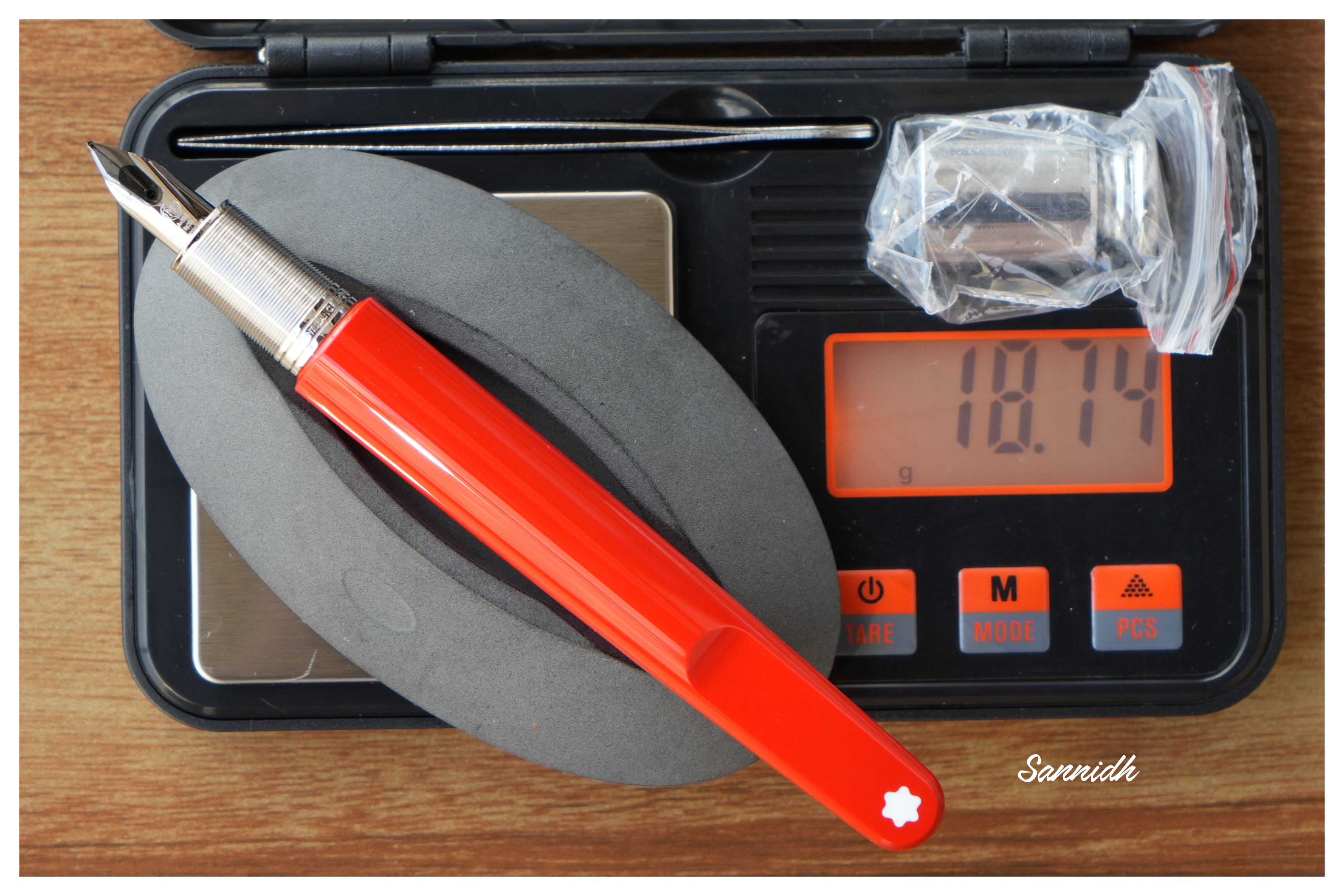
  • Overall Weight ~ 32 g (without ink, cap weight~10 g)
Below are the pictures along with a MB146, Visconti HS Maxi and a Pelikan m805 for your reference.


ECONOMIC VALUE (3/6)


An expensive retail price of above USD 900 puts off people, while getting a pre-owned does save some money, while you keep the charm of writing with a 149. When it comes to the internet, one has to be careful regarding the abundance of fakes in the online marketplaces and the best fakes are costly and are quite difficult to identify without experience. I am not going to discuss the pricing, but I had more than a reasonable discount, thanks to Kapil. And for me it’s a gift (although I could end up using it :P) and the price didn’t matter. Although personally speaking, I would have preferred a pre-owned 149 in a great shape.

OVERALL (5.5/6)


The writing experience is as amazing as the nib looks, with just the kind of control which you would require from a superb nib. Both Kapil & Dennis had tested it before packing. There is spring and softness in the nib and an absence of any line variation between the horizontal and vertical strokes. The lines dry in 30 seconds with a MB Mystery Black ink running on MD Paper. 
                 
                   With other inks the width is good enough to reflect some shading too. The best part perhaps is the balance that Montblanc could find with an oversize nib, so that it does not feel unwieldy. I initially had my own doubts regarding the size but I did try the 149 in a MB boutique then Pradeep’s 149, to be certain. The nib never skips and always lays a wet line, and seems to be one of the best oversized nibs in my small collection. I am sorry I couldn't gather the courage to put some pressure and try flexing some characters out from this one. 

REFERENCES

StOD Hallmark


Thank you for going through the review.
You can find some more pen and paraphernalia reviews here.

Sunday, February 1, 2015

A Tale of the lesser flagship of Montblanc : The Meisterstück 146

My holidays rarely match with others’ in the family. So, last afternoon, while I was staring at the chessboard to play yet another game, I thought of putting the board to a better use than just moving the pieces against myself. So, why not take three big nibs out of their temporary resting places and give them a try. In this fast-paced world, fountain pens have most certainly embarked the sail of luxury, consistent with properties of both time and money. These days, keyboards – physical, on-screen or speech-engine ones have taken over a Pen’s traditional space-time. Thankfully, notebooks and writing pads are still there to keep them alive, even if people have started to take notes in their tablets, phones or phablets. 

Not being a fan of very big pens, I usually go for the nearer to flagship models. They seem to be appealing from twin perspectives of economy & convenience. 

A BRIEFER HISTORY IN TIME


MONT BLANC


I came across a real Montblanc pretty much later in life, though used to love a pen called Camlin Premier during school days. It came with a 1-pen leather pouch, an additional screw-fit nib and it did have those striped ink windows. I say I loved it, but never wrote with it since it belonged to my dad and I was a small kid. Back in 1999-2000, it cost around USD 5.00 and it was a hefty price tag for a locally made fountain pen. Later I did realize that it was yet another MB 146 inspiration, when I went to a pen store in Calcutta. 

As most of you would know, Montblanc was started in 1906 a Hamburg banker, Alfred Nehemias, and a Berlin engineer, August Eberstein as Simplizissimus-Füllhalter which means Simplistic Fountain pens, after they learnt about fountain pens with ink tanks from the US. By 1908, three other people by the name of Wilhelm Dziambor, Christian Lausen and later Claus Johannes Voss had taken over the business and the company took the name “Simplo Filler Pen Co.” which referred to a fountain pen design with a built-in ink-tank. 

In 1909, a safety fountain pen made up of hard rubber called “Rouge et Noir” was launched, which actually means Red and Black. The pen consisted of a red cap and a black body, perhaps inspired from a card-game. You can also find a limited edition of the same. In 1910, the company became Mont Blanc, inspired by the highest peak of the Alps (4810 m) and a pen called Montblanc was introduced with a white tip (which would later evolve into a white star in 1913). In 1926, the Meisterstück was launched. By 1929, the nibs were engraved with 4810, the official height of Mont Blanc peak, as an allusion to supreme quality and craftsmanship. The flagship Meisterstück 149 was launched in 1952, evolving from celluloid & brass mechanism to resin & plastic mechanism over the years. For the Meisterstück 146, the ink windows were modified to striped version somewhere around the 1970s from clear blue window and the the two-tone nib was introduced in 1993-94.

As far as the model numbers XYZ (146) are concerned, MB did traditionally follow a naming convention, albeit in a rather loose manner
X or 1: Tier of pen,  1 - Top class or Meisterstück 2 - Medium range & 3 - Economy
Y or 4: 0 - Safety filler, 2 - Button Filler, 3/4 - Piston Filler
Z or 6: Nib size, 9 being the largest

MB eventually stopped production of all economy pens in 1992.

DESIGN (5/6)


The pen is made of glossy 'precious resin' (a custom variant of Polymethyl methacrylate aka PMMA) and is adorned plated rings and bands. Glistening golden with the subtle shine of black preserve a culture while adding a modern luxurious touch. This specific cigar shape was later copied around the world by many leading pen makers, over decades till date. The cigar shape was invented by Sheaffer Balance in 1928. The 146 also comes with platinum plated trims. The resin does feel substantial to hold, but it's also prone to scratches, if due care is not exercised. 


With a minimalist piece of design,  the clip does start with a tiny piece of elevated ramp. The cap bands and the rings follow the same equation till a ring separating the piston end concludes both dazzle and design. The clip is tension fit and carries a serial number and GERMANY along the ring. On its underside it may or may not carry the engraving of Pix, depending upon the year of manufacture. Montblanc included the trademark post 1997. There are a lot of Chinese fakes flooding both online and offline channels, which is why Montblanc has to come up with newer and innovative trademarks with every model. 


The cap unscrews with a single turn revealing a dazzling two tone nib along with a striped ink window. I like the ink-windows very much.


The cap does mention MONTBLANC - MEISTERSTÜCK etched across the broader of the concentric golden bands, in a cross-hatched font while two thinner bands above and below render  the differential aesthetics. The finial carries the white-star.


FILLING SYSTEM (6/6)


The piston is distinguished by a golden band and has an easy and a hassle-free mechanism. The piston end unscrews with less than three rotations and as the white piston head moves along the ink-windows, ink gushes into the barrel. A brass connector gives the necessary weight to the barrel.


NIB - ALL THAT MATTERS (6/6)


The dazzling two-tone nib is tested by hand, and it comes in eight different widths including the common widths of EF, F, M & B. And this silvery rhodium finish provides both glitter and glamour. 

                         A golden decor runs along the shoulders of the nib and it converges across the outer tines onto an iridium tip, while the rhodium silvery finish diverges from the breather hole across the inside of the tines and over to the tail. 

A bounded layer of arabesques & curves segregates the rhodium and gold decors. Then, there is a dazzling white M logo resting inside the encircled star, above which rest the height of Mont Blanc peak, 4810 (m). This one is a fine nib and writes quite wet and smooth. The tail end specifies the composition (58.5% Au) of the gold-alloy used. Above it rest the specification 14K and brandname of MONTBLANC. There is no width specified on the nib itself, unlike others.
A standard black plastic feed with finely spaced fins (earlier ones had ebonite feeds) ensures a good ink buffer for the awesome wetness and prevents hard starts. By the way, I just love the ink windows.

PHYSICS OF RELATIVITY (6/6)


It does give a comfortable feel to write with the pen without posting the cap. The overall capped length is around 14.2 cm. The pen can be used posted without any feeling of top-heaviness as the weight of the cap is less than a third of the total weight. The section has a comfortable grip of around 1.2 cm.
  • Uncapped Length ~ 12.4 cm
  • Posted Length ~ 15.6 cm
  • Nib Leverage ~ 2.4 cm
  • Overall Weight ~ 31 g (Cap Weight ~ 9 g)
Below are the pictures along with a Pelikan m805 and a Pilot Custom 823 for your reference.


ECONOMIC VALUE (3/6)


This one defies both logic & gravity and the pen retails at more than USD 750. The price puts most of the fountain pen people off, while getting a pre-owned one from your uncles (well nothing like that! or buying it at a good discount) can save some money. You can also get hold of a MB boutique sales person selling off some older generation demo pens at a good discount. When it comes to the internet, one has to be careful regarding the abundance of fakes in the online marketplaces and the best fakes are costly and are quite difficult to identify without experience.
Value for money? I doubt.
Heritage Value? High.
You can probably pass on the pen to your next generation and they would still recognise it as a brand. Can I pass on the same emotional value with a say, Pilot Custom 845, outside of Japan? I doubt. This will probably need some internet searches, before one realizes the true value of the pen.

OVERALL (5.2/6)


The writing experience is amazing although I do find the pilot custom 823 and m805 being equally good when it comes to nibs of similar size and constituency.  There is a hint of spring and softness in the nib and an absence of any line variation between the horizontal and vertical strokes. The lines dry relatively quickly with a MB Toffee Brown ink taking around 25 seconds on MD Paper. And you get a nice shading too.

Comparatively, a custom 823 with a medium nib, draws a line, thinner than both 146 and m805 fine points and dries quickly. On a smooth MD paper with stock pelikan 4001 inks, it took more than 30 seconds to dry the dots put by the 146 (as well as the m805). 


Final Toffee Pose

REFERENCES


Thank you for going through the review.
You can find some more pen and paraphernalia reviews here.