Showing posts with label Red. Show all posts

Monday, January 15, 2024

A Review of the Montblanc M in Red

PRELUDE

In the search of suitable replacements for a Meisterstuck Doue FP 145


My meticulously planned fountain pen hiatuses are occasionally disrupted by the well-meaning members of my family. Instead of appreciating my carefully timed fountain pen acquisitions, they enthusiastically offer advice on investments, the time value of money, and everything in between. To add a twist to the tale, they threw me a curveball last year by gifting a Meisterstück Doue FP 145 LE, even though I had only bought a total of three fountain pens in the last three years. If we exclude the Opus 88, then it's just two.
The Doue 145 is undeniably a beautiful pen, but I found myself wondering if I could ever use it with its slim metal section and rather shortish nib. Determined to find a more suitable replacement, I revisited the local MB Boutique. While Montblanc's customer service remains top-notch for pens within the two-year warranty period, they seem to derive more delight from pens outside the warranty period than their customers do.

    Faced with the task of choosing two pens to match the value of the pricier Doue, I was drawn to a Naruto LeGrand 146. Then, the salesperson revealed his secret NOS drawer, housing various pens, including a Great Characters Walt Disney FP. Opting for the Montblanc M, not only because its 2018 price, combined with the Naruto, matched the total credit value for the Doue, but also because it simply looked nicer.


PRESENTATION (6/6)

Usual MB 


The usual MB single pen box. The standard Montblanc single pen box with no customisation, with the only variation being the red cardboard sleeve that encases the box. The RED collection boasts a charitable initiative, contributing less than 1% (€5) towards fighting HIV/AIDS programs. It's almost as if Montblanc is tackling HIV/AIDS single-handedly, making minuscule donations of €5 at a time, all while charging the end customer a whopping €540+. As Master Yoda famously said, “Do or do not. There is no try”.

    The pen securely nestles within a cushioned and somewhat snug slot inside the box, accompanied by a complimentary cartridge filled with black ink. However, it seems that most of the ink inside the cartridge had evaporated during its 5 years of shelf-living.


DESIGN (6/6)

From the likes of the Apple Watch 


The Montblanc M, available today in three finishes—Ultra Black, RED, and RED Signature—has been designed by Marc Newson, renowned for his work on the Apple Watch. Newson has successfully blended functionality with elegance, anchoring the design firmly outside the tradition for Montblanc.
The shape of the pen is particularly appealing in modern pen terms. It boasts a perfect cylindrical shape with zero taper and rounded ends, except for the flat section, commonly referred to as the “plateau” at the end of the barrel. The platinized clip is a personal favourite; it avoids the cheap look of the Safari, perhaps because it's not oversized and doesn't unlawfully occupy a third of the cap's surface area.
The glossy and bright red finish mirrors background lights and hues effectively. Upon uncapping, one notable feature is the novel use of magnets to secure the cap. The snap cap rotates itself to align its magnetic poles perfectly, ensuring the clip and plateau on the barrel are perfectly aligned on a plane. A soft snap securely seals the cap, earning full marks here. According to Red Dot Project award records, the snowflake emblem made of white resin is ultrasonically welded onto the plateau and then milled with a diamond tool to maintain flatness. The design reflects a harmonious flow and is truly eye-catching.
The cap, adorned with the snowflake emblem on top like regular Montblanc pens, exhibits impeccable overall quality of work. In certain lighting conditions, the magnetic insert is faintly visible inside the cap.
The knurled platinized metal section adds enough weight to balance an otherwise light barrel. Due to the flat plateau on the barrel, the cap cannot be posted. The section, embossed with the MONTBLANC brand name five times on the visible rear ring where the cap snaps on, is somewhat short and not ideal for longer writing sessions. More on that later.


FILLING & CLEANING SYSTEMS (4/6)

Cartridge & No Converter


This is where, like many other fountain pen users, I express my concerns. It's worth noting that this pen only supports standard international short cartridges, and none of the available converters are compatible due to the featured plateau on the barrel. On the positive side, the pen accepts short international cartridges or proprietary MB cartridges, limiting its cartridge capacity to 0.5 ml. The form of the pen, while aesthetically pleasing, somewhat restricts its functionality as part of the design. Perhaps because the pen was conceived in this digital age, the designer didn't anticipate it being used extensively.

Additionally, cleaning the section with running tap water is an easy process.


NIB - ALL THAT MATTERS (6/6)

The two toned rhodium ruthenium stunner


The 14k nib is claimed to be handcrafted by Montblanc in a series of 30 steps. Rhodium-coated with a dark grey ruthenium-coated inlay, this nib is a stunner. I particularly love the shape of the nib, which comes in two widths - Fine and Medium, as far as I know.

    A dazzling cylindrical flow of silvery rhodium bounds the dark grey ruthenium inlay with well-defined contours. Just below the circular breather hole, the 'M' logo rests within an encircled star. The tail end specifies the composition 'Au585' of the gold-alloy, and the brand name 'MONTBLANC' rests just above the tail. Between those, a hallmark of 'StOD' with a crossed ellipse adds a touch of elegance. As always, the nib itself doesn't mention the width explicitly, but a sticker at the piston end of the barrel provides all the necessary details.

Once you turn the nib, you'll behold a somewhat unconventionally shaped black glossy feed that seamlessly matches the curvature of the pen. Apart from an air hole, there is nothing else in the feed, although the nib runs almost medium wet.


PHYSICS OF IT (5/6) – RELATIVELY SPEAKING

The Newtonian Laws


The overall capped length is around 14 cm. As perhaps mandated by Mr. Newson, I have to use the pen un-posted. Although the section has a somewhat comfortable girth, the shortest length of the section of around 2 cm with a step from the barrel does make it less than ideal to use it as a workhorse. The metallic section balances the weight of 19g pretty well.


Below are the pictures along with a Conid Minimalistica for a comparative reference. The Minimalistica is super comfortable for me, here are the dimensions for the Montblanc M.

  • Uncapped Length ~ 12.5 cm
  • Total Length ~ 14 cm

  • Exposed Nib Leverage ~ 1.6 cm (A #6 nib has typically 2.4 cm)


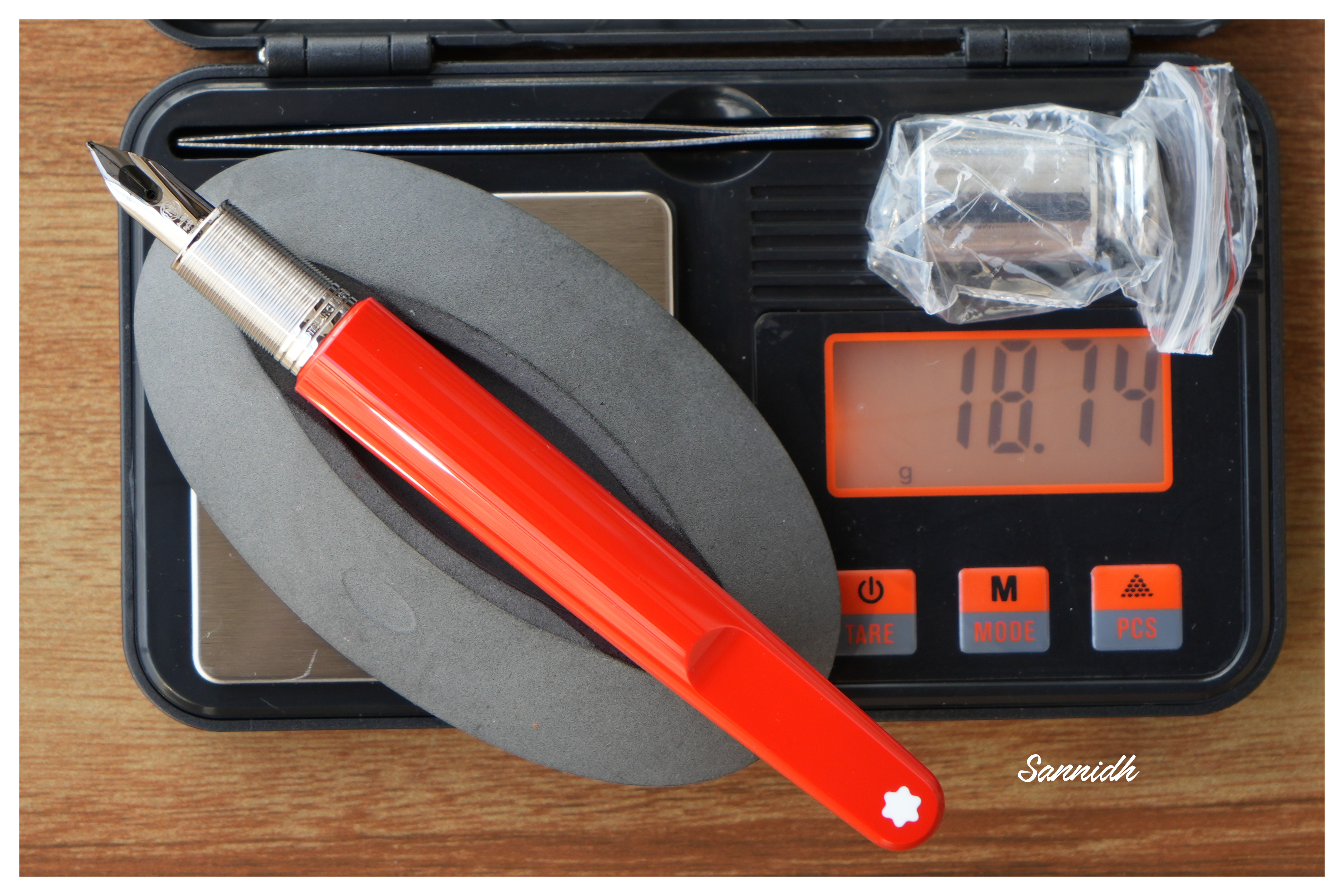
The weight of the pen is comforting even without the cap.

  • Overall Max Weight ~ 27 g (with a cartridge, without cap ~18.75 g)


ECONOMIC VALUE (0/0)

FOC for me


No comments. No rating, as I paid nothing :)


WRITING & FINAL COMMENTS (5.4/6)

Writes well


The writing experience is quite pleasant, albeit with a relatively stiff nib. It does possess a hint of tooth and precisely the kind of control you'd expect from a well-tuned nib. There is a certain degree of softness in the nib, though minimal line variation occurs with pressure. Lines dry in 30 seconds with MB Toffee brown ink on Endless Regalia 80 GSM paper, and the line width is sufficient to display some shading. The nib skipped on the black cartridges (the salesman included a couple of cartridge packs), but it performs flawlessly on the brown ones, offering a steady ink flow with no drying issues.

However, the length of the section, along with the step, leaves something to be desired in an otherwise excellently designed fountain pen. The nib leverage is minimal, so you inevitably touch the step from the barrel. With sweat, the knurling on the grip loses efficiency, unlike a Conid Kingsize with a titanium section. The weight, balance, and aesthetics of the Montblanc M surpass present standards. I believe Montblanc has successfully created a modern pen.

Thank you for going through the review. 
You can find other pen and paraphernalia reviews here. 

  
REFERENCES

Monday, June 1, 2015

The Sterling Pelikan Souverän m625

As you might already know, Pelikan as a company encompasses a rich heritage of 180 years – in manufacturing inks, pens and stationery (177 years to be exact, you can find a bit of history in a previous post ). In 1929, it released its first transparent Pelikan fountain pen  and was credited with the genesis of the piston-filling mechanism, using a differential spindle gear. However, the first of the silvery m625 models does not come until the next 77 years go by. 


m625


Pelikan launched the Souverän m625 model in 2006, which constituted of a dark blue resin barrel with rest of the visible hardware - i.e cap, piston knob and grip section, carved out of sterling silver (92.5% silver + 7.5% copper giving the required strength while preserving appearance of the noble metal). It was later followed by an aubergine model and a red model with two variations in the cap section. These had a 18k rhodium plated gold nib. Later, they also released a limited batch of m625s with a red barrel and a 14k nib, for the Asian market.

The pen comes in a standard G15 gift box, essentially the same packaging as all the other standard souverän models.


DESIGN (6/6)


It's an amazingly stunning pen encompassed in a standard souverän series design. Closed, the sterling silver cap and the piston knob dazzle with ambient reflections, while the barrel awaits light to bedazzle you.

Once exposed to the visible spectrum, a play of light reveals the inside mechanisms like a demonstrator. And it's definitely more spectacular to the eyes than it is to the lenses.
The barrel is made up of high grade translucent resin and is resistant to scratches in course of normal use. There is also a thin palladium coating on the sterling silver parts to avoid staining of the pen with time. This was confirmed by the Pelikan team.
On unscrewing the cap, you will instantly notice a resonance in design with a glittering grip section wholly carved out of sterling silver, along with a rhodium plated nib. So there is either reflection or refraction of ambient light, rendering the m625 with its characteristic trait. The silvery metallic grip is quite comfortable to hold and does not feel slippery, and it adjoins the barrel with threads for securing the cap.
Twirls engraved around the sterling silver cap run on its surface gleaming with all possible proximate imagery.  A few swirls end near the middle, where Ag 925 is etched in between, granting a somewhat finality of trust to the glitter show.The logo on the finial is the one embraced by Pelikan post 2003, that of a mother pelican and a chick,   in a brushed palladium finish. At the base, imbibed are the words PELIKAN SOUVERÄN GERMANY, which is common across the range of souverän series. The absence of any differential aesthetics in the cap drives the inherent singularity in appearance.


FILLING SYSTEM (6/6)


A piston filler with a sterling silver knob surely distinguishes the m625 from other models in the range. Apart from enchanting looks, like any other pelikan, it's an easy and hassle-free mechanism. 
The piston end unscrews with three to four rotations and ink is sucked in, with quite a gush, once the piston is screwed back on. And of course, you can observe the entire thing in action.


NIB (6/6) – ALL THAT MATTERS


The dazzling rhodium plated gold nib with an usual iridium tip is tested by hand, and it comes in four main sizes – EF, F, M & B along one special width – BB (extra-broad). Like all its cousins, the nib is exquisite and efficient. With a screw fit mechanism and a standard m6xx feed, the nib-section is an ensemble of efficiency as well as artistry. And this silvery white finish does converge with the sterling silver grip in terms of both glitter and glimmer. 

The tail end specifies the nib-width and composition (14 C, 58.5% Au) of the gold-alloy used. Three arabesques diverge along the shoulders of the nib with two of them converging near the breather hole. The third arabesque runs across the tines towards the shoulders ending with the tail end of the nib. There is of-course the dazzling white mother-baby pelikan logo, resting above the tail. This one is an extra-fine nib and writes smoothly out of the box.
A black plastic feed (earlier ones had ebonite feeds) with closely spaced fins allows a good buffer capacity to hold ink with ambient pressure and temperature fluctuations.


PHYSICS OF IT (5/6) – RELATIVELY SPEAKING


It does give a comfortable feel to write with the pen without posting the cap. The overall capped length is around 13.3 cm. The total weight of m625 has a significant contribution from the cap, which is otherwise quite well-balanced. And yes, a substantial cap does make the pen very top-heavy if posted.

  • Uncapped Length ~ 12.4 cm
  • Posted Length ~ 15.4 cm
  • Nib Leverage ~ 2.3 cm
  • Overall Weight ~ 34 g (Cap Weight ~ 17.5 g)

While not posted, a length of 12.4 cm is quite comfortable for writing because of a thicker girth and a substantial weight, mostly due to the metallic grip and piston-knob sections, eventhough the piston mechanism is made up of plastic rather than brass. (common across m6XXs)


ECONOMIC VALUE (4/6)


Although the m625 retails at excess of USD 700, it is available at lower street prices. I was able to get the pen at a good discounted price in an online action at the bay. I would not undervalue the rating by much, because in the end, the m625 seems more of an art rather than science. As isn't it why all of us buy, discuss and share experiences with fountain pens all the time ?

OVERALL (5.4/6)


I adore the distinct red translucent design of the m625 which is embraced with the glistening contours of sterling silver. This pen is blessed with a smooth extra-fine (EF) nib which delivers a thin but a very wet line. The line width closely resembles a Pilot 14k-FM nib. For a relatively dry Pelikan Royal Blue ink, it takes around 12-13 seconds to dry. I could not find any line variation with horizontal and vertical strokes for this one. And yes, nib's a nail too when it comes to flex.
Thank you for your time. You can find some more pen and paraphernalia reviews here.