Sunday, March 15, 2015

A bookish review of the Midori Traveler’s Notebook

Lately, along with a fair bit of travel, my focus has shifted towards acquiring various paraphernalia, genetically consistent with the core fountain pen ecosystem, while the pen themselves are in transit. Having used parker notebooks with the usual ivory coloured paper, for my travelogues; I was fascinated by the idea of a notebook  enclosed in a traditional manner within a leather jacket. To my limited knowledge and much elation, the Midori Traveler Notebook came out to be much more than that. I came in touch with the Midori brand, when I had got myself an aluminium multiple ruler. As per their website, Midori is a 65-year old Japanese company specializing in paper products and creative design stationery. You may also bump into MD Paper, while searching for quality paper products across Asia. 
From the perspective of paper, the company also makes stitched notebooks along with the flagship Traveler Notebook. And the core part of the notebook i.e paper manufacturing remains with Midori, Japan. Traveler Notebook comes in two different sizes – Passport & Regular across two standard colour variants – black & brown. (Additionally a blue - special edition is being released in April - 2015). The one being reviewed here is a regular sized traveler notebook.


PRESENTATION (6/6)


One of the enchanting parts of the notebook is the multi-tier packaging. Nothing expensive, but enticingly ‘differentiated’! A polyethylene plastic wrap, diaphanously enclosing a package wrapped in traditional brown paper, increases the excitement for unwrapping the gift. A note on the Traveler’s notebook in traditional Japanese paper, reveals a consistent purpose and description. It does reveal that the brown leather jacket is handmade in Chiangmai, Thailand, whereas the notebook is manufactured in Japan, thus referencing and embellishing quality.

At the backside of the package, rests some information regarding manufacture of the notebook and the leather jacket – from the countries of JAPAN and THAILAND respectively, along with product/bar codes and other compliance details in Japanese script. The brown package is fastened with a reddish-brown elastic band.

Opening the package, unveils a notebook enclosed in a white cotton bag. Additionally, one spare elastic band (orange) is provided in a poly-pack. You can also remove the reddish-brown elastic band from the outer enclosure.

I had also ordered a 64-page refill along with the notebook (Refill#001), which has a simple wrap with a coloured stamp conveying the details of it.

DESIGN (6/6)


A leather enclosure secured by a single brown elastic band going through a perforation at the back of it, expresses the sense and simplicity part of it. The cover is made from cowhide leather, with an elemental texture and it acquires grace with time. It’s supposed to scratch, acquire colour over time to transform into your signature companion.

The enclosure carries one single stitched notebook with blank pages (Refill#003). There is a series of two strings running across the notebook and the leather cover through multiple perforations on the it and those are anchored by a small tin clasp placed at the top-left end of the notebook system. The elastic band fastens the notebook while the rather loosely held non-elastic one is meant to be a bookmark. The only embossed mark on the leather jacket is at the botton-left side of the back cover, which states MIDORI & MADE IN THAILAND.
The design of the notebook is primarily based upon an Add-On model: base + spares like the Gillette razor-blade model. But again Sony too sells the PlayStation at a loss and makes up for the same with the entire gaming ecosystem.
So, the primary ecosystem for the traveler notebook consists of two categories of refills – notebook and accessory. Notebook refills come in 64 pages (both sides) across blank (003), lined (001), grid (002), monthly planner (005), lightweight paper (128 pages, 013) and kraft paper (014). Accessorizing your traveler with sticky notes (022) or film album (023) or a pen-holder (015/016) is pretty easy once you purchase the refills and they may be priced between $4 to $10. There are several other inserts that are available for the traveler from Midori. You can find a complete list here.

PERFORMANCE (6/6)


The enclosing elastic band can be replaced with another by pulling it out from the inside of the back-cover. 
Adding a notebook is easy, by using one of the spare elastic bands to connect the new notebook with the existing one, which needs securing the band around the spine of both these notebooks. I have covered the writing part of it in the last section.

UPDATE 2.0


Off late, I did add a blue Midori PAN AM pen holder refill, which can keep a pen or a pencil with diameter less than 1.2 cm. Though it’s meant to go with MTN’s blue special edition, I ordered it for my regular brown MTN. 


PHYSICS OF IT (4/6) – RELATIVELY SPEAKING


A very portable one, the dimensions (13 X 21 cm) match closely with the standard parker notebook. However, given the availability of pages (192 in parker) and an absence of a pen-holder, the parker does score some brownie points here. If you are looking for pure table-top writing experience, then parker can be more appealing, given its solid frame. The leather cover does offer a lot of flexibility when you are travelling and it’s meant for the traveller.


ECONOMIC VALUE (4/6)


The traveler notebook and a 64-page refill cost me around USD 35, with free shipping from Japan. While the price might still be low for a comparative analysis (with other shops), the economic value of the notebook does not do very well against the likes of competition - parker costs less than one-fourth of the same. Then again, you have to purchase refills typically costing anywhere between $4 to $10. That’s midori’s ecosystem for making money. The Add-On model!

OVERALL (5/6)


The design and vogue part of the traveler is exquisite. And yes, the MD paper is nice, thick and smooth for all your beloved fountain pens. Since, it was another Japanese product, I tested a Sailor Pro Gear Sigma Slim (Medium) with it. And it did run like a dream, laying quite a fine wet line. The thickness and texture of the MD paper makes even a relatively wet ink dry up pretty fast (sailor jentle ink dried within 6 seconds). However, that again comes with an little although unnoticeable bit of feathering, unlike the parker notebooks. However, there is no bleed-through for the MD paper.
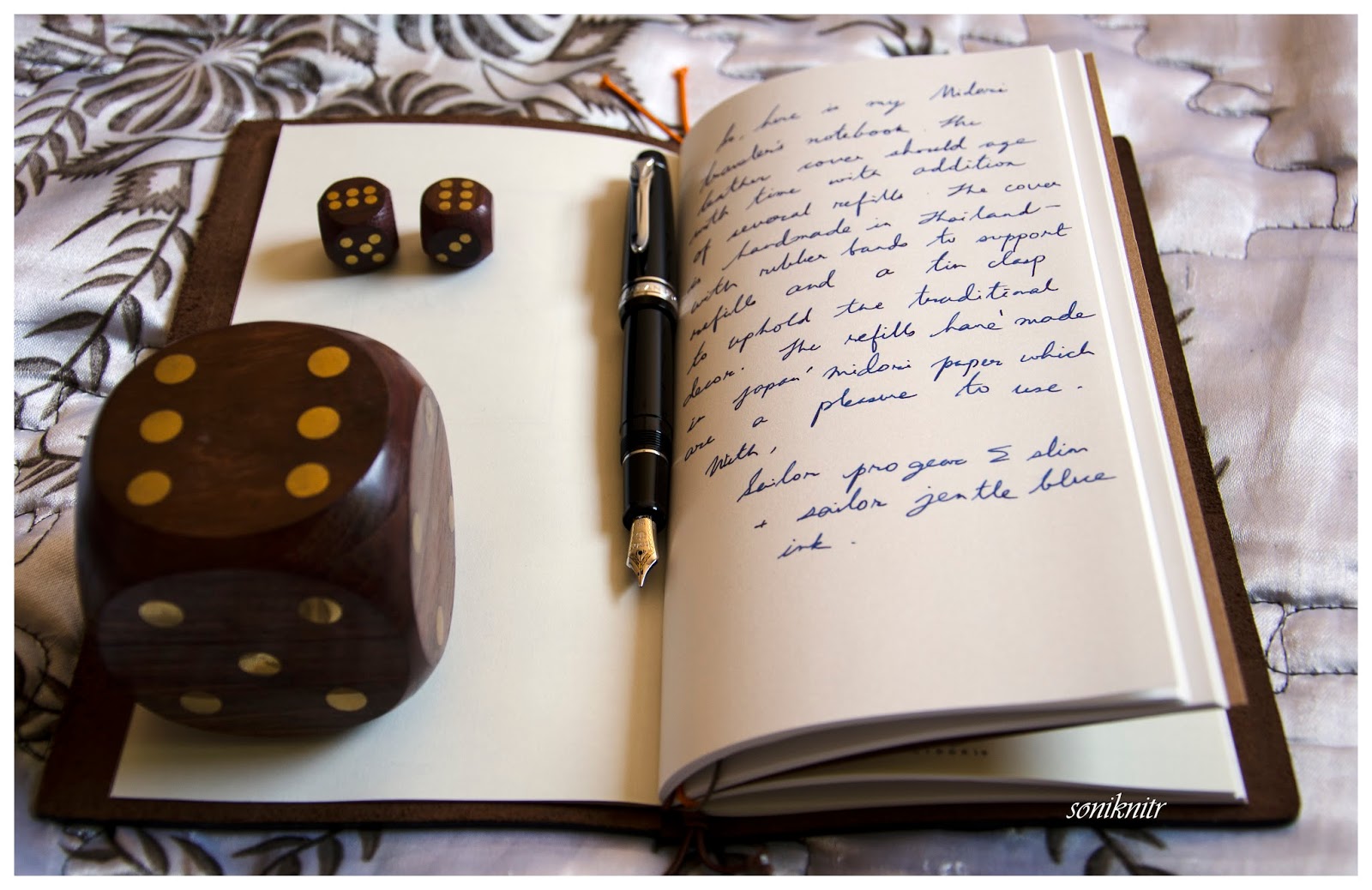
It was fun reviewing the Midori Traveler's Notebook. Hope you enjoyed the review.
You can also find a review of Traveler's Notebook (Passport Size) here.

Wednesday, March 4, 2015

An Intuitive conversation with the Graf von Faber-Castell Intuition

THE INTUITION


With a covetous eye on this pen, since the time I had got my FCD Ambition and then an orange coloured Ondoro fountain pen, it indeed required lady luck's blessings to get this one at a steeply discounted price. I must say, that there was already a strange sense of loss of colours, after I had parted with both of my orange coloured fountain pens - Ondoro and later a Pelikan m205. And this seemed to be an appropriate treatment for my colour blindness. Coming to the Faber-Castell Design (FCD) and the rather luxurious Graf von Faber-Castell (GvFC) line of pens, I must say that they have been able to splendidly highlight the art of convergence of design and utility. The Intuition pen comes in six lines of resin-based designs and two (earlier three) lines of wood-based designs. The wooden designs are called Intuition Platino Wood which is an enhanced intuition design altogether, be it the fluted wooden barrel or the platinum plated cap or an extra-large and more exquisitely designed bi-colour nib. And, it naturally places them in a more premium segment. You can find a review of the GvFC Elemento here, which shares its dimensions with the wooden Platino designs.

     These lines come with a fountain pen (with 6 to 7 different nib widths), a roller ball, a propelling pencil (0.7mm) and a ballpoint pen.

PRESENTATION (6/6)


It’s a chamois-coloured gift box with top and bottom wooden linings,  which secures itself by a magnetic catch within the two folds. There is the pen resting in a cardboard box within a chamois-coloured linen bag, which carries the Graf Von Faber-Castell name and their coat-of-arms logo.


I someway like the linen, bag because of its differentiated appeal, though not from an utilitarian perspective. There is also a warranty leaflet-cum-manual, which states a lifetime guarantee against manufacturing defects and assures services, in case any need for repair arises. Then, it also illustrates refilling the entire range of GvFC pens and other stationery.


DESIGN (6/6)


The Intuition range comes in six variants (terra - orange, ivory – off-white/fluted, black - black/fluted/metal cap) with six different nib sizes – EF, F, M, B, OM and OB. Only one of these variants comes with a platinum plated metal cap with a shiny black barrel.
             
Coming back to the pen, once you take it out, it surely looks like a compact enchanting piece of art. A high gloss sheen of the of the barrel and the cap reflects back quite a bit of light. Complementing this sheen, are the dazzling platinum plated trims of the pen.


On pulling the cap off, you would initially notice the singularity of the barrel, a section sans joints. It’s made out of a single piece of resin, in this case reflecting the colour of earth or ‘terra’,  gleaming with an orange smile. At the top end of the barrel, is a twist-metallic crown, which disengages the bi-tone nib section and converter system, from the rest of the body. I just love this element of design! The knob is embossed with the coat-of-arms logo, on the finial. Usually the coat-of-arms logo is used in GvFC pens and FCD pens (Ambition, Ondoro, e-motion) carry the jostling knights logo. Traditionally coat-of-arms is said to represent full-achievement in a heraldic tradition. GvFC has quite a bit of design superiority over the other FCD pens. Towards the nib end, the singular barrel narrows down to a slightly concave section to form a comfortable grip. Despite the glossy and smooth finish, the pen has a subtle but non-slippy grip section. The cap (snap-on) secures itself to the barrel with an audible click.


The cap is engraved with GRAF VON FABER – CASTELL, encircling the metallic finial insert which again bears another coat-of-arms logo with its platinum sheen. The cap band says GRAF VON FABER – CASTELL on one side and on the other end it's HANDMADE IN GERMANY. ‘Handmade’ because there are over a hundred steps in the entire manufacturing process of this pen, a majority of which are carried out by hand. The clip on the cap carries the gleam of platinum with a highly efficient and visible spring loaded system.


The finial at the barrel end carries a coat-of-arms logo.


FILLING SYSTEM (6/6)


Once the crown of the barrel is rotated anti-clockwise to disengage the nib & filling system, you would notice a rather classical CC filler system. The nib has a screw fit, and inserts into a metallic sleeve like most of the Faber-Castell fountain pens which I have seen. The nib sleeve has threads which synchronize with threads on the inner barrel, both ending up with an octagonal cross section. The converter has a metallic premium band which friction-fits into the nib section though it does not fit a FCD Ambition section. However, the Ambition converter fits in the Intuition nib section. The converter has a reasonably high capacity of 0.8 – 0.9 mL, and the ink does last for quite a while! I usually have a bias towards piston fillers, but I do appreciate the capacity offered by Faber-Castell converters.

The nib section carries a six-digit number which denotes the date of manufacture, which I did confirm with the Faber-Castell team. Mine says 011210, which would mean it was manufactured way back on 01-December-2010.


NIB (5/6) - ALL THAT MATTERS!


The 18k bi-tone nib comes in four main widths – EF, F, M & B and two special widths – OM (left) & OB (left). The tail end specifies the nib size and composition (75% Au , 18 ct) of the alloy used. A white rhodium decor occupies the outer tines converging with the iridium tip, while the inner part circumscribing the breather hole gleams golden with engraved stripes. There is a dazzling white coat-of-arms logo resting just above the tail-end. This one is a fine nib and writes quite smoothly with a 'minutely minute' hint of feedback when I use relatively drier inks. It lays down a wet albeit fine line, which will be covered in the last section of this review. With a rather curved shoulder, the nib does portray an apparently smaller size even if it’s quite similar to the size of the relatively flat Ambition nib. [minus 1]


The feed is standard grey plastic, with a big filler hole delivering an amazing ink suction, which is also used across the Faber-Castell Design series.


Below is a comparison to the FCD Ambition (non-premium) sections. You can check the differences between the two converters, the Intuition has got some metallic embellishment. Both use the same feed.


PHYSICS OF RELATIVITY (4/6)


With a cylindrical body of 1.2 cm diameter, it does give a comfortable feel without adding much weight. The capped length of 12.5 cm is quite similar to a Pelikan m400. In short, it is quite a compact pen when compared to an MB146 or even a thinner Ambition, for that matter. And a compact pen, can have its advantages along with some disadvantages. The weight of this pen has a significant contribution from the resin cap.
  • Uncapped Length ~ 12 cm
  • Posted Length ~ 15 cm
  • Nib Leverage ~ 2 cm
  • Overall Weight ~ 29.4 g

Uncapped, it’s quite similar to the m400 but slightly shorter than the Ambition. The loss of weight and length is somewhat balanced by the wider grip section, if not completely.


Alternatively, you can post it and it’s similar to a posted m400 with a slightly top-heavy configuration. However, I feel comfortable to use it both posted and unposted, although I never have shared the same feeling with Ambition.


ECONOMIC VALUE (5/6)


Although this pen retails around USD 600, it is available at much lower street prices. With end of season clearance sale, I was able to get the pen at a good discounted price.

OVERALL (5.3/6) 


I feel loved by the design and exquisite appeal of this pen on an overall scale, whenever I write with the intuition. No skipping or hard starts right from the beginning, it turned out quite smooth out of the box. With a stiff nib, it delivers a wet line, with this fine nib. The line width closely resembles a Lamy 2000 Fine/ a Japanese FM nib. For a pelikan 4001 brilliant green ink, it takes around 12-13 seconds to dry. There is no noticeable line variation with horizontal and vertical strokes for this one. Below goes a written review of the same:


It was fun reviewing the intuition. Hope you enjoyed reading it.

Sunday, February 22, 2015

A dialogue with the Lamy Dialog 3

MOTIVATION

A collection of fountain pens is never complete without the retractable ones in your armoury. And the ones, which immediately strike an already covetous mind, are of course the Pilots (VPs, decimos and the fermos). Then there are pens like Lamy Dialog 3, Visconti Pininfarina among a few others equipped with a relatively small-sized non-hooded nib. Somehow, the idea of yet another hooded nib became quite less appealing, when I saw the Dialog 3. I knew it would be quite a heavy pen for the capless clan, but so was the Fermo. The Dialog 3 was launched by Lamy back in 2009 designed by one of the contemporary designers, Franco Clivio. The Lamy Pico is another pen by the same Swiss designer. As per LAMY, Franco innovates with basic shapes – circle, square and triangle, foregoing anything superfluous in the process to achieve technical necessity. 

                          As you would have already discovered, there are no dialog 1 or 2 in their fountain pens range. Dialog 1 refers to a ball-point pen whereas Dialog 2 is a roller-ball pen, and interestingly enough, they belong to different designers.

PRESENTATION (6/6)


How do you ensure minimalism with luxury? By establishing extravagance incrementally, in step-by-step. A paper sleeve encases a much more attractive black cardboard box etched with the LAMY name. With the usual papers and a cartridge outside, a thin sheer cloth then encloses a beautifully polished gift box made out beech wood, closed with a magnetic rim.
The beauty of the beech-wood box is that it’s alluringly small enough to slip inside your pocket, the pen still dreaming inside with a soft cushion under her head.
PS: However, with the dialog 3 inside, it could be heavier than your cellphone. 

DESIGN (6/6)


A twist-action fountain pen with an advanced design, it comes with four variants now – matte-black, pianoblack, pianowhite and palladium finish, with six nib sizes – EF, F, M, OM, B & OB. 
The silvery palladium finish with chrome polished clip reflects its immediate environmental colours. An etched pair of parallel lines run along the barrel & grip pieces represent the final nib retraction point, when in sync. LAMY is etched between the lines at the end of the barrel. Half-a-twist clockwise from the barrel top-end will open a ball-valve at the nib end of the grip and the nib extends to a click-stop, keeping the pair of parallel lines at diametrically opposite ends. Anticlockwise, post the parallel sync, the barrel can be unscrewed from the grip+clip section, to take out the nib + filling system. There might be an odd slippage in the twist mechanism, but once I tightened the barrel and grip section, it did not occur again. Simply Elegant!
A chrome ball-valve at the end of the grip section protects the nib from damages of dust and drying, acting in sync with the twist-mechanism. Secondly, the clip lifts and rescinds with the twist to either facilitate an easier grip or enable clipping it on your pocket. 

From the aesthetics of design, the dialog 3 is really majestic. 

FILLING SYSTEM (6/6)


The sum of parts for me is greater than a whole. It’s less fun taking the pen apart, because it’s meant to. Once the barrel is unscrewed anticlockwise beyond the synced parallel lines, it separates out to reveal the nib & fill system. The nib/fill system can be unscrewed anticlockwise from the grip section. You will find a standard Z26 converter fitted into the nib section. Again like the 2000, the design elements appear to be fluidic in both nature and function. The standard capacity is around 0.7-0.8 ml for the Z26 converter, as per various FPN reviews, is quite good for a retractable one.
Once you fill her up, you can put the pen together and then comes the wow moment. 

NIB (6/6) - ALL THAT MATTERS


The 14k two-tone nib comes in four standard widths (EF, F, M, B) and two special widths (OM and OB). Elegantly, designed although in a modern geometric fashion, the white rhodium decor occupies the tines and the tail parts of the nib, while a golden streak runs from the breather hole and diverges itself at the tip end of the nib. Embossed near the tail end are the usual specs of nib size (F), content - 14k-58.5% and of course the LAMY logo.
By the way, this nib runs extremely smooth like warm butter. The plastic feed is a rather small one with a big feeder hole, and it does ensure a wet and smooth flow of ink. The tip is quite a sphere.
One thing I did observe, is the difference between the tipping sizes of 14k-fine nibs of Lamy - a 2000 with a Fine nib in this case, which is in my current rotation. Though, the 2000 had its nib replaced with a somewhat older-service stock of Fine nibs, you can clearly see the difference between their tipping sizes, even without using a loupe. 


PHYSICS OF IT (4/6) - RELATIVELY


A cylindrical body with a 1.3 cm diameter having around 50 grams of weight, might seem to be a heavy proposition to wield as a pen. The length of the fully extended pen is similar to a posted MB146. Taking these into account, this pen does not seem comfortable for extended writing sessions. However, as far as short note taking sessions or signatures are concerned, believe me it could be the dream pen to write with. The illusive weight, the copious flow and the buttery nib will ensure a silky glider. 
  • Retracted Length ~ 13.8 cm 
  • Extended Length ~ 15.7 cm 
  • Nib Leverage ~ 1.8 cm 
  • Weight ~ 50 g 

ECONOMIC VALUE (4/6)


With a street price of USD 250-260, it falls right into a category where you would probably think thrice or may be more, before buying the pen. There is always some discount running on MRP of USD 385 in local stores, which brings the price closer to street price levels.

OVERALL (5.3/6)


A flawlessly efficient pen as far as the vital parts of the pen are concerned. It has never skipped and all the twist mechanisms operate with firm intents of functionality. The d3 fine nib has quite a soft touch, decent spring, runs wet like rains & smooth like butter laying a broad line. With a relatively dry Pelikan 4001 ink, the wet lines laid by the Fine nib, run broader than a 2000-fine and a Platinum President Broad nib running the wettest of Diamine inks. The lines take around 30-35 seconds to dry Pelikan 4001 Royal Blue ink on MD Paper. 

A pen you cannot ignore, if you wish to have a retractable one with the smoothest of nibs.
Hope you liked the review. The Lamy 2000 is reviewed here.
You can find some more pen and paraphernalia reviews here.

Saturday, February 14, 2015

A LAMY 2000 story (with a little zen tale of maintenance)

MOTIVATION


This might sound pretty clichéd.. but it is actually true. If you love fountain pens, it is difficult to stay away from the Lamy 2000 for long. The 2000 is often quoted to have a timeless design, a masterful construction and a rather envious efficiency. And, it comes with a small 14k platinum-plated gold nib. The first of the Lamy 2000s are said to have been launched in 1966 and have well succeeded to become the flagship product of the company. To get the 2000 designed, Lamy had drawn a joint-project with a free-lancer (a top designer in the industrial space during the 1960s), Gerd Alfred Müller – of Braun fame. Incidentally, he was one of the first salaried designers of Braun and one of the advocates of the Bauhaus movement (‘form follows function’ maxim). And that project ended up with a piston-filler fountain pen made out of rigid fiberglass-reinforced makrolon polycarbonate and brushed stainless steel along with a gold nib. 

PRESENTATION (6/6)


The L2k arrived in a small tri-folded black cardboard box (with a thick paper outer-sleeve), that locks the third fold on a silver colour plate bearing the ‘LAMY’ logo. These folds reveal the pen resting on a zig-zag felt-like paper floorboard along with a leaflet/manual.


DESIGN – CAPPED (6/6)


The pen in its final elements apparently bestows a fluidic design. Even though it is often quoted to have an understated appearance with the brushed black makrolon matter, I feel that that’s the way the pen truly differentiates itself from others. The spring loaded clip made out of brushed-steel, is both efficient and stunning at the same time. 

DESIGN – UN-CAPPED (5/6)


Then there is LAMY embossed on one of the mount-sides of the clip, with GERMANY 2 written on its underside. As per some FPN posts, the GERMANY 1 or 2 could refer to the cavity number of the die in which the clip was made. Once uncapped, the pen depicts a engineering marvel, the one without boundaries. Concealing all the seams of individual parts starting right from the piston knob and ending with the nib, the lamy 2000 plays an effortless symphony, from the blackness of makrolon body through the subtle set of glassy ink windows (0.25 cm) towards the silvery brushed-stainless steel grip section ending with a hooded metallic nib (14k – Gold: Platinum plated). And that’s when you do realize a splendid piece of industrial design, by Müller!

                 I do find the snap-cap a blessing, when it comes to taking quick notes. Once uncapped, the pen becomes quite susceptible to rolling and falling off from smooth surfaces even with a little hint of slope. [That’s why probably a Minus – 1]

There is a stainless steel disc adorning the end of piston knob, ending the sweet sonnet of an eternal design with a silvery look which once started with the steely grip and clip. 

FILLING SYSTEM (6/6)


The piston knob is adequately large and quite comfortable to operate. The brushed surface ascertains a firm grip. Initially, the piston knob was too snug for my comfort, but it worked like a charm after lubricating the piston seal. In fact, it now is apparently smoother than the nib itself. More on it later. 


The pen draws and expels ink through its breather hole (below pic), located on the underside of the hood. Rather, the mechanism gushes ink in or out with remarkable efficiency. The ink capacity is said to be around ~ 1.4 – 1.5 mL. 

PHYSICS OF IT - RELATIVELY (6/6)


From the perspective of writing comfort, I would prefer the whole 25 grams and keep the pen posted. For short notes, I am comfortable to use the pen un-posted. 

            Dimensionally, it is quite similar to a Pilot Custom Heritage 91/92 and is a rather medium sized pen. The hooded nib seems small but an elusive unification with the metal grip gives the pen an unexpected leverage with a somewhat bottom heavy design. So you might never feel the absence of a big nib. 
  • Capped Length ~ 14 cm
  • Uncapped Length ~ 12.5 cm
  • Posted Length ~ 15.4 cm
  • Nib Leverage ~ 0.75 cm
  • Total Weight ~ 25 g
  • Body Weight ~ 15 g


NIB - ALL THAT MATTERS (5/6)


Below, is the complete nib-section which is hidden under the hood. It’s a rather small nib but to reiterate, it’s a supremely efficient and an effective design. And thanks to Müller, apart from the most elegant of appearances, LAMY also managed to save some costs on the gold part of the nib. 

                          Mine was an EF nib and was yet another QC victim [Minus –1]. I did smoothen it up, but again the angularly-varying nib widths were not pertaining to my taste. But thanks to Lamy India Customer Service – by William Penn, they replaced it with a F nib in three weeks, totally free of charge. I was assured by them, if any Lamy is within a year of purchase (from anywhere across the globe), William Penn will happily service the pen at zero cost. The replaced nib is quite smooth and I believe it’s one of the older pieces in their service stock. It does draw a line quite similar to a pilot FM nib or a pelikan EF.

DISASSEMBLY (5/6)


The best part of the pen is the ease of dis-assembly without a need of a tool. (The only part in which you would probably need a tool is probably pushing out the piston rod and seal out of the barrel)

             The steel grip section can be unscrewed off from the barrel in a clockwise manner, with the piston end on top. Be careful when you push out or push in the nib section, for I had used a cloth to hold the nib + feed, while gently pushing out the nib. While putting it in, I would suggest making sure that the convex opening of the grip section is well-aligned with the nib and feed faces the breather hole. It should smoothly fit-in, else it’s not aligned. The nib can be easily damaged during this exercise and secondly, there are multiple o-rings – metal (grip section) and rubber ones (nib section) to take care of. [Minus –1] I recommend staying away from the force (forcing the nib section in), even when The force is with you!

                   The piston knob can be screwed off in a quite similar manner of operation. After a stop, once it’s rotated anti-clockwise from top a few clicks are heard and it comes out completely revealing a plastic internal end cap for this version. 

Since, my piston knob was quite snug from the beginning, I took the liberty of disassembling the pen to apply some silicone grease on the interiors of the barrel, with an ear-bud. After turning the piston knob in and out for a few times, it was magically butter-smooth to operate. I referred to this video by Brian Goulet.

ECONOMIC VALUE (5/6)


I was able to win the pen at USD 120 on an online auction. I am not sure whether I could have got it for less. It probably sells at a street price of USD 150-160 and retails at USD 200+ in India. And, post the nib-replacement I am pretty happy with the pen. 

OVERALL (5.5/6)


Know what! If you haven’t already, you must get it. It deserves a place in your collection. PS – It was 1966 not 68

ADORABLE REFERENCES


The Lamy 2000 Bible by Brandon
Applying Silicone Grease Video

Thank you for going through this review. Hope you enjoyed it. The Lamy Dialog 3 is reviewed here