PRELUDE
Compensating for missing out on an Omas Extra Flessible nib
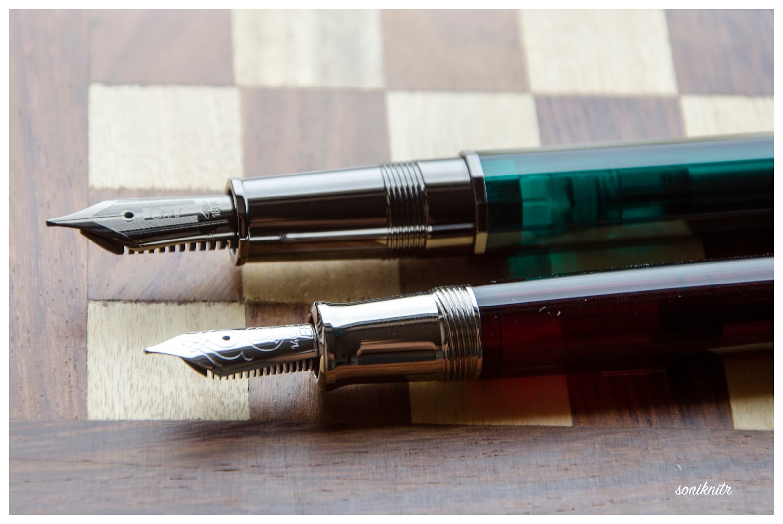
I managed to snag an Omas Arte Italiana Vision fountain pen back in 2015 when Omas was still around. The Art Vision in green/emerald with a medium nib is absolutely adorable and perfectly showcases the design flair Omas was known for. Just take a look at the ruthenium-plated ‘O’ on the finial! However, the extra-flessible has nib always intrigued me, especially when Omas launched the Ogiva Alba & Cocktail series with that option. But my courage couldn’t match my budget or rather the lack of it. So in mid-2020, I went for a Scribo with a Feel the Flex nib to address this emotional gap. A chat with ever-gracious Frank from Fontoplumo assured me that Scribo indeed had the Omas equipment as the other reviews suggested, so the nibs would be similar, if not identical. Somehow, the newly resurrected Omas pens don't quite capture the finesse that the classic Omas pens had in abundance.
PRESENTATION (3/6)
A cardboard box and a canvas wrap
The packaging is pretty basic and seems to be a combination of eco-friendliness and cost-friendliness. The cardboard box didn’t survive my move, it looked like it lost a fight crumpled under a paper weight. So, no photos or fond memories of the box. I mean, if you're charging over $500, wouldn't it make sense to spend 1/20th of that on a box that doesn't self-destruct? Anyway, rant over, I did manage to keep the off-grey canvas wrap, so at least there's that!

As you can see, the wrap can carry two pens and a polishing cloth. Alas! they forgot to include the polishing cloth.

DESIGN (4/6)
Somewhat Greek-y Functionalism sans a Greek-key
I had the chance to chat with Luca from Scribo, who I later found out is the founder of the company. This conversation happened because the metal parts of my pen decided to oxidise themselves within a month. Rust spots popped up all over the cap band and parts of the clip, like the pen had gone on a deep-sea dive. I was shocked to see such quality issues with the plating so soon. Even my Platinum #3776 took a good 3-4 years to show off how thin its gold plating was, but for the price and the gold nib, I could live with it.

A penalty of -2 for all the trouble, but the excellent customer service from Luca within COVID-19 restrictions adds +1. Luca and his team handled all the issues with incoming customs when the product was mistakenly declared as merchandise by the postal department here. He was gracious enough to send a free sample bottle of Rosso Melograno ink along with the pen. I love the colour more than Rosso Chianti which would be the one to go with the pen.

Melograno in Italian translates to pomegranate tree. One of the reasons I chose this variant is that I did not have any fountain pens in those hues, unless you consider a Platinum 3776 in burgundy to be one. Especially with the subtle play of maroon, pink, and white streaks in a cracked ice pattern, the pen becomes quite attractive. The pen feels substantial in the hand, thanks to its hourglass design and gentle tapering at the finial ends. It is slightly larger compared to an Omas Vision/Paragon, which initially felt a bit odd.
The legendary dodecagonal structure is aesthetically pleasing and prevents the pen from rolling off surfaces. Compared to Omas, I feel the Scribo Feel leans more towards functionalism rather than aesthetics. Unlike the Omas, there is no Greek-key design on the cap band, and I feel the design has been somewhat rushed for the sake of modernism, with quick parallel lines.

The uncapping is quick and takes about 1.25 turns for the cap to come off - perfect for those impatient moments. A nice touch is the continuation of the dodecagonal structure into the section.

The section itself is long and comfortable to hold, ending with a rhodium-plated ring for that extra bit of bling. More on that later. Somehow, I probably expected a classic Omas-like Greek key design here too, but I guess they decided to leave ancient history in the past.

Now, coming back to the cap, it feels substantial with its spring-loaded convex clip that curves into a concave arc towards the end. The clip is one of the best functional parts I've used, much like the GvFC clips. The cap band is adorned with parallel lines and proudly displays SCRIBO, which stands for Scrittura Bolognese or "Bolognese writing," alongside their slogan, "Feel the Writing”. And yes, it does feel very comfortable while writing, like a handshake from an old friend.
The finial, or cap medallion, is inscribed with a feather quill and features some parallel lines running along it. The cap gently tapers towards this end. Nothing too remarkable here.
FILLING & CLEANING SYSTEMS (6/6)
A convenient piston filler
The piston mechanism is very well made and seems functionally superior to the Omas Vision I have, in terms of suction and smoothness of operation. However, Pelikans are probably the best of the lot.

The piston fills up smoothly with 1.3-1.4ml of ink. The mechanism includes a brass/metal sleeve, adding some extra heft to the Feel. No complaints here—it works like a charm. My only gripe, shared by a few others, is the lack of an ink window. With the flexible nib and wet ebonite feed, this pen runs out of ink faster than others with similar ink capacity.
NIB - ALL THAT MATTERS (5/6)
The Extra-Flessiblity
The Scribo Feel series boasts an array of around 10-12 different nib variations, now including both 18k stock and 14k flexible nibs. While I haven’t had the pleasure of using an 18k nib yet, I imagine it’s as soft and luxurious as an Omas. The 14k ones are meant to cater to our extra-flessible desires.

Love it! Except for the inscription. The 14k feel the FLEX, Fine nib. It’s simultaneously one of the most beautiful nib in terms of writing and unappealing in terms of design. While it may have the writing charm of Omas nibs of yore, the embossing of slogan, company and gold content of the nib residing within an elongated hexagon doesn’t market the nib well. But I do not think the Omas extra-flessible nibs had much to offer either.

Speaking of shape, the nib bears a striking resemblance to the Omas Art Vision.

Once you turn the nib, the first thing you'll notice is the feed, and then the tip. The tip appears to have a sort of an elongated bulb. The feed has the exact same structure as an Omas. It’s a heat set black ebonite feed and supports the wet ink flow very well. In theory, ebonite attracts water as it is hydrophilic as opposed to hydrophobic plastics which repel water, thereby wetting more efficiently under the nib.
PHYSICS OF IT (6/6) – RELATIVELY SPEAKING
The Newtonian Laws
The overall capped length measures approximately 15 cm. The section offers one of the most comfortable grips in my collection, with a diameter ranging from approximately 1.1 to 1.2 cm.
Below are pictures along with a Sailor Pro Gear Fujiyama Realo for a comparative reference. It was in rotation and sitting pretty, so I thought of taking a few pictures with that. Normally, I would post a standard Sailor Pro Gear, while writing.

Here go the dimensions.
- Uncapped Length ~ 13.5 cm
- Total Length ~ 15 cm

- Exposed Nib Leverage ~ 2.5 cm

The weight of the pen is comforting even without the cap.
- Overall Weight ~ 37.6 g (inked, without cap ~20.5g)

ECONOMIC VALUE (4/6)
Functionality vs Price
I paid the full MRP for this pen. While it's finely engineered, I find it lacking in overall aesthetics compared to the venerable Omas pens of yore. Given the premium price, I would expect a more pleasing design on the cap band, thicker plating to prevent oxidation within 2-3 years, a more attractive cap medallion, and some attention to the inscription on the nib. Additionally, there are some micro spots of oxidation appearing on the trims, which are visible in the photos.
WRITING & FINAL COMMENTS (4.7/6)
Pleasure to write with, aesthetics need to scale up
The writing experience with this nib is among the softest I've encountered, responsive to pressure and writing style. Even without intentionally flexing the nib, its natural tendency to vary strokes is impressive.
This nib writes wet without any issues of drying out or railroading. The slight feedback it provides is more about control than a flaw. With moderate pressure, the nib flexes, opening its tines and increasing ink flow. I handle it with care.
On Endless Regalia 80 GSM paper, using Iroshizuku Yama Budo ink, lines take approximately 45-55 seconds to dry. While I'm not particularly inclined towards flex writing, the nib does offer pleasing line variation.

I've been using this pen on and off since 2020, and it has become an essential part of my rotation. One crucial aspect is the approximately 3cm long, polygonally contoured section, which provides an incredibly comfortable writing experience. I find the section threads non-intrusive while writing. I appreciate Scribo's differentiation from Omas, as highlighted in Dries' excellent review. However, I can't help but feel that the aesthetics have declined from Omas' standards. I would prefer the pen to have metal sections that are better finished and don't oxidize every couple of years. Now, over to Luca and team to make those improvements.
Thank you for going through the review.
You can find other pen and paraphernalia reviews here.