Showing posts with label Omas. Show all posts

Sunday, January 12, 2025

Pursuit of an almost elusive Omas 360

PRELUDE

The never ending search of NOS Omas-es

My love with Omas began with a dodecagonal (12-faceted) Omas Vision back in 2015. Like a fleeting teenage romance, it turned out to be as ephemeral as it was passionate, as the 90-year old company filed for bankruptcy the very next year, in 2016.

                            For years, I never managed to acquire another Omas ,until late 2024, when I crossed paths with Tom Westerich (penboard.de). This inadvertent meeting led me to acquiring a few more Omas pens: a beautifully fluted 2003 Ogiva from Tom, an Europa later from Regina (martiniauctions) and a 360 dating back from the 1990s to early 2000s, courtesy of Marco (penboard).

Now, I feel my pursuit for Omas pens has reached it’s conclusion though seemingly intelligent people who love ballpoint pens would see it as redundant. Among the pens, the 360 in Venice blue stands out. It came with a titanium emotica nib (semi-flex, by the way which original Omas nib isn’t!). Marco, in a gesture of old-school trust graciously refused payment until I received the pen and tested it, a courtesy likely extended because of my connection with Tom.

        The 360 seems to be a pen of legend, evoking tales of endless delight and occasional heartbreak from its end users. Nonetheless, I am going to exalt the 360 in this review and here is why!


HISTORY

The luxury of yesteryears now withered away

According to the listing, the pen came without a box but did include its original pen sleeve - sporting a matching blue color or rather, what remained of it after 30 years of loyal service. Back then, Omas wouldn’t have left a stone unturned, when it came to presenting their exquisitely crafted pens.

              The history of the 360 design is a fascinating tale, well-documented in this FPN comment. Apparently, in the 1990s, Omas was inundated with fountain pens sent in for nib repairs. The culprit? Users who apparently gripped the fountain pens incorrectly! Enter Miss Malaguti (refers to Raffaella Simoni, Armando Simoni’s daughter), who had a lightbulb moment: why not design a pen that forces users to hold it the right way. This stroke of genius led to the triangular 360, but it also created a new engineering challenge: how to cram their standard cylindrical piston mechanism into a triangular barrel. The solution? Stretch the pen’s size, making it significantly larger than Omas’s typical offerings. I discovered this firsthand when I held the 360 - it’s as big as the Scribo Feel, though without the heft.


DESIGN

An Equilateral Triangle

The Omas 360 (Venetian blue cotton resin), released in 1996, is often hailed as the brand's last major design innovation, featuring its iconic triangular body and grip. I’ll admit, the idea of a triangular grip never seemed convincing to me - at least not until I actually held the pen in my hands. For this 360, the trims are in fact sterling-silver, a finish Omas fancifully called "HT" (High Tech) which included rhodium plated trims. My 360 does get a patina over time which can be cleaned out easily.

        Even after three decades, the pen manages to dazzle - though now in the muted hues of Venetian blue. The triangular facets give the pen a unique sense of curvature, something absent from the dodecagonal Paragon designs. At the finials, the gentle curvature is so precise it feels like it was sculpted by a mathematician in love with parabolas. The trims are simple yet elegant: a thin triangular ring followed by a thick center band adorned with the Greek key, meandros. Notably, unlike the more modern Omas pens from the company's later years (pre-2016 closure), this band doesn’t have "OMAS" stamped within the motif. Closed, the final trim cleverly highlights the piston knob - a small but satisfying detail.

The cap is snap-fit and pulls off with ease. However, I do have a minor quibble with the two-stage snapping mechanism. There’s a slight wobble during the second stage of uncapping, though it does seem to minimize the risk of ink spillage - a trade-off, perhaps. In my experience with premium fountain pen snap caps, the spectrum of quality is wide. At the top sits Faber-Castell (GvFC), while Sheaffer Legacy sits firmly at the bottom, scratching entire sections with the kind of determination that makes you wonder if it’s intentional. (Pro tip: If you want scratches to feel like a design feature rather than a bug, go all-in like the Lamy 2000. No offense to L2K lovers - I’m one of you!) Omas 360 comfortably lands in the top 10 percentile of snap-cap designs, at least in my limited experience and collection.

     Even without a magnifying glass, the trims bear the subtle marks of 30 years of ageing, lending the pen a certain vintage charm. The friction-fit clip arcs gracefully, with a concave taper that’s as functional as it is beautiful.

Opening the cap reveals a delightful cross-sectional symmetry at the section’s end: a thin triangular ring followed by the signature Greek-key band. There’s a minor step as you transition to the section, but it never interferes with writing comfort. The triangular grip is smooth and intuitive, with its three planes acting as natural guardrails to ensure proper nib alignment. The pen does feel larger, albeit lightweight, compared to other Omas pens fitted with #6 nibs.


FILLING & CLEANING SYSTEMS

Piston Filler, Easy to use though difficult to service

The piston filling system features a sturdy, pyramid-like knob at the end, along with two tiny metallic circles. These are the exposed ends of a brass pin that secures the blind cap to the piston mechanism. The knob requires a respectable 4–5 turns to move the piston to its end stop, and the mechanism works smoothly, drawing up an around 1.2 ml of ink from the bottle. The difference in weight prior and post filling the pen was 1.18g.

Now, when it comes to lubricating the piston mechanism, things get a bit...tricky. Unlike the Paragon or Ogiva series, where you can simply unscrew the section and go to town with your silicone grease, the 360 makes you work for it. You’ll either need to carefully pull out the pin at the piston end or remove the heat-set nib from the other end. Both approaches require caution, patience, and possibly a bit of meditation beforehand. Secondly, it takes a long time to clean the pen, some ink just keeps coming out from nowhere.


NIB - ALL THAT MATTERS

Titanium Emotica

My Omas 360 is equipped with a Medium Titanium Emotica-series semi-flex nib, which feels remarkably similar to a well-tuned Conid Ti nib. The size "M" is discreetly marked on the wing of the nib, while the material composition is etched towards its tail. The OMAS branding sits within an oval, adorned with some scrollwork that looks definitely inferior to the gold nibs. Fortunately, the nib arrived perfectly tuned, and I’ve had no complaints so far.

The heat-set black ebonite feed ensures a generous ink buffer and an unapologetically wet ink flow. Ebonite, being hydrophilic, attracts water, unlike its hydrophobic plastic counterparts. This makes ebonite exceptionally efficient at delivering ink to the nib.

There’s also a charming difference between Omas feeds of different eras. The modern feeds (circa 2015) showcase symmetrical fins on their exposed surfaces, giving them a neat, precise look. In contrast, the older feeds (1996–2003) embrace a minimalist aesthetic, with a plain design.


PHYSICS OF IT – RELATIVELY SPEAKING

The Laws of Ms. Malaguti

Although there’s a step down from the barrel to the section, it never interferes with writing comfort. The pen is large, much like the Scribo Feel, and proves to be quite comfortable for extended writing sessions. And to top it off, there’s no room for confusion when holding the nib, thanks to the ingenious design by Miss Malaguti.

Below are the pictures along with a Scribo Feel and a Pelikan M200 for a comparative reference.

Here go the dimensions.

  • Uncapped Length ~ 13.5 cm

  • Total Length ~ 15 cm
  • Exposed Nib Leverage ~ 2.5 cm


The weight of the pen is comforting even without the cap.

  • Overall Weight ~ 26 g (inked, without cap ~16g)


WRITING & FINAL COMMENTS

Writes wet and elastically

The writing experience is beautiful - easily rivalling any well-tuned Bock Titanium nibs. Thanks to the natural springiness of titanium, this nib delivers an experience so delightful it’s a joy to ink the pen again.

The nib writes wet and doesn’t suffer from major drying-out issues. I did encounter one hiccup: after leaving the pen untouched for a month, it required to prime the feed. I simply placed it nib-down for 2-3 minutes. This seems to be a recurring quirk with older Omas NOS pens. While writing, there’s a faint feedback reminiscent of graphite on paper, barely noticeable with wetter inks. With moderate pressure, the nib flexes, tines parting well to increase ink flow. The line variation is satisfying without requiring excessive effort, though I approach this titanium nib with the care of someone handling a 14k gold nib’s more temperamental cousin.

On Endless Regalia 80 GSM paper with Scribe Indigo ink, the drying time clocks in at 40 seconds - another proof of wetness. While I’m not a die-hard flex writer, the line variation is pleasing enough to bring a smile to our face.


After 2–3 months of use, this pen has secured its place in my Omas rotation. One of the standout features for me is the long section, which offers a great level of comfort as you settle into your perfect grip. The Omas 360 might have started as a design experiment, but it’s proven itself as a reliable one.

Thank you for going through the review.

You can find other pen and paraphernalia reviews here.


REFERENCES

Thursday, June 20, 2024

Review of the SCRIBO Feel Melograno : My search for an Omas-worthy nib

PRELUDE

Compensating for missing out on an Omas Extra Flessible nib


I managed to snag an Omas Arte Italiana Vision fountain pen back in 2015 when Omas was still around. The Art Vision in green/emerald with a medium nib is absolutely adorable and perfectly showcases the design flair Omas was known for. Just take a look at the ruthenium-plated ‘O’ on the finial! However, the extra-flessible has nib always intrigued me, especially when Omas launched the Ogiva Alba & Cocktail series with that option. But my courage couldn’t match my budget or rather the lack of it. So in mid-2020, I went for a Scribo with a Feel the Flex nib to address this emotional gap. A chat with ever-gracious Frank from Fontoplumo assured me that Scribo indeed had the Omas equipment as the other reviews suggested, so the nibs would be similar, if not identical. Somehow, the newly resurrected Omas pens don't quite capture the finesse that the classic Omas pens had in abundance.


PRESENTATION (3/6)

A cardboard box and a canvas wrap


The packaging is pretty basic and seems to be a combination of eco-friendliness and cost-friendliness. The cardboard box didn’t survive my move, it looked like it lost a fight crumpled under a paper weight. So, no photos or fond memories of the box. I mean, if you're charging over $500, wouldn't it make sense to spend 1/20th of that on a box that doesn't self-destruct? Anyway, rant over, I did manage to keep the off-grey canvas wrap, so at least there's that!

As you can see, the wrap can carry two pens and a polishing cloth. Alas! they forgot to include the polishing cloth.

DESIGN (4/6)

Somewhat Greek-y Functionalism sans a Greek-key


I had the chance to chat with Luca from Scribo, who I later found out is the founder of the company. This conversation happened because the metal parts of my pen decided to oxidise themselves within a month. Rust spots popped up all over the cap band and parts of the clip, like the pen had gone on a deep-sea dive. I was shocked to see such quality issues with the plating so soon. Even my Platinum #3776 took a good 3-4 years to show off how thin its gold plating was, but for the price and the gold nib, I could live with it. 

 A penalty of -2 for all the trouble, but the excellent customer service from Luca within COVID-19 restrictions adds +1. Luca and his team handled all the issues with incoming customs when the product was mistakenly declared as merchandise by the postal department here. He was gracious enough to send a free sample bottle of Rosso Melograno ink along with the pen. I love the colour more than Rosso Chianti which would be the one to go with the pen.

Melograno in Italian translates to pomegranate tree. One of the reasons I chose this variant is that I did not have any fountain pens in those hues, unless you consider a Platinum 3776 in burgundy to be one. Especially with the subtle play of maroon, pink, and white streaks in a cracked ice pattern, the pen becomes quite attractive. The pen feels substantial in the hand, thanks to its hourglass design and gentle tapering at the finial ends. It is slightly larger compared to an Omas Vision/Paragon, which initially felt a bit odd. 

      The legendary dodecagonal structure is aesthetically pleasing and prevents the pen from rolling off surfaces. Compared to Omas, I feel the Scribo Feel leans more towards functionalism rather than aesthetics. Unlike the Omas, there is no Greek-key design on the cap band, and I feel the design has been somewhat rushed for the sake of modernism, with quick parallel lines.

The uncapping is quick and takes about 1.25 turns for the cap to come off - perfect for those impatient moments. A nice touch is the continuation of the dodecagonal structure into the section. 

The section itself is long and comfortable to hold, ending with a rhodium-plated ring for that extra bit of bling. More on that later. Somehow, I probably expected a classic Omas-like Greek key design here too, but I guess they decided to leave ancient history in the past.

Now, coming back to the cap, it feels substantial with its spring-loaded convex clip that curves into a concave arc towards the end. The clip is one of the best functional parts I've used, much like the GvFC clips. The cap band is adorned with parallel lines and proudly displays SCRIBO, which stands for Scrittura Bolognese or "Bolognese writing," alongside their slogan, "Feel the Writing”. And yes, it does feel very comfortable while writing, like a handshake from an old friend.

        The finial, or cap medallion, is inscribed with a feather quill and features some parallel lines running along it. The cap gently tapers towards this end. Nothing too remarkable here.


FILLING & CLEANING SYSTEMS (6/6)

A convenient piston filler


The piston mechanism is very well made and seems functionally superior to the Omas Vision I have, in terms of suction and smoothness of operation. However, Pelikans are probably the best of the lot.

The piston fills up smoothly with 1.3-1.4ml of ink. The mechanism includes a brass/metal sleeve, adding some extra heft to the Feel. No complaints here—it works like a charm. My only gripe, shared by a few others, is the lack of an ink window. With the flexible nib and wet ebonite feed, this pen runs out of ink faster than others with similar ink capacity.


NIB - ALL THAT MATTERS (5/6)

The Extra-Flessiblity 


The Scribo Feel series boasts an array of around 10-12 different nib variations, now including both 18k stock and 14k flexible nibs. While I haven’t had the pleasure of using an 18k nib yet, I imagine it’s as soft and luxurious as an Omas. The 14k ones are meant to cater to our extra-flessible desires.

      Love it! Except for the inscription. The 14k feel the FLEX, Fine nib. It’s  simultaneously one of the most beautiful nib in terms of writing and unappealing in terms of design. While it may have the writing charm of Omas nibs of yore, the embossing of slogan, company and gold content of the nib residing within an elongated hexagon doesn’t market the nib well. But I do not think the Omas extra-flessible nibs had much to offer either.

Speaking of shape, the nib bears a striking resemblance to the Omas Art Vision.

Once you turn the nib, the first thing you'll notice is the feed, and then the tip. The tip appears to have a sort of an elongated bulb. The feed has the exact same structure as an Omas. It’s a heat set black ebonite feed and supports the wet ink flow very well. In theory, ebonite attracts water as it is hydrophilic as opposed to hydrophobic plastics which repel water, thereby wetting more efficiently under the nib. 


PHYSICS OF IT (6/6) – RELATIVELY SPEAKING

The Newtonian Laws


The overall capped length measures approximately 15 cm. The section offers one of the most comfortable grips in my collection, with a diameter ranging from approximately 1.1 to 1.2 cm.


Below are pictures along with a Sailor Pro Gear Fujiyama Realo for a comparative reference. It was in rotation and sitting pretty, so I thought of taking a few pictures with that. Normally, I would post a standard Sailor Pro Gear, while writing. 

Here go the dimensions.

  • Uncapped Length ~ 13.5 cm
  • Total Length ~ 15 cm
  • Exposed Nib Leverage ~ 2.5 cm

The weight of the pen is comforting even without the cap.

  • Overall Weight ~ 37.6 g (inked, without cap ~20.5g)


ECONOMIC VALUE (4/6)

Functionality vs Price


I paid the full MRP for this pen. While it's finely engineered, I find it lacking in overall aesthetics compared to the venerable Omas pens of yore. Given the premium price, I would expect a more pleasing design on the cap band, thicker plating to prevent oxidation within 2-3 years, a more attractive cap medallion, and some attention to the inscription on the nib. Additionally, there are some micro spots of oxidation appearing on the trims, which are visible in the photos.


WRITING & FINAL COMMENTS (4.7/6)

Pleasure to write with, aesthetics need to scale up


The writing experience with this nib is among the softest I've encountered, responsive to pressure and writing style. Even without intentionally flexing the nib, its natural tendency to vary strokes is impressive.

   This nib writes wet without any issues of drying out or railroading. The slight feedback it provides is more about control than a flaw. With moderate pressure, the nib flexes, opening its tines and increasing ink flow. I handle it with care.

On Endless Regalia 80 GSM paper, using Iroshizuku Yama Budo ink, lines take approximately 45-55 seconds to dry. While I'm not particularly inclined towards flex writing, the nib does offer pleasing line variation.

I've been using this pen on and off since 2020, and it has become an essential part of my rotation. One crucial aspect is the approximately 3cm long, polygonally contoured section, which provides an incredibly comfortable writing experience. I find the section threads non-intrusive while writing. I appreciate Scribo's differentiation from Omas, as highlighted in Dries' excellent review. However, I can't help but feel that the aesthetics have declined from Omas' standards. I would prefer the pen to have metal sections that are better finished and don't oxidize every couple of years. Now, over to Luca and team to make those improvements.


Thank you for going through the review. 

You can find other pen and paraphernalia reviews here


REFERENCES

The Pencilcase Blog

Scribo - About Us

Wednesday, September 2, 2015

A Review of the Omas Art Vision in Liquid Green

OMAS as you already know is a 90 year old Italian manufacturer of fine writing instruments and related luxury goods. Founded in 1925, it does carry the name of its founder, Armando Simoni. OMAS as it is, stands for Officina Meccanica Armando Simoni, which means workshop for machinery And initially from 1919 - 1925 this workshop had been producing parts and safety mechanisms for pens.. OMAS had launched its first fountain pen in 1927 and had also copied Duofolds for a while. The turning point for the company came in 1932 with the Omas Extra, a faceted celluloid pen. Today, OMAS is no longer a 100% Italian company as it was earlier, after international acquisitions, first with the French LVMH stake in 2000 and then a 90% controlling equity investment of the Hong Kong based luxury conglomerate Xinyu Hengdeli Group in 2007. 

                  As for the Arte Italiana Collection, the twelve faceted or dodecagonal pens were first launched in 1930s and they never got out of fashion over all these years. In Italy it’s called Faccettata, which is also representative of Greek Doric Columns. The Vision along with Milord and a larger Paragon belong to the same collection. They are still assembled in Omas boutique job shop one after the other, manually. The Vision comes in two distinct designs - Liquid Blue & Liquid Green limited to 331 pieces per colour. However these pieces are not individually numbered like the Ogiva Vintage runs. Liquid Blue comes trimmed with bright rhodium decor while Liquid Green is trimmed with dark ruthenium decor. The colours are inspired from watercolour shades.


PRESENTATION 


The Art Vision comes in a luxurious cardboard box encased within a silvery grey paper box. The heavy box is inlined with grey felt resembling the shades of steel grey. 

Once you remove the top cover, you can find the pen nesting inside a grey pen sleeve, placed on a custom made bed. The inside of the lid muses with the following motto customary to Omas:

Italian Creativity, 
History, 
Craftsmanship. 
The Pleasure of Writing.

Once you flip open the velvety separator, you would notice that there are two beds for two of your pens. Underneath rest the manuals and warranty card for this pen in a separate section. 


DESIGN - THE SONG OF DARK & EMERALD (6/6)


It’s the Game of Thrones playing in my mind or these colours of liquid green and dark ruthenium play a beautiful symphony of light and dark. These pens are made of Omas proprietary Cotton Resin which constitutes of blended cotton seeds and resin polymer derivatives. The cotton resin feels quite substantial and does reflect a luxury in its own terms of rendering hues.

The entire pen gleams with emerald tunes, entrapped within hushed darkness of ruthenium giving something that is not very common to this world of art. You can actually visualise the pen as a doric column which separated long ago and fell right into your palms. The clip gleams like an arc quite subservient to an emerald haze.

The piston knob concludes the structure with a raised dome. 

The cap feels light and unscrews with a single turn, revealing a dark ruthenium plated nib converging with gleaming shades of its metallic section. It reminds me of my gun-metal frames. The section starts with a dodecagonal structure (12 sides) stepping down for commencement of the efficient threads before tapering down to a comfortable grip section, before ending with a raised loop. These are the times when soulful geometry transforms into art. I did not find the grip uncomfortable or slippery and I hold the pen 0.4 - 0.5 cm above the nib.

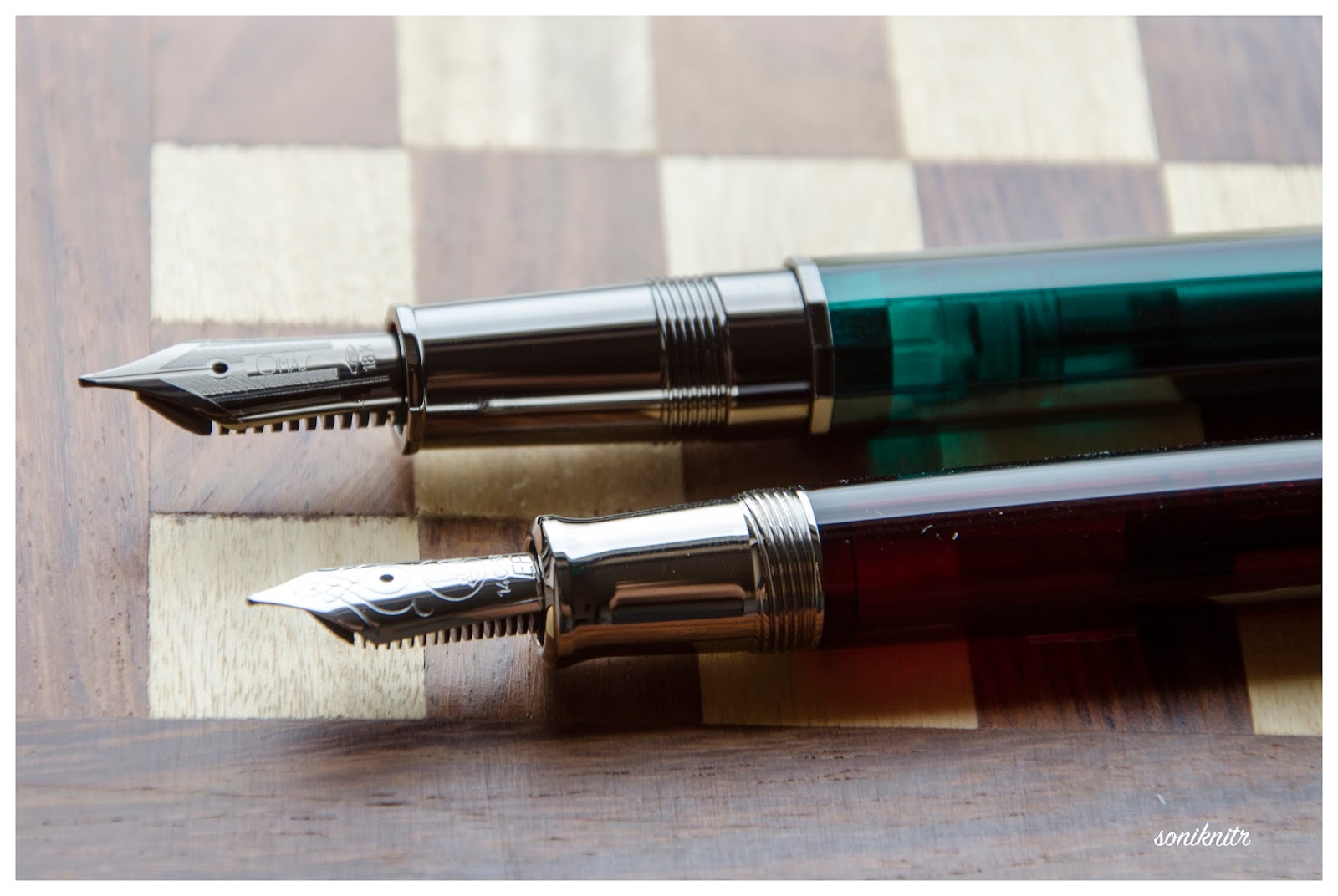
Now in case you are wondering about palladium, rhodium and ruthenium icing, along with some silver cake, here goes a picture. The other one (m625) has a silver section, coated with palladium along with a rhodium coated nib. 

The clip acquires the shape of a convex arc before ending with a tender concavity. It has the OMAS classic roller disc (since the 1930s) which slips and secures the pen in your pocket. The finial has a dome like the piston knob and its polygonal planes define triangular precision finally being bethrothed to the famous OMAS O dazzling subtly in dark ruthenium. You can see the distinct outlines of the cap insert. The centre band is engraved with OMAS and ITALY at either ends, interlocked with an architectural pattern known as the Greek key or Meandros


FILLING SYSTEM (5/6)


The piston filling system has a sturdy but small knob and is embellished with what seems to be a single loop. The knob requires three turns for the piston to move to its end stop which reveals the loop to be a part of the piston connector. The piston is smooth and efficiently draws ink from the bottle. 

            The piston end does go down inside the metallic grip section of the pen while filling ink, which provides the additional ink capacity compared to the similar cartridge/converter model of the Milord models. The barrel along with the grip provides a decent ink capacity of 1.2-1.4 mL

After a few years i.e 8 years tbh, I found the need to lubricate the piston seal. It's indeed quite easy to disengage the piston mechanism with a stock Asvine tool (the 80mm slot), without a bother to remove the nib unit. The Scribo Feel piston nut shares the same dimensions as the Omas Art Vision. 


NIB - ALL THAT MATTERS (5/6)


The nib comes rhodiated or rutheniated in 14k (Extra Flessible ones) or 18k alloys across four stock widths - EF (14k, Extra-Flessible), F (14k, Extra-Flessible), F & M and seven special widths - BB, OM, OMD, OBD, OBBD, Stub & Italic (untipped). 

This has a 18k semi-flex and comparatively responsive nib with the usual shaded geometries of the Milord/Paragon series. The size M is mentioned on the wings of the nib while the gold content is mentioned towards the tail. The content resides within an elongated hexagon. It’s kind of hard to describe the parallel hatching and geometrical patterns on the nib and you can see it for yourself. It has got some thick inclined hatching around the breather hole with OMAS branding residing in between the symmetry of it, and thinner lines of straight hatch and plains keep recurring as you move towards either of the tines. The nib is a darling to write with.

The heat set black ebonite feed has thinly spaced fins and two capillaries which ensure a good ink buffer and an extremely wet ink flow. Ebonite attract water (these are hydrophilic) as opposed to hydrophobic plastics which repel water, thereby wetting it more efficiently under the nib. Having said this, I find my plastic pelikan feeds even more efficient in this regard.


PHYSICS OF IT (6/6) – RELATIVELY SPEAKING


For me, this pen is very comfortable for writing without posting the cap. The overall uncapped length is around 13.2 cm, with a decent girth of more than 1 cm. Cap has heft and weighs a third of the total weight. The section is dark and metallic with the signature ruthenium coating although I did not find it slippery as such. The section feels quite substantial along with the cotton resin and I happen to grip the pen around 0.4-0.5 cm away from the nib. Its does feel a delight to write with, simply with the responsive nib. It’s a heavy and long pen to post and you may not prefer posting the Vision.
  • Closed Length ~ 14.5 cm
  • Posted Length ~ 17.7 cm
  • Nib Leverage ~ 2.4 cm
  • Overall Weight ~ 33 g (without ink, Cap ~ 11 g)
Capped and uncapped comparisons with a TWSBI 580 and a Pilot Custom 823 go below for your reference.


ECONOMIC VALUE (3/6)


The Visions retail at USD 495 and I am not sure if it’s a good or bad price since I do not usually find Omas pens selling at great discounts. I had a got a good, I will say steep discount from my longtime local distributor/reseller on this one. Since I have a lot of blue demos with rhodium trims, I rather went ahead with this song of dark and emerald. After the steep discount, the pen again could not make sure of value for money, but let’s not judge a piece of Art by monetary values alone! 

OVERALL (5/6)


These 18k nibs are extremely smooth, somewhat flexible with a very wet flow. A little pressure increases the ink flow and results in thicker lines. The horizontal lines are a tad thinner than the verticals. I am not allured by flex, partly because of my bad handwriting, but I can assure these are delightfully soft and springy nibs, the best perhaps for a long long time. Being extremely wet writers out of the box, the Medium nib puts a line which takes around 30 seconds to dry GvFC Moss Green ink on MD Paper. Go for the Vision, if you love this pen, substantial, differentiated & limited (331) with a befitting nib!

OTHER DEMONSTRATOR REVIEWS


REFERENCES


Thank you for going through the review. 
You can find some more pen and paraphernalia reviews here.